Get unlimited access to the full spreadsheets used to make the charts in this and other posts, and support the ongoing work of this site by becoming a member of Seattle Bubble.
It’s been a few months since we took a look at the in-county breakdown data from the NWMLS to see how the sales mix shifted around the county. I like to keep an eye on this not only to see how individual neighborhoods are doing but also to see how the sales mix shift affects the overall county-wide median price.
In order to explore this concept, we break King County down into three regions, based on the NWMLS-defined “areas”:
- low end: South County (areas 100-130 & 300-360)
- mid range: Seattle / North County (areas 140, 380-390, & 700-800)
- high end: Eastside (areas 500-600)
Here’s where each region’s median prices came in as of April data:
- low end: $330,000-$520,000
- mid range: $559,950-$964,250
- high end: $699,475-$2,203,000
First up, let’s have a look at each region’s (approximate) median price (actually the median of the medians for each area within the region).
All three tiers saw large month-over-month gains in their respective median-median price, and they all three set a new all-time record high. Month-over-month, the median price in the low tier rose 6.7 percent, the middle tier increased 6.4 percent, and the high tier gained 3.6 percent.
Twenty-eight of the twenty-nine NWMLS regions in King County with single-family home sales in April had a higher median price than a year ago, while fifteen had a month-over-month increase in the median price. The only area that had a lower median price than a year ago was Area 390, Capitol Hill/Madison Park.
Here’s how the median prices changed year-over-year. Low tier: up 16.9 percent, middle tier: up 23.4 percent, high tier: up 19.7 percent.
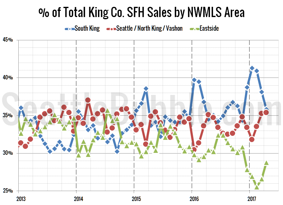
Next up, the percentage of each month’s closed sales that took place in each of the three regions.
Sales in the low and middle tiers fell between March and April, but the high tier saw a slight gain. Month-over-month sales were down 8.2 percent in the low tier, down 1.9 percent in the middle tier, and up 5.8 percent in the high tier.
Meanwhile, year-over-year sales fell in all three tiers. Compared to a year ago, sales decreased 2.0 percent in the low tier, fell 4.8 percent in the middle tier, and dropped 10.7 percent in the high tier.
After a few months of the low tier dominating the sales mix and the high tier making up a near record-low portion of sales, the mix has started to shift back toward a more normal mix, with cheap sales falling off and expensive sales gaining back ground. This kind of move will make the overall county-wide median increase even if all the regions weren’t seeing price gains individually.
As of April 2017, 35.8 percent of sales were in the low end regions (up from 34.5 percent a year ago), 35.4 percent in the mid range (up from 35.1 percent a year ago), and 28.8 percent in the high end (down from 30.4 percent a year ago).
Here’s that information in a visual format:
Finally, here’s an updated look at the percentage of sales data all the way back through 2000:
It’s interesting that despite the shift in the sales mix away from the cheap regions and toward the expensive regions, the county-wide median price increased less year-over-year than all three of the price tier aggregate regions. If the sales mix continues moving away from the cheap regions, I expect the next few months to see even bigger gains in the county-wide median price.


