Get access to the full spreadsheets used to make the charts in this and other posts, as well as a variety of additional insider benefits by becoming a member of Seattle Bubble.
June market stats have been published by the NWMLS. Their press release hasn’t been published yet, so maybe we’ll do a reporting roundup tomorrow and take a look at Lennox Scott’s breathless Lereah-esque bloviations.
For now, let’s just dive into the numbers for June.
NWMLS monthly reports include an undisclosed and varying number of
sales from previous months in their pending and closed sales statistics.
Here’s your King County SFH summary, with the arrows to show whether the year-over-year direction of each indicator is favorable or unfavorable news for buyers and sellers (green = favorable, red = unfavorable):
| June 2017 | Number | MOM | YOY | Buyers | Sellers |
|---|---|---|---|---|---|
| Active Listings | 2,602 | +21.1% | -18.1% |  |
 |
| Closed Sales | 2,891 | +12.2% | -0.1% |  |
 |
| SAAS (?) | 1.36 | +4.2% | +1.2% |  |
 |
| Pending Sales | 3,392 | -1.8% | +0.9% |  |
 |
| Months of Supply | 0.90 | +7.9% | -18.0% |  |
 |
| Median Price* | $653,000 | +3.3% | +13.9% |  |
 |
New listings are coming on at a decent pace and inventory actually saw a decent increase, but buyers are still snatching up most listings very quickly. The average time on market in King County for single-family home sales that closed in June was just 17 days—an all-time low.
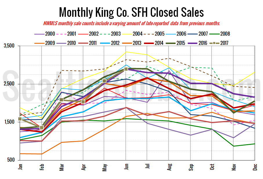
Here’s your closed sales yearly comparison chart:
Closed sales shot up 12 percent between May and June. Last year over the same period closed sales increased 15 percent. Year-over-year closed sales were down just barely.
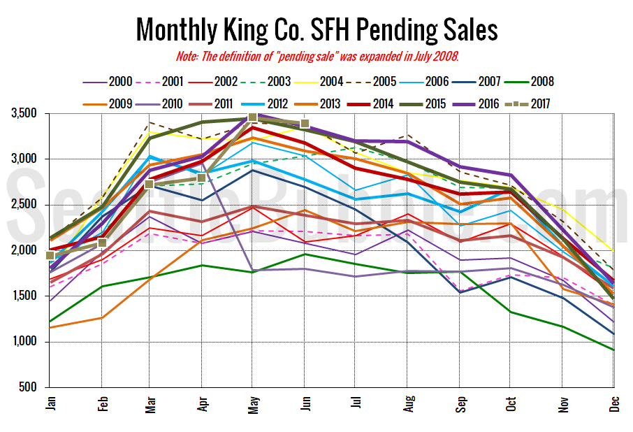
Pending sales fell two percent from May to June, and were up one percent year-over-year.
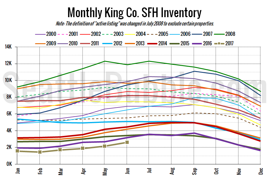
Here’s the graph of inventory with each year overlaid on the same chart.
Inventory rose 21 percent from May to June, which actually the largest month-over-month increase on record. If there’s any glimmer of hope for buyers in this month’s data, that’s probably it. Year-over-year inventory was still down 18 percent, though.
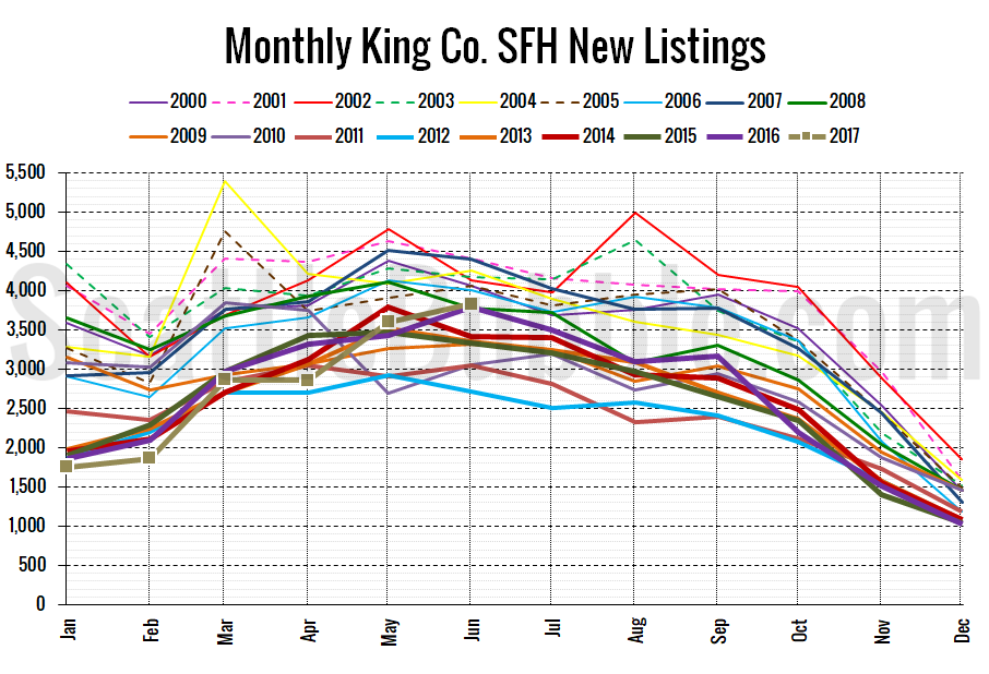
Here’s the chart of new listings:
New listings were up seven percent month-over-month, and up one percent from last year. The overall level of new listings is middle-of-the-pack compared to previous years, which is also at least not terrible news for buyers.
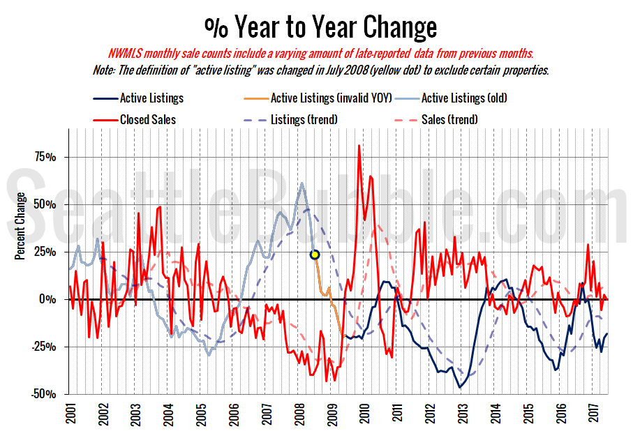
Here’s the supply/demand YOY graph. “Demand” in this chart is represented by closed sales, which have had a consistent definition throughout the decade (unlike pending sales from NWMLS).
The overall supply and demand situation is still very much trending in sellers’ favor.
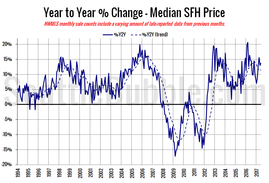
Here’s the median home price YOY change graph:
Another crazy month for year-over-year price gains.
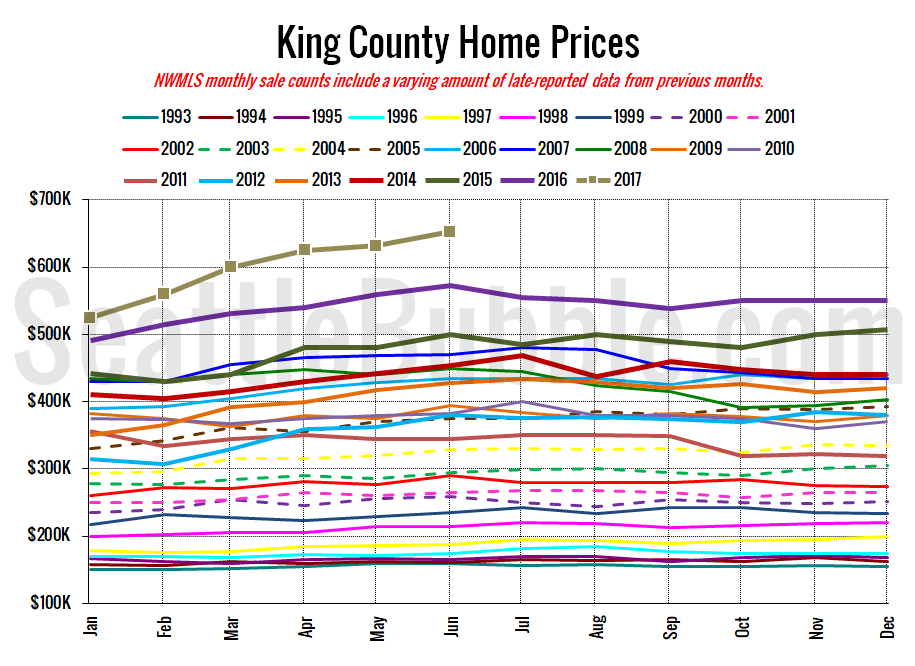
And lastly, here is the chart comparing King County SFH prices each month for every year back to 1994 (not adjusted for inflation).
Yet another new all-time record high.
June 2017: $653,000
July 2007: $481,000 (previous cycle high)
These numbers only just came out, so there’s no article yet in the Seattle Times. I’ll probably update this post when they publish their story.
