Let’s have a look at the latest data from the Case-Shiller Home Price Index. According to March data that was released this morning, Seattle-area home prices were:
Up 1.8 percent April to May
Up 13.3 percent year-over-year.
Up 17.7 percent from the July 2007 peak
Over the same period last year prices were up 1.4 percent month-over-month and year-over-year prices were up 10.7 percent.
Home price growth in Seattle as measured by Case-Shiller show no signs of slowing. Seattle leads the nation yet again in month-over-month and year-over-year home price growth. Thanks, Amazon.
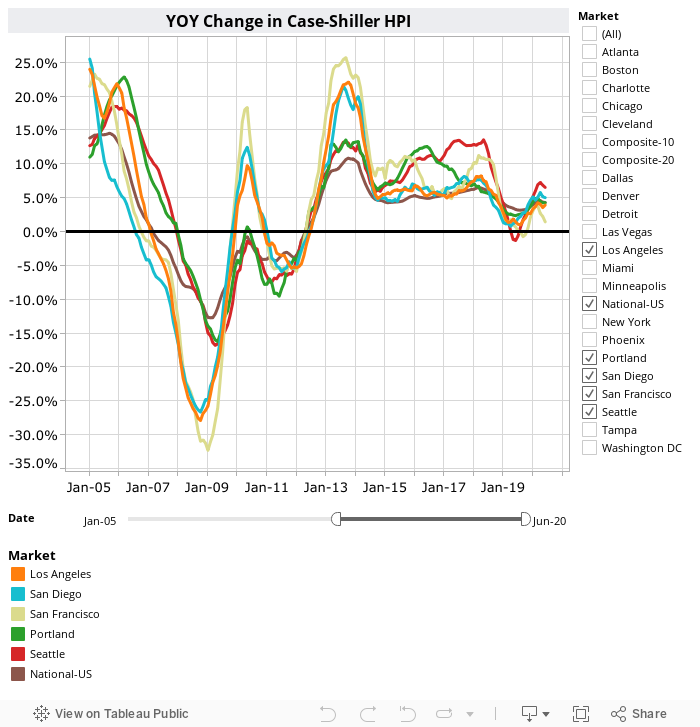
Here’s a Tableau Public interactive graph of the year-over-year change for all twenty Case-Shiller-tracked cities. Check and un-check the boxes on the right to modify which cities are showing:
Seattle’s rank for month-over-month changes hit #1 in February and has held that position since then, through May.

Hit the jump for the rest of our monthly Case-Shiller charts, including the interactive chart of raw index data for all 20 metro areas.
Seattle’s year-over-year price growth edged up yet again from April to May, to the highest level it has been at since nearly 11 years ago—October 2006. Yet again in May, none of the twenty Case-Shiller-tracked metro areas gained more year-over-year than Seattle. From February through August of last year, Portland had been in the #1 slot above Seattle.
The same eight cities as last month hit new all-time highs again in May: San Francisco, Denver, Atlanta, Boston, Charlotte, Portland, Dallas, and Seattle.
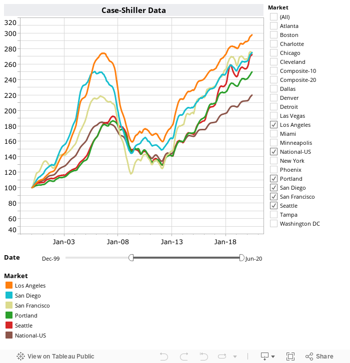
Here’s the interactive chart of the raw HPI for all twenty metro areas through May.
Here’s an update to the peak-decline graph, inspired by a graph created by reader CrystalBall. This chart takes the twelve metro areas whose peak index was greater than 175, and tracks how far they have fallen so far from their peak. The horizontal axis shows the total number of months since each individual city peaked.

In the 118 months since the price peak in Seattle prices are up 17.7 percent.
Lastly, let’s see how Seattle’s current prices compare to the previous bubble inflation and subsequent burst. Note that this chart does not adjust for inflation.

Check back tomorrow for our monthly look at Case-Shiller data for Seattle’s price tiers.
(Home Price Indices, Standard & Poor’s, 2017-07-25)