Get access to the full spreadsheets used to make the charts in this and other posts, as well as a variety of additional insider benefits by becoming a member of Seattle Bubble.
July market stats were published by the NWMLS yesterday. Before we get into our monthly stats, here’s a quick look at their press release.
Homebuyers Encouraged,”But Still On Edge” While Sellers Face Reality Check
“Home sellers throughout the Seattle region are experiencing a reality check and the days of multiple offers are days of the past,” was how one director with Northwest Multiple Listing Service summarized the market upon reviewing the statistical report for July.
…
“In Seattle and King County supply is at the highest level since first quarter 2015, which has me thinking about the longevity of seller luxuries like offer review dates, pre-inspections, and escalation clauses,” remarked Robert Wasser, owner of Prospera Real Estate and an officer of the Northwest MLS board of directors. “People are taking notice of the evolving real estate landscape — even my mom tells me she’s noticing more for sale signs!”“There continues to be better news for buyers,” agreed Mike Grady, president and COO of Coldwell Banker Bain. He noted the inventory in King County has doubled since March from 0.8 months to 1.5 months of supply, but added “While this is significant, we are still well below a balanced market of 4-to-5 months of inventory.”
…
“Seller gridlock has loosened close to the job centers,” stated J. Lennox Scott, chairman and CEO of John L. Scott Real Estate. “While we are experiencing record sales activity for the higher end and luxury markets in year 2018, a record number of new listings is coming on the market in these price ranges. This has resulted in more opportunities for home buyers and lower premium pricing from the spring market.”
I have no idea what “seller gridlock” is even supposed to mean. In general though, the agents quoted in this month’s press release are being fairly realistic so far. It will be interesting to see if that keeps up if the market starts to seriously slow down.
NWMLS monthly reports include an undisclosed and varying number of
sales from previous months in their pending and closed sales statistics.
Here’s your King County SFH summary, with the arrows to show whether the year-over-year direction of each indicator is favorable or unfavorable news for buyers and sellers (green = favorable, red = unfavorable):
| July 2018 | Number | MOM | YOY | Buyers | Sellers |
|---|---|---|---|---|---|
| Active Listings | 4,163 | +12.0% | +43.7% |  |
 |
| Closed Sales | 2,577 | -6.6% | -5.5% |  |
 |
| SAAS (?) | 1.40 | -4.2% | +9.4% |  |
 |
| Pending Sales | 2,693 | -9.5% | -8.7% |  |
 |
| Months of Supply | 1.62 | +19.8% | +52.0% |  |
 |
| Median Price* | $699,000 | -2.2% | +6.2% |  |
 |
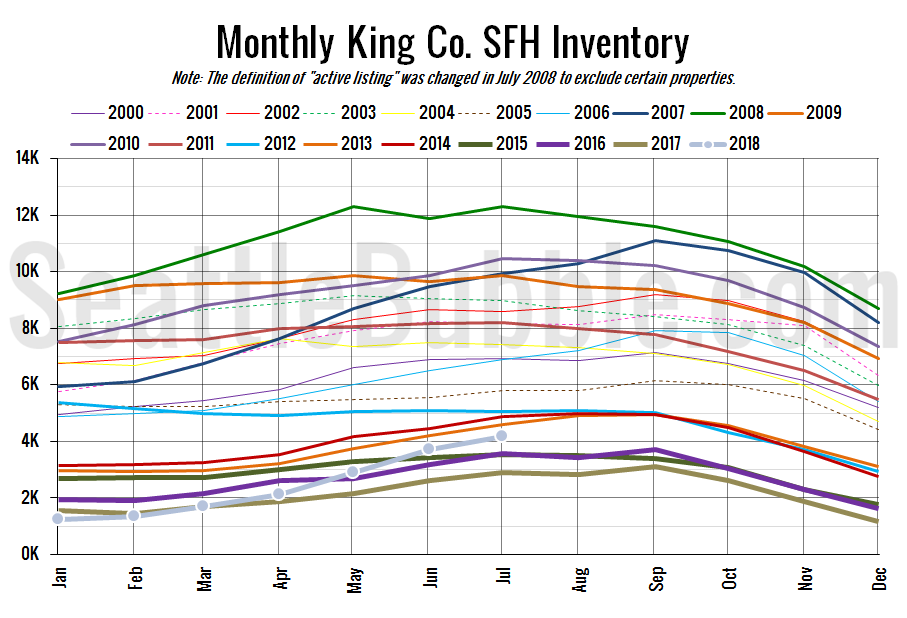
The biggest news is still the climb in inventory, which is up 256 percent from the all-time low that was set back in December. If the current trend continues (a big “if”), it’s entirely possible that by the end of this year inventory will be at its highest point since 2011.
Here’s the graph of inventory with each year overlaid on the same chart.
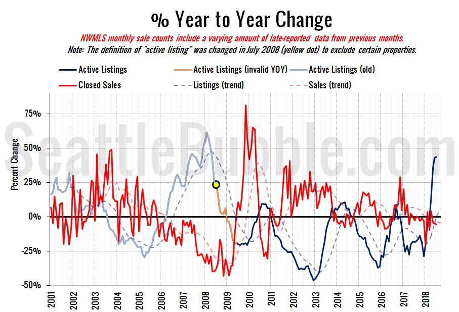
Inventory rose twelve percent from June to July, and was up forty-four percent from last year. This is the largest year-over-year increase we’ve seen in active listings cine April 2008.
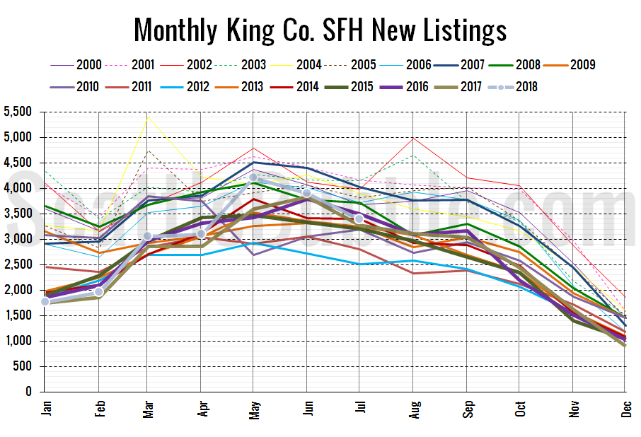
Here’s the chart of new listings:
New listings were up three percent from a year ago, but dipped slightly from June to July, which is typical for this time of year.
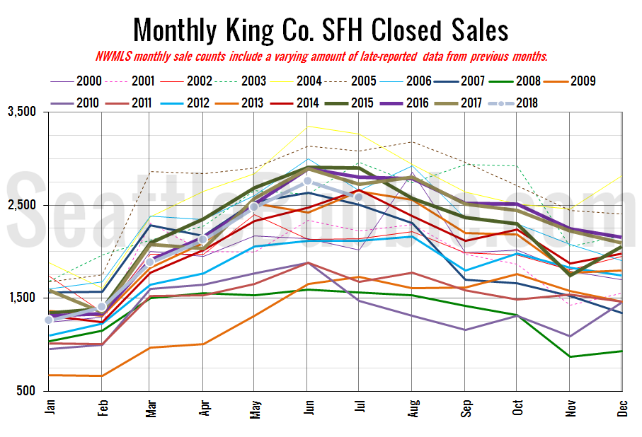
Here’s your closed sales yearly comparison chart:
Closed sales fell seven percent between June and July. Last year over the same period closed sales dropped six percent. Year-over-year closed sales were down six percent.
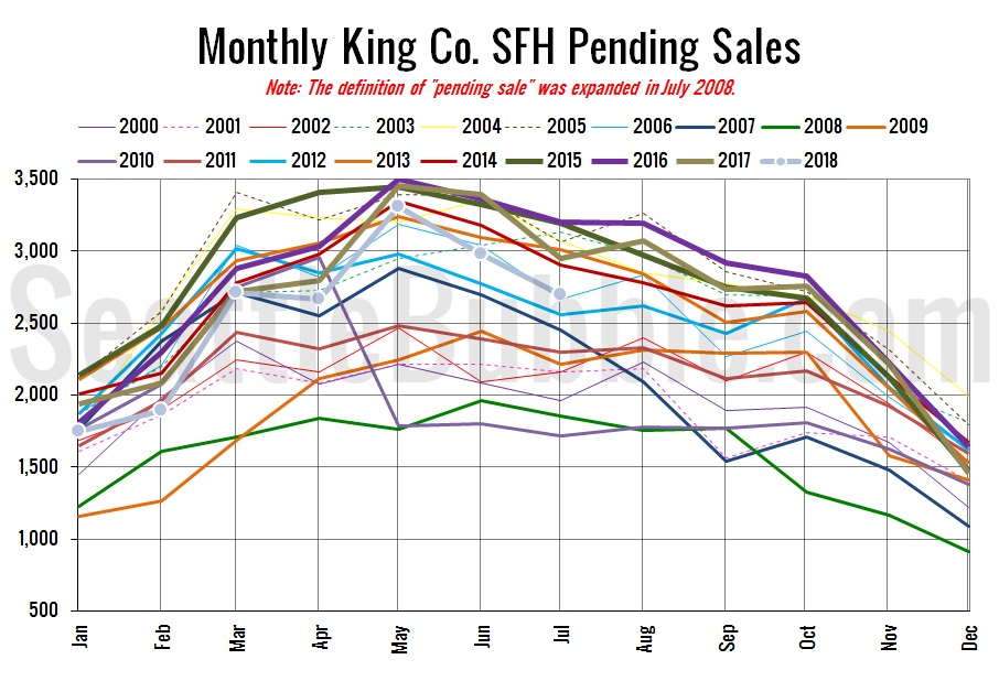
Pending sales were down ten percent from June to July, and were down nine percent year-over-year.
Here’s the supply/demand YOY graph. “Demand” in this chart is represented by closed sales, which have had a consistent definition throughout the decade (unlike pending sales from NWMLS).
This is the steepest surge in listings that we’ve seen, with the year-over-year numbers surging faster than they did between 2005 and 2008.
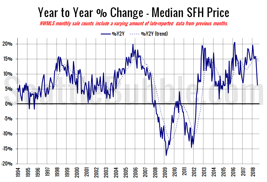
Here’s the median home price YOY change graph:
Year-over-year home price changes fell to their lowest level since July 2015.
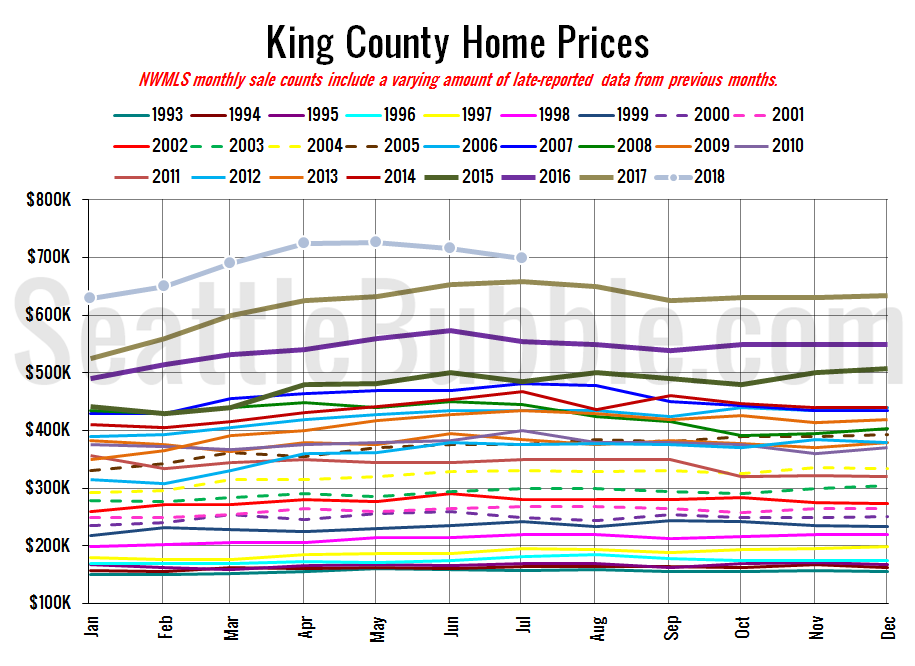
And lastly, here is the chart comparing King County SFH prices each month for every year back to 1994 (not adjusted for inflation).
June or July is usually the high point for prices in a given year, but this year prices peaked in May. Between 2000 and 2017, April to July has seen the median price increase an average of 3.4 percent. This year prices fell 3.6 percent over those same four months.
July 2018: $699,000
July 2007: $481,000 (previous cycle high)
Here’s the article from the Seattle Times: More Seattle-area home sellers lower list prices as market cools way down
