Good news for Seattle Bubble members! The spreadsheets behind the charts in this post as well as all the other spreadsheets I keep have been updated with the most recent data. Become a member of Seattle Bubble to get access to the private spreadsheets folder and join our private Slack channel.
I’ve got a few charts to update you with, but let’s start with a few charts that sum up the state of King County single-family listings, inventory, and pending sales.
After five or six years of the same story month after month—fewer listings, more sales, soaring prices—the market has definitely turned in 2018. Pending sales are now on the decline and inventory is rising rapidly. Let’s see what this looks like in charts.
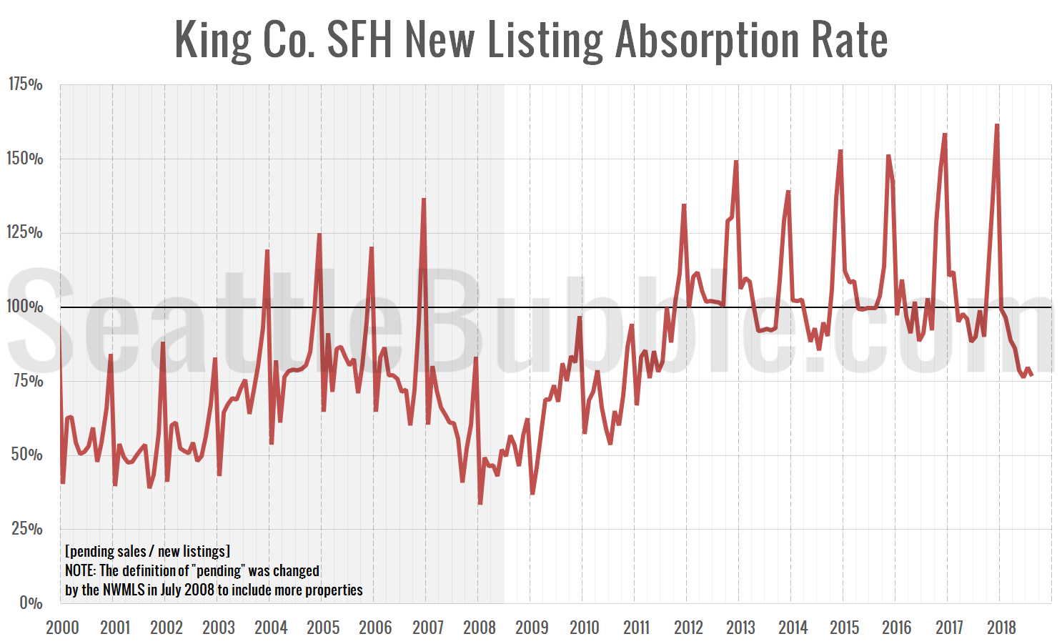
First up, here’s a chart of new listing absorption. This is a simple look at the ratio of pending sales to new listings. If more homes are going pending in a month than there are being listed, this ratio goes above 100 percent, which is obviously not great for buyers.
As of August, the absorption metric has dropped to 77 percent—on par with where it was in late 2010. This rate was at its all-time highest level just last December at 162 percent. In past years, the absorption rate typically hits its lowest point of the year in June or July and begins climbing in August or September. If the rate doesn’t spike back above 100 between now and December, the market could get really interesting.
Keep in mind that the pre-2008 data is not directly comparable, since in July 2008 the NWMLS changed how they define “pending sale” to include more sales.
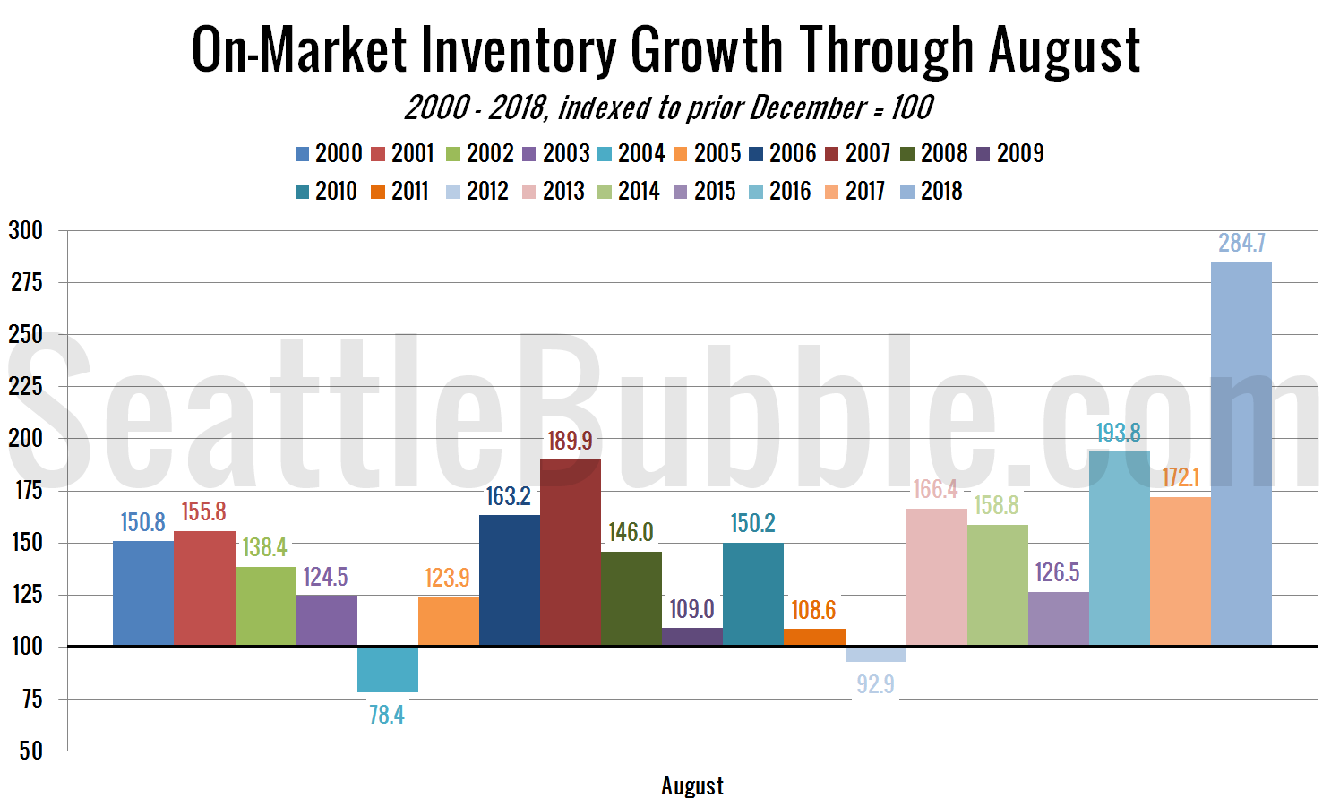
Next up: a comparison of total on-market inventory growth through August for each year:
Since last December was the all-time low for on-market inventory it’s not too surprising that this year set the record for the largest percent gain between December and August. Still, that is a huge difference.
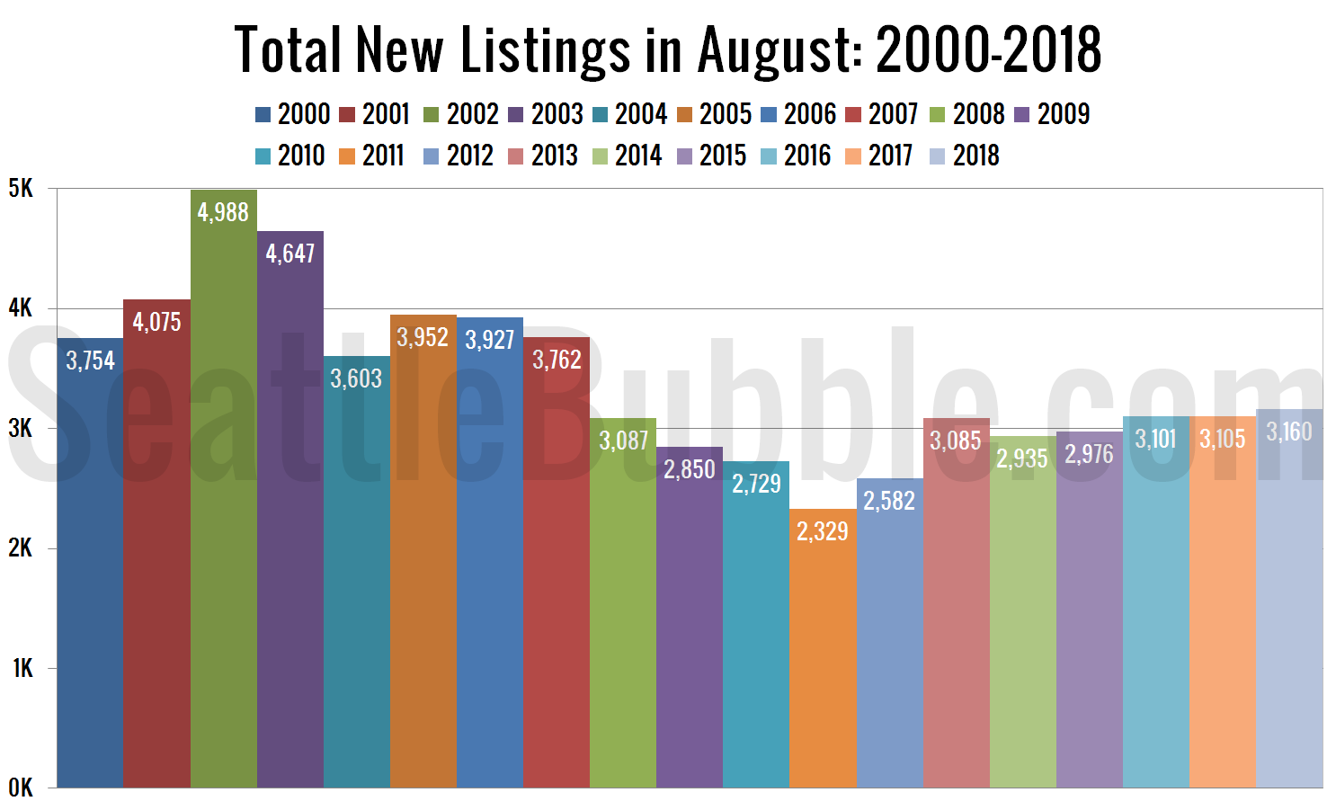
Next, here’s a yearly comparison of the total number of new listings just in the month of August:
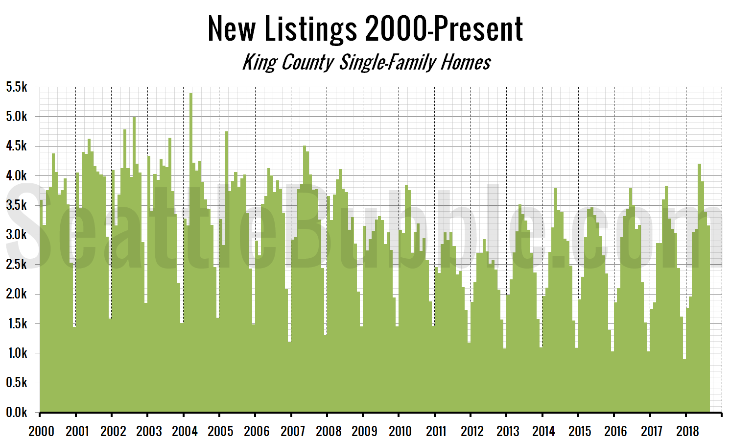
And here’s a broad look at monthly new listings since January 2000:
Even though on-market inventory is climbing like crazy this year, the number of new listings isn’t hitting new records at all. This means that most of the increase we’re seeing in inventory is from a decrease in pending sales.
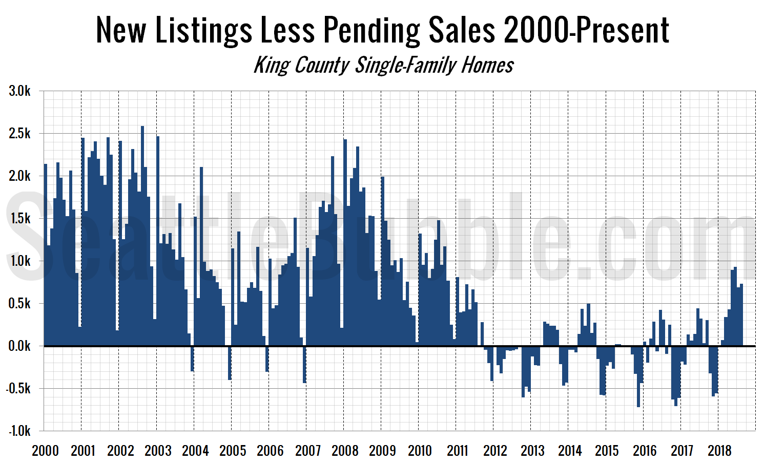
Finally, here’s a simple chart that shows the difference between new listings and pending sales. While the first chart in this post is new listings divided by pending sales, this one is new listings minus pending sales:
This year is the first year since 2010 that this measure has been above zero every month between January and August. It seems that we may have finally hit some kind of tipping point in the hot market.
