As promised in last night’s affordability post, here’s an updated look at the “affordable home” price chart. In this graph I flip the variables in the affordability index calculation around to other sides of the equation to calculate what price home the a family earning the median household income could afford to buy at today’s…
Category: Statistics
Statistics, number-based analysis, etc.
Affordability Rose Slightly in September
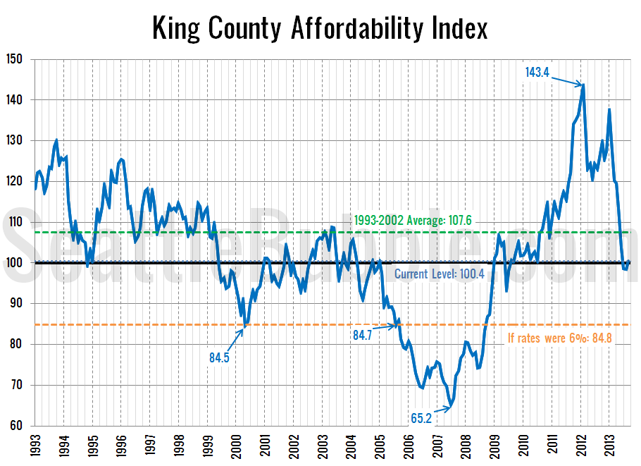
Let’s take a look at how affordability is doing in the Seattle area after the last couple months of changes in home prices and interest rates. So how does affordability look as of September? Slightly better. The index inched back above 100 (i.e. the median-priced home is affordable to a median-income household) thanks to the…
Around the Sound: Snohomish County Inventory Shoots Up
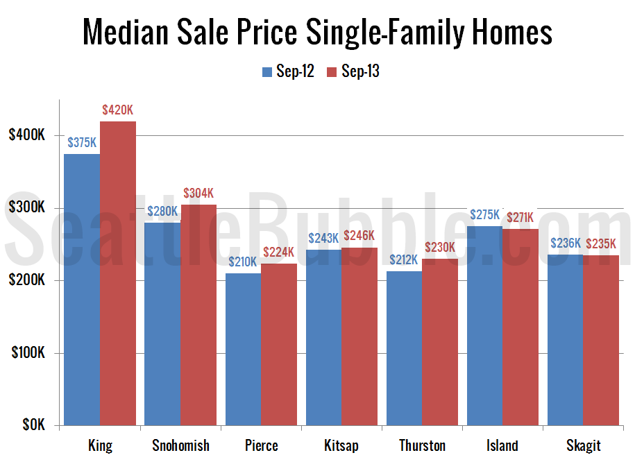
It’s time for us to check up on stats outside of the King/Snohomish core with our “Around the Sound” statistics. If there is certain data you would like to see or ways you would like to see the data presented differently, drop a comment below and let me know. First up, a summary table: September…
Median Price Fell Across King County in September
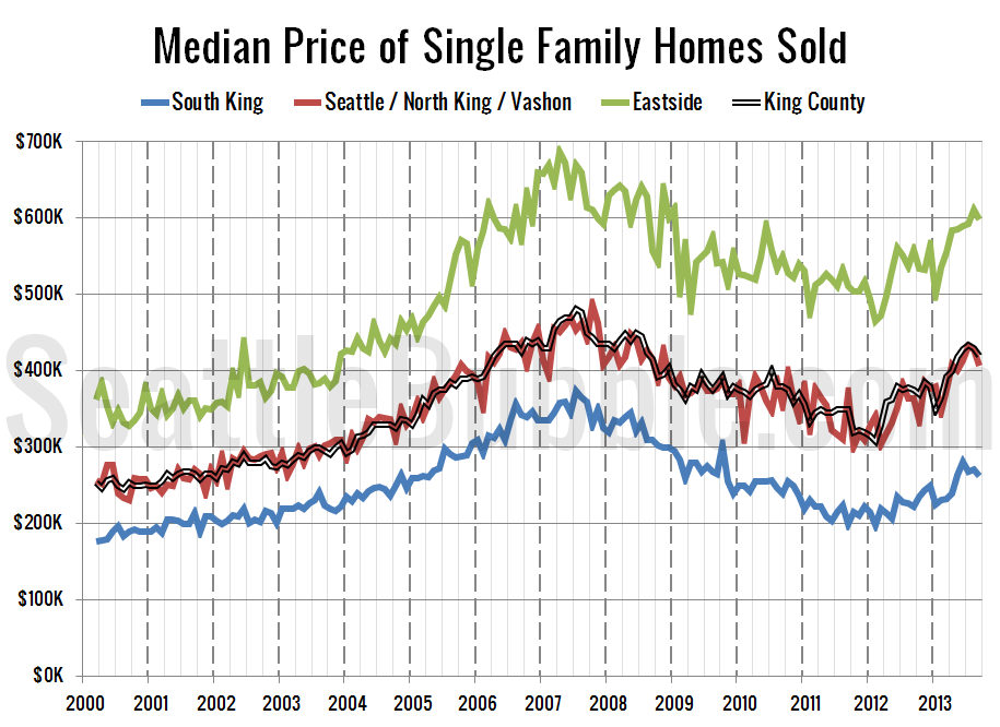
It’s time once again to take an updated look at how King County’s sales are shifting between the different regions around the county, since geographic shifts can and do affect the median price. In order to explore this concept, we break King County down into three regions, based on the NWMLS-defined “areas”: low end: South…
Listing Growth in 2013 Largest Since 2007
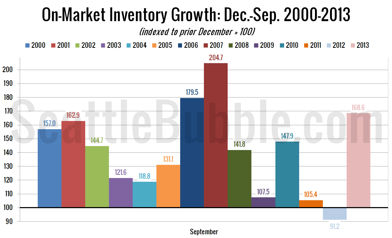
Let’s have a look at how listings are doing over the last few months. First up, here’s a view of how inventory has grown so far this year: Since 2013 started at a record-low level of homes on the market, inventory growth this year has been the largest since 2007, and the third-largest of any…


