March market stats were published by the NWMLS this morning. Here’s a snippet from their press release: Prices "spiking" as home buyers compete for scarce inventory.
“All price ranges are feeling a lift,” reported Dick Beeson, principal managing broker at RE/MAX Professionals in Tacoma. Northwest MLS director John Deely echoed that comment: “We are seeing many homes in Seattle meet and exceed pre-bubble price levels,” stated Deely, the principal managing broker at Coldwell Banker Bain in Seattle.
“The recovery continues on a slow and steady pace in most areas and surging hard in others,” concluded Darin Stenvers, vice chair of the MLS board.
I think it’s a mischaracterization to say that prices are “spiking.” I get into the reasons for this a little more below. I’m also having a hard time rectifying the “spiking” headline with the “slow and steady” comment from Mr. Stenvers. Whatever.
All righty, on with our usual monthly stats.
NWMLS monthly reports include an undisclosed and varying number of
sales from previous months in their pending and closed sales statistics.
Here’s your King County SFH summary, with the arrows to show whether the year-over-year direction of each indicator is favorable or unfavorable news for buyers and sellers (green = favorable, red = unfavorable):
| March 2013 | Number | MOM | YOY | Buyers | Sellers |
|---|---|---|---|---|---|
| Active Listings | 2,972 | +0.8% | -40.3% |  |
 |
| Closed Sales | 1,825 | +39.6% | +11.1% |  |
 |
| SAAS (?) | 1.36 | -3.1% | -9.9% |  |
 |
| Pending Sales | 2,936 | +18.9% | -2.7% |  |
 |
| Months of Supply | 1.01 | -15.2% | -38.6% |  |
 |
| Median Price* | $392,000 | +7.4% | +18.8% |  |
 |
Feel free to download the updated Seattle Bubble Spreadsheet (Excel 2003 format), but keep in mind the caution above.
For the third month in a row now, we’re looking at the lowest months of supply has ever been as far back as my data goes (January 2000). The number of listings on the market at the end of the month was barely higher than the number of pending sales. Remember thoug that the NWMLS changed the definition of “active listing” in July 2008, so months of supply before and after that point aren’t really directly comparable, and closed sales still aren’t coming anywhere near pending sales, but barely over one month of supply is still pretty abysmal.
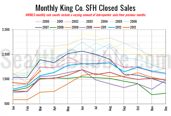
Here’s your closed sales yearly comparison chart:
Same basic pattern as every year, with sales surging between February and March.
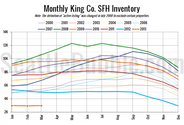
Here’s the graph of inventory with each year overlaid on the same chart.
Inventory inched up, but remains at record lows.
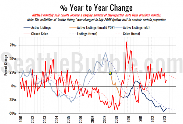
Here’s the supply/demand YOY graph. In place of the now-unreliable measure of pending sales, the “demand” in this chart is represented by closed sales, which have had a consistent definition throughout the decade.
The listings curve is moving closer to zero (flat year-over-year), but the sales curve turned back up again in March.
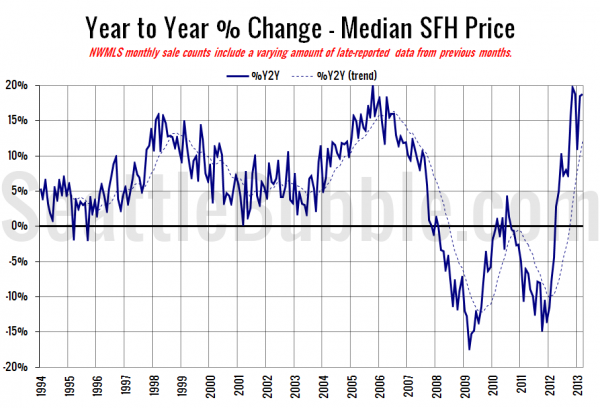
Here’s the median home price YOY change graph:
More or less the same as last month at a nearly 20% year-over-year gain. Remember that this large of a jump is mostly due to a decrease in distressed sales (short sales, bank-owned) and a geographic shift toward the more expensive parts of the county.
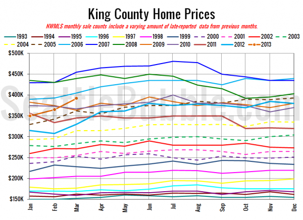
And lastly, here is the chart comparing King County SFH prices each month for every year back to 1994.
March 2013: $392,000
December 2005: $393,000
So far I haven’t seen any articles from the Times and P-I, but I’ll update this post later if they show up.
Update:
Seattle Times: King County house prices jumped almost 20 percent over year
Seattle P-I: Homes even harder to find in Seattle area in March
Check back tomorrow for the full reporting roundup.

