Let’s have a look at the latest data from the Case-Shiller Home Price Index. According to July data that was released this morning, Seattle-area home prices were:
Up 0.6 percent June to July
Up 13.5 percent year-over-year.
Up 20.2 percent from the July 2007 peak
Over the same period last year prices were up 0.6 percent month-over-month and year-over-year prices were up 11.2 percent.
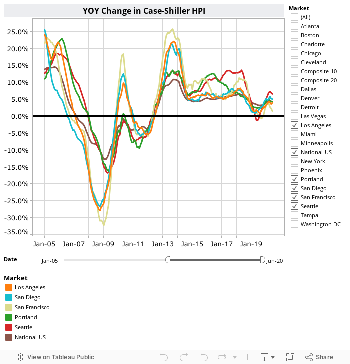
To get a sense of just how nuts it is here in Seattle compared to pretty much everywhere else, consider this chart of year-over-year home price changes in all twenty Case-Shiller cities over the past year and a half:

Seattle is not only the city with the highest year-over-year home price growth (by a wide margin) but it has also seen by far the strongest growth in year-over-year home price changes in recent months. Since December, eight cities have seen declining year-over-year home price growth, another eight cities have seen an increase of less than a percentage point, three more have increased between one and two percentage points. In Seattle it increased 2.7 points.
How do you spell unsustainable? S-E-A-T-T-L-E.
Here’s a Tableau Public interactive graph of the year-over-year change for all twenty Case-Shiller-tracked cities. Check and un-check the boxes on the right to modify which cities are showing:
Seattle’s rank for month-over-month changes did fall off a bit in July, down from #2 in June to #9 in July.

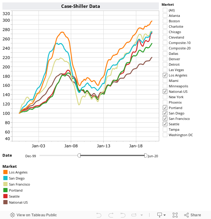
Hit the jump for the rest of our monthly Case-Shiller charts, including the interactive chart of raw index data for all 20 metro areas.
Seattle’s year-over-year price growth hit another new post-peak high. The highest level since October 2006. Yet again in July, none of the twenty Case-Shiller-tracked metro areas gained more year-over-year than Seattle. Not even close.
The same eight cities as last month hit new all-time highs again in July: San Francisco, Denver, Atlanta, Boston, Charlotte, Portland, Dallas, and Seattle.
Here’s the interactive chart of the raw HPI for all twenty metro areas through July.
Here’s an update to the peak-decline graph, inspired by a graph created by reader CrystalBall. This chart takes the twelve metro areas whose peak index was greater than 175, and tracks how far they have fallen so far from their peak. The horizontal axis shows the total number of months since each individual city peaked.

In the 120 months since the price peak in Seattle prices are up 20.2 percent.
Lastly, let’s see how Seattle’s current prices compare to the previous bubble inflation and subsequent burst. Note that this chart does not adjust for inflation.

Here’s the Seattle Times story about this month’s numbers: Seattle home price growth is nearly double any other U.S. city
Check back tomorrow for our monthly look at Case-Shiller data for Seattle’s price tiers.
(Home Price Indices, Standard & Poor’s, 2017-09-26)