There are many arguments to be had between the Seattle Bubble housing bulls and bears, but one belief that seems to be commonly shared is that one of the primary drivers of demand and pricing in our market is a steady stream of rich Californians moving up and driving prices up. The bulls argue that our booming market is fueled by a never-ending flow of California equity, and that this situation is unlikely to end because Seattle is just-so-special. The bears point out that, as the California market slows down, so will the flow of emigrants, which will bring this gravy train to an end.
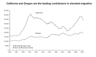
I counted myself more in the latter camp than in the former. But as someone who is always on the lookout for data to support my viewpoint, I was excited to find out that the State of Washington Office of Financial Management publishes an annual population estimate for the state. In this report, they show immigration trends based on license surrenders by major source of population. The chart below, showing the long-term migration trend from California and Oregon, is the one that caught my eye.
The dips and peaks of California immigration shown on this chart looked suspiciously like the oscillations of our local real estate market. So, I put in a couple of calls to Theresa Lowe, the State Demographer – and soon found myself in possession of the data from which this chart was derived.
From there it was a quick effort in Excel to compare this data to the Case-Shiller Index, the longest running and most accurate gauge of price available for this market. I matched the 12 month rolling total of immigration to the year-over-year appreciation in the index, because looking at annualized data should smooth out seasonal variations. The results of this comparison surprised me.
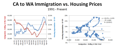
The left hand side of the graphic below shows California immigration versus home prices. To the naked eye, there does appear to be a relationship. Major peaks and valleys roughly align. However, the right hand side of the same graphic, which uses the same data, tells a very different story. This chart shows a scatterplot of the two time series. As you can see, there is almost zero correlation between the two. The coefficient of correlation is negative 3%, and the R-square is practically zero. Based on this data – there isn’t a slight relationship between the two data series, there is effectively no relationship at all!
Actually, if you look closely back at the chart on the left- you can see why this is the case. At the beginning of the time series, immigration is still climbing right through the biggest drop in home appreciation. Then for the next 7 years (through 1998), immigration tails off, while the rate of appreciation climbed steadily. Both trended the same way from 2001 to 2006, but more recently immigration has held steady while price appreciation has drastically eroded. The two series don’t move together at major points of change, and for a good part of the series they are moving in opposite directions altogether.
Not ready to give up yet, I thought that perhaps most people are like me – and don’t go to get their licenses immediately after moving. They do important things first, like buy houses. So I experimented with shifting the moving-date data data out further – between one and 12 months. That modification only served to make the explanatory value worse – and if anything, ended up showed a greater negative correlation. (in other words, more Californians equals lower home prices!)
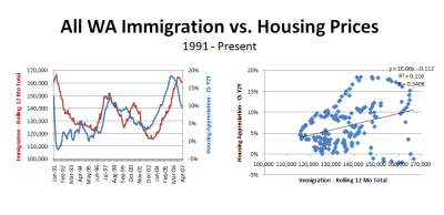
So the relationship between the number of Californians moving here and home price appreciation appears to be a bust. What about immigration at large? I ran the same analysis for all immigration to the state versus home prices to see if that showed any relationship. Here, I found a greater correlation. This time, I got a coefficient of correlation of postive 34% and an R-square of 0.116 – which can be interpreted as “moderate” correlation. There is definitely a relationship, but with such a low R-square -the explanatory value of immigration as a driver of home prices is very low.
So it appears, at least based on drivers license data (which should include most, if not all, potential home buyers), there doesn’t appear to be that great of a relationship between immigration and home price appreciation – and that old standby that California Equity is driving our market doesn’t appear to have much substance behind it at all.
The “California Equity Locust” appears to be a mythical beast, whose powers are greatly exaggerated.
Edit: The graph below shows how CA immigration compares to a blended CS index for California, built from weighting SF, LA, and SD in the same way they are in the CS 10 city index. As you can see, there is a very strong negative correlation between these two time series, as many readers have commented.


