Let’s check out the three price tiers for the Seattle area, as measured by Case-Shiller. Remember, Case-Shiller’s “Seattle” data is based on single-family home repeat sales in King, Pierce, and Snohomish counties.
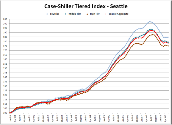
First up is the straight graph of the index from January 2000 through June 2008.
You can see that all three tiers basically flattened out through the spring. The medium and high tiers had that slight bump from March to April, but have since given back the slight gain, while the low tier has been nearly flat.
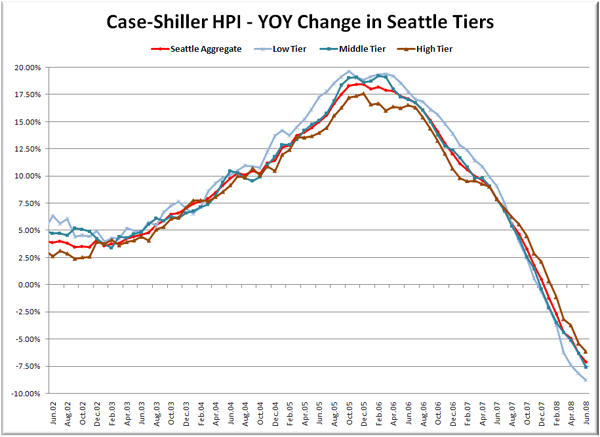
Here’s a chart of the year-over-year change in the index from June 2002 through June 2008.
Despite being flat for four months, the low tier continues to perform worst in terms of year-over-year price changes, coming with a nearly 9% drop from June 2007. Here’s where the tiers sit YOY as of June – Low: -8.8%, Med: -7.6%, Hi: -6.2%.
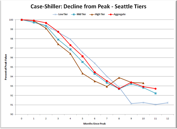
Lastly, here’s a decline-from-peak graph like the one posted yesterday, but looking only at the Seattle tiers.
It’s almost as if the low tier is waiting for the other two tiers to catch up after dropping so severely between months 8 and 9. Looks like another month or so and the mid and high tiers should be pretty close in terms of total decline from peak.
So has the low tier bottomed out, or is the flatness of March-June just the best “spring bounce” that could be mustered? We’ll find out soon enough as we crawl into the summer and fall.
(Home Price Indices, Standard & Poor’s, 08.26.2008)


