In order to bring an even more complete picture of the Seattle-area foreclosure situation, I spent some time with Snohomish and Pierce County records, and pulled data on the number of Notices of Trustee Sale going back to 2000 for each county.
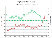
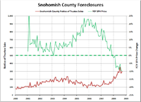
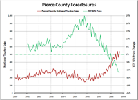
Here are charts of King, Pierce, and Snohomish County foreclosures from January 2000 through September 2008, with uniform y-axis scales to provide easier comparison:
The raw increase in sheer foreclosure volume has been fastest in King County, where January-September 2008 saw 2,166 more foreclosures than the same period in 2007. However, the percentage increase was largest in Snohomish County, where Jan.-Sept. foreclosures rose 86% over 2007. The percentage increase in 2008 through September was 83% in Pierce and 78% in King—a total spread of just 8 percentage points between the three counties.
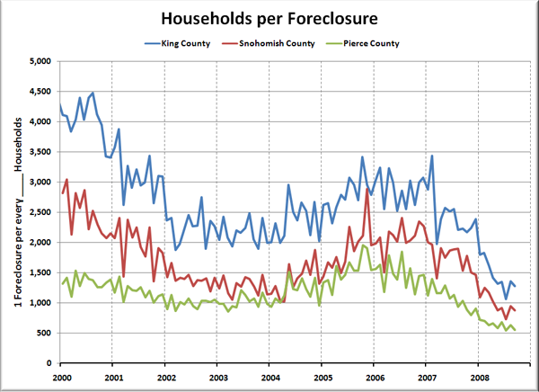
Here’s another look at the data, scaled in terms of number of households per foreclosure (based on household data from the American Community Survey, assuming linear household growth between surveys):
Since early last year, King County has gone from 1 foreclosure per approximately 3,000 households to 1 per 1,281 as of September. Snohomish County dropped from 1 foreclosure per over 2,000 households to under 900. Pierce—having rarely been above 1,500 households per foreclosure—has dropped from 1 foreclosure per around 1,400 households to 1 per every 537.
For comparison, the latest press release from RealtyTrac shows the nationwide rate to be 1 foreclosure per every 475 households, and puts Washington’s statewide rate at 1 foreclosure per every 1,383 households.
One more take on the data, the following chart simply indexes the number of Notices of Trustee Sale to 100 in January 2000 for each of the three counties, to give a directly comparable perspective of the rate of change between King County, Snohomish County, and Pierce County:
Ther were 3.45 times as many foreclosures in King County in September 2008 as there were in January 2000, 3.65 times as many in Snohomish County, and 2.71 times as many in Pierce.
If you’re interested in an even more granular breakdown of the most recent data, check out the foreclosure heat map at Hotpads.com, which color-codes each zip code based on households per foreclosure.


