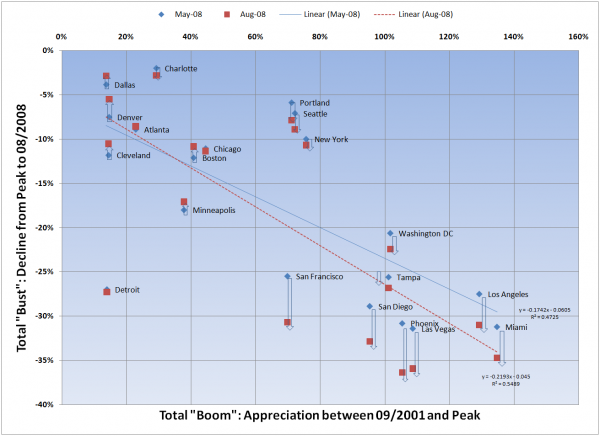
Back in July I posted a comparison of the total percentage gain during the boom years to the total percentage drop from peak to date across a bunch of markets, to see if I could establish a clear relationship or correlation between the two. I wanted to give a quick update on this analysis.
As a reminder, I based the gain/loss percentages on Case-Shiller data for May and August; and for the purposes of this comparison, I used the following definitions:
- “Boom” returns are the total appreciation between 09/2001 (based on the oft cited relationship between the Fed taking down short term lending rates and the housing boom) and the peak for each market.
- “Bust” returns are the total decline from peak to the latest reported numbers.
Couple of things I noticed in this updated version of the analysis:
- Overall, the slope of the line got steeper – meaning that the ratio of “bust” to “boom” increased. Based on what we are seeing in the super-bubbly markets (SF, San Diego, Phx, LA, Miami) I would expect this phenomenon will continue.
- The “fit” of the line also got better – meaning markets generally moved closer to the line
- Of the markets identified as “outliers” in the earlier analysis (Seattle, Portland, New York, Detroit), all but Detroit moved in the direction expected.
