Let’s check out the three price tiers for the Seattle area, as measured by Case-Shiller. Remember, Case-Shiller’s “Seattle” data is based on single-family home repeat sales in King, Pierce, and Snohomish counties.
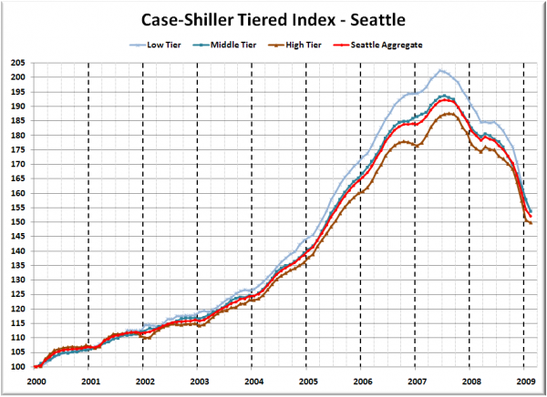
First up is the straight graph of the index from January 2000 through February 2009.
All three tiers dropped again in February, but in a reversal from last month, the high tier fell the slowest, dropping just 0.6% month-to-month. The low tier has rewound to April 2005, the middle tier to June 2005, and the high tier to June 2005.
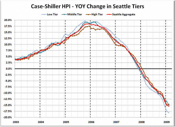
Here’s a chart of the year-over-year change in the index from January 2003 through February 2009.
The low tier inched closer to matching its October 2005 +19.6% performance but in opposite magnitude. The high tier actually improved slightly from a year-over-year basis, for the first time since March 2006. The low tier again kept its title for largest YOY decline, with the high and middle tiers swapping places. Here’s where the tiers sit YOY as of February – Low: -18.1%, Med: -14.9%, Hi: -14.6%.
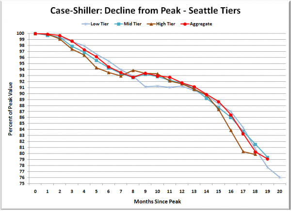
Lastly, here’s a decline-from-peak graph like the one posted yesterday, but looking only at the Seattle tiers.
What’s interesting is that the decline softened somewhat month-to-month for the high and low tiers, but continued at roughly the same rate for the middle tier. It will be interesting to see if this is just a one-month outlier or the beginning of some sort of pattern.
(Home Price Indices, Standard & Poor’s, 04.28.2009)


