Let’s make our regularly scheduled monthly check on the Case-Shiller Home Price Index. According to March data,
Down 0.3% April to May.
Down 16.6% YOY.
Down 22.5% from the July 2007 peak
Last year prices fell 0.5% from April to May and year-over-year prices were down 6.3%.
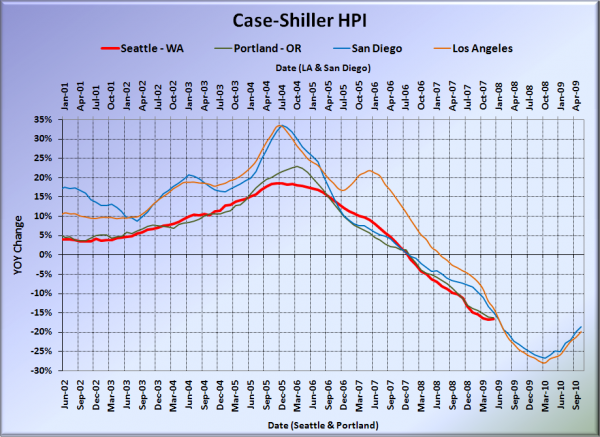
Here’s the usual graph, with L.A. & San Diego offset from Seattle & Portland by 17 months. Portland rose from April to May, so the year-over-year drops down there continue to come in smaller than here in Seattle. Meanwhile, down in SoCal, the losses shrank to less than 20% YOY. If this pattern keeps up, Seattle could be seeing larger YOY drops than Los Angeles & San Diego by September.
Note: This graph is not intended to be predictive. It is for entertainment purposes only.
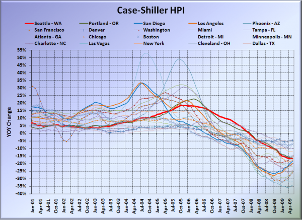
Here’s the graph of all twenty Case-Shiller-tracked cities:
In May, nine of the twenty Case-Shiller-tracked cities experienced smaller year-over-year drops than Seattle (the previous four months it was eight). Dallas at -4.2%, Denver at -4.6%, Cleveland at -6.2%, Boston at -7.2%, Charlotte at -10.0%, New York at -12.1%, Washington, DC at -14.9%, Atlanta at -15.0%, and Portland at -16.3%. As usual, Phoenix had the largest year-over-year drop, with prices falling 34% in a single year.
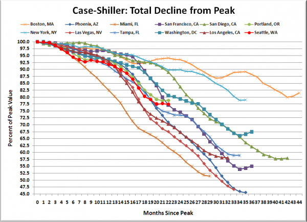
Here’s an update to the peak-decline graph, inspired by a graph created by reader CrystalBall. This chart takes the twelve cities whose peak index was greater than 175, and tracks how far they have fallen so far from their peak. The horizontal axis shows the total number of months since each individual city peaked.
In the twenty-one months since the price peak in Seattle prices have declined 22.5%. This spring’s flatline puts us right in line with San Francisco’s relative drop. San Francisco and DC both seem to be having uncharacteristically strong spring upticks this year.
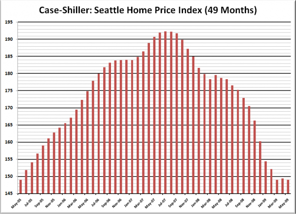
Here’s the “rewind” chart. The horizontal range is selected to go back just far enough to find the last time that Seattle’s HPI was as low as it is now. This gives us a clean visual of just how far back prices have retreated in terms of months.
Seattle’s Case-Shiller value for May 2009 of 148.96 came in just barely below its May 2005 value of 148.97. Prices have now “rewound” four years and one month.
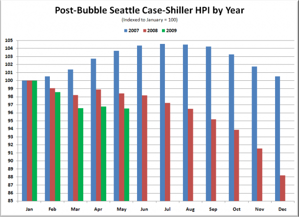
Finally, the following chart takes the post-bubble years of 2007, 2008, and 2009 and indexes each January’s Case-Shiller HPI to 100 so we can get a picture of how this year’s declines compare to last year:
Note that last year the March to April uptick took two months to be erased, and prices fell nearly 12% from January to December. This year the March to April uptick was considerably smaller, and was erased in a single month.
Check back tomorrow for a post on the Case-Shiller data for Seattle’s price tiers.
(Home Price Indices, Standard & Poor’s, 07.28.2009)
[Update]
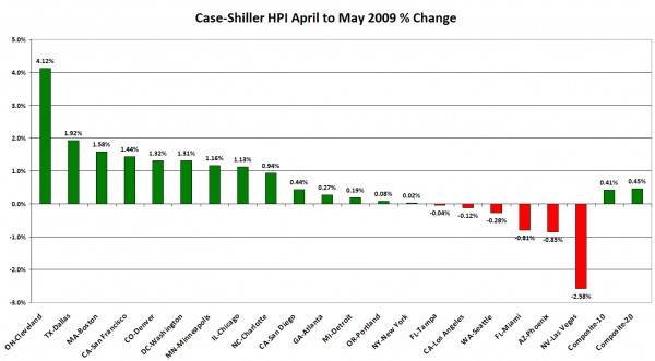
Since the news reports on the radio and in the papers this morning are focusing on the month-to-month increase in the 10-city and 20-city indices, I thought I would add this chart, which compares the month-to-month change for all 20 metro areas tracked by Case-Shiller:
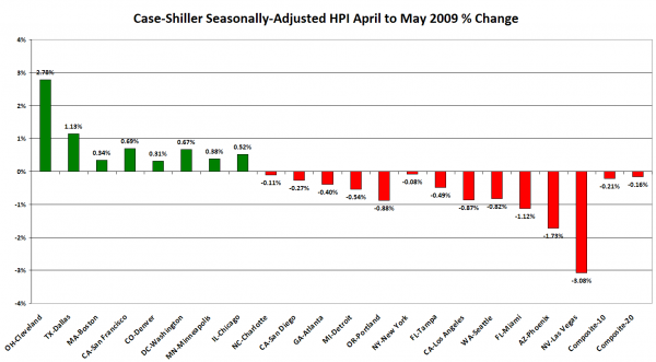
Of course, the seasonally-adjusted data (which is the only semi-sensible way to look at month-to-month numbers) paints a somewhat less rosy picture, but at least Seattle moves from fourth-worst to sixth-worst.
