Let’s check out the three price tiers for the Seattle area, as measured by Case-Shiller. Remember, Case-Shiller’s “Seattle” data is based on single-family home repeat sales in King, Pierce, and Snohomish counties.
Note that the tiers are determined by sale volume. In other words, 1/3 of all sales fall into each tier. For more details on the tier methodologies, hit the full methodology pdf. Here are the current tier breakpoints:
- Low Tier: < $272,143
- Mid Tier: $272,143 – $400,584
- Hi Tier: > $400,584
The tier breakpoints continued to shift slightly upward in June, implying a shift in the sales mix of homes away from the low end toward the high end.
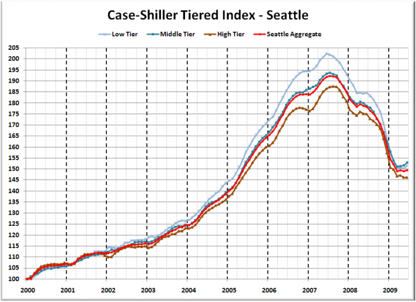
First up is the straight graph of the index from January 2000 through June 2009.
The high tier was flat from May to June, while the low and middle tiers each increased 0.8%. The “rewind” situation switched into forward for a month, with low tier sitting about where it was in April 2005 and the middle and the high tiers at May 2005 levels.
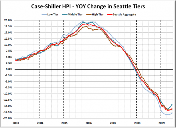
Here’s a chart of the year-over-year change in the index from January 2003 through June 2009.
The strongest upward turn in the YOY data has been in the middle tier over the last two months. The low and high tiers seem to be more or less flat YOY. Here’s where the tiers sit YOY as of June – Low: -18.0%, Med: -14.4%, Hi: -16.5%.
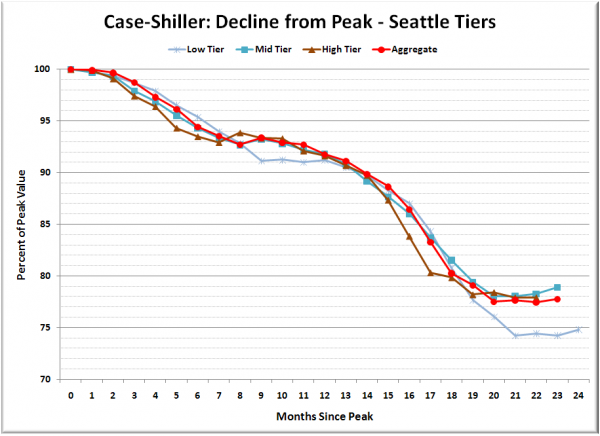
Lastly, here’s a decline-from-peak graph like the one posted yesterday, but looking only at the Seattle tiers.
Still bobbing along the spring plateau. Does this indicate a bottom, or just a seasonal break in the downward slide to a price level that is supported by economic fundamentals? I think you can probably guess which one I’m betting on…
(Home Price Indices, Standard & Poor’s, 08.25.2009)


