June market stats have been published by the NWMLS. Here’s a link to the NWMLS press release (not yet live as of this posting).
As requested, here are the full monthly stats from the NWMLS “July” report. Before we get into the numbers though, there are two key points that I’d like to try to clarify.
First, thanks to some in-system sleuthing by Seattle Bubble regular Kary L. Krismer, we believe we have discovered the explanation for July’s 200+ magical mystery sales. Basically it appears that when the NWMLS puts out their monthly reports, the sales counts are not really the number of sales that happened in the reported month. These counts also include sales that took place in previous months, but were updated in the system by member agents during the reported month.
In other words, the extra 200+ sales in July’s report were actually sales that took place in June (or possibly further back). Kary explains:
In 2009 the average number of late reported transactions each month was about 110-115. April, June and July 2010 saw significant increases, and were all higher than any month in 2009. Those late sales have to be reported sometime, and in just one week in July over 100 late sales from June were reported. That one week would have been pretty close to an entire typical month for all prior months in 2009.
As for the reason for the increase, again one of my guesses is Matrix. It kicked in during May, and the beginning of May is when many of the sales from April should have been reported (due to how many sales close at the end of a month). April had twice as many sales reported late as March.
So anyway, it appears much of the problem is due to agents, and specifically agents using the new Matrix system. Remember that many agents might not have a sale for a two month period, so three months into this there are some agents who still have not reported a sale, and have not learned how to do it.
Numbers from NWMLS sources but not complied or guaranteed by the NWMLS.
At least we have solved the mystery. Unfortunately this means that the monthly stats from the NWMLS are much less useful than I had believed them to be. They’re still decent for showing general trends, but if you really want to know what actually happened just in July, you’ll have to look elsewhere.
The second point I’d like to spend a little time on is the median price. We have covered this topic in a fair degree of detail here in the past, and I highly recommend you read the first portion of this post for a quick refresher.
The important thing to remember when looking at July’s median price data is that between June and July a large portion of the low end of the market basically vanished. Since sales distribution is an inherent factor that drives the median price, the expected result of a disappearing low end would be an increase in the median. Incidentally, that happens to be exactly what happened, as King County’s SFH median jumped up 4.4% in a single month.
Unfortunately, this bump in the median only really tells us what we already knew: that sales of cheaper homes fell off in July. What it does not tell us is that the actual value of individual homes is actually on the rise. We can say “the median price of houses sold in King County was up 4% in July from a year earlier,” but that basically means squat when it comes to home values.
So, with those two points in mind, hit the jump if you’d like to check out this month’s misleading NWMLS data.
NWMLS monthly reports include an undisclosed and varying number of
sales from previous months in their pending and closed sales statistics.
Here’s your King County SFH summary, with the arrows to show whether the year-over-year direction of each indicator is favorable or unfavorable news for buyers and sellers (green = favorable, red = unfavorable):
| July 2010 | Number | MOM | YOY | Buyers | Sellers |
|---|---|---|---|---|---|
| Active Listings | 10,470 | +6.0% | +6.2% |  |
 |
| Closed Sales | 1,474 | -21.6% | -14.6% |  |
 |
| SAAS (?) | 2.31 | +37.9% | +15.3% |  |
 |
| Pending Sales | 1,716 | -4.9% | -22.6% |  |
 |
| Months of Supply | 5.47 | +3.1% | +38.7% |  |
 |
| Median Price* | $399,950 | +4.4% | +4.2% |  |
 |
Feel free to download the updated Seattle Bubble Spreadsheet (Excel 2003 format), but keep in mind the caution above.
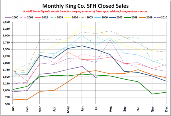
Here’s your closed sales yearly comparison chart:
We got the drop we were expecting to see, but the messed-up way the NWMLS reports “monthly” statistics hid the true severity of the fall.
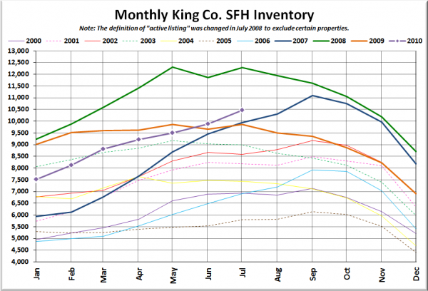
Here’s the graph of inventory with each year overlaid on the same chart.
Woo, 10,000. I wonder if we’ll manage to break 11,000 this year.
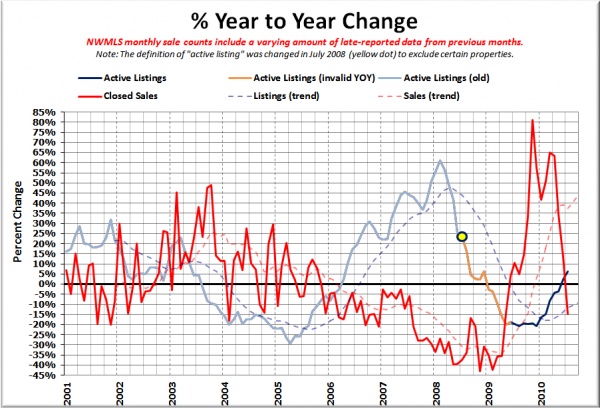
Here’s the supply/demand YOY graph. In place of the now-unreliable measure of pending sales, the “demand” in this chart is represented by closed sales, which have had a consistent definition throughout the decade.
Despite the NWMLS monkeying with the data, the sales and listings YOY lines crossed back into strong buyer’s market territory in July.
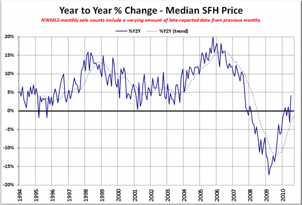
Here’s the median home price YOY change graph:
See the note above about what this is really telling us.
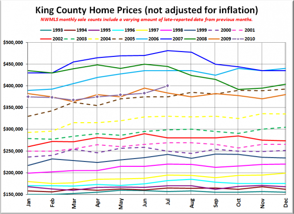
And lastly, here is the chart comparing King County SFH prices each month for every year back to 1994.
Even still, the median barely edged above 2005 levels.
Tomorrow we’ll check out all the local news reports and see if any of them managed to find the real story this month.
