February market stats have been compiled by the NWMLS. Their press release isn’t up yet, but you can read it here once they do publish it.
Since we don’t have any amusing prose to poke at, we’ll just dive right into the stats and save the response to their salesmanship for tomorrow’s Reporting Roundup.
NWMLS monthly reports include an undisclosed and varying number of
sales from previous months in their pending and closed sales statistics.
Here’s your King County SFH summary, with the arrows to show whether the year-over-year direction of each indicator is favorable or unfavorable news for buyers and sellers (green = favorable, red = unfavorable):
| February 2012 | Number | MOM | YOY | Buyers | Sellers |
|---|---|---|---|---|---|
| Active Listings | 5,178 | -3.7% | -31.7% |  |
 |
| Closed Sales | 1,230 | +12.3% | +22.6% |  |
 |
| SAAS (?) | 1.46 | +18.8% | -23.8% |  |
 |
| Pending Sales | 2,429 | +29.8% | +23.8% |  |
 |
| Months of Supply | 2.13 | -25.8% | -44.8% |  |
 |
| Median Price* | $308,125 | -2.2% | -7.7% |  |
 |
Feel free to download the updated Seattle Bubble Spreadsheet (Excel 2003 format), but keep in mind the caution above.
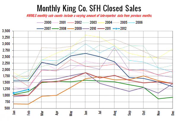
Here’s your closed sales yearly comparison chart:
Still pretty low compared to most years, although that is quite a healthy bump up from last year, when sales dropped between January and February. The 23% year-over-year jump is pretty close to the 25% jump we saw in the public records.
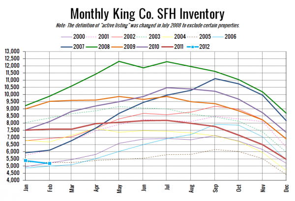
Here’s the graph of inventory with each year overlaid on the same chart.
Continuing the trend we began last month, we’re still in uncharted territory with on-market inventory decreasing into the second month of the year. Between 2000 and 2011, the average change between January and February is a 3.6% increase.
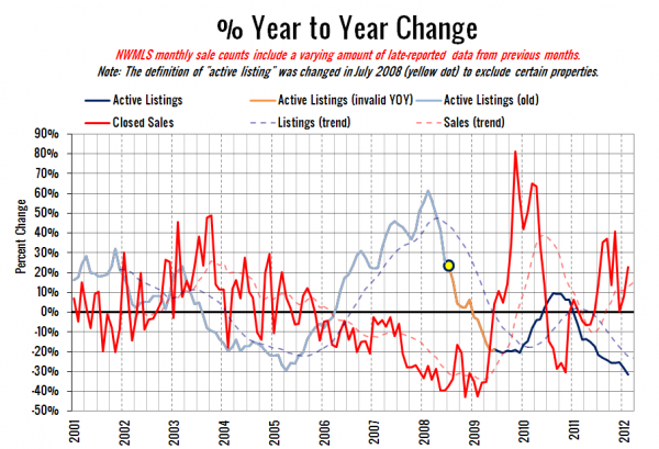
Here’s the supply/demand YOY graph. In place of the now-unreliable measure of pending sales, the “demand” in this chart is represented by closed sales, which have had a consistent definition throughout the decade.
Still looking at gains in sales coupled with declining inventory.
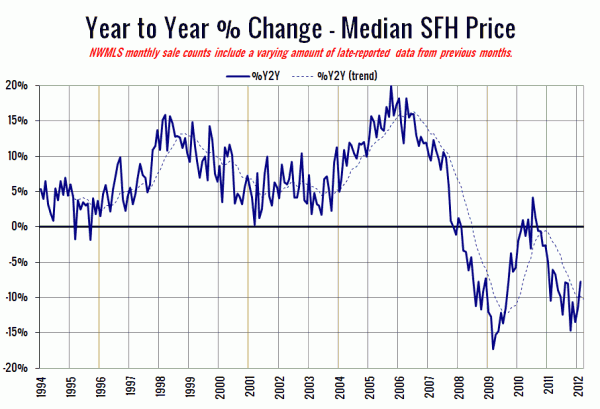
Here’s the median home price YOY change graph:
I think it’s interesting to note that this has been on a fairly steady upward trend since October. The last time that happened was when the tax credit juiced sales and threw the whole market out of whack for a year and a half. This time around, I’m inclined to think that the slowdown in the bleeding of prices is more “natural.”
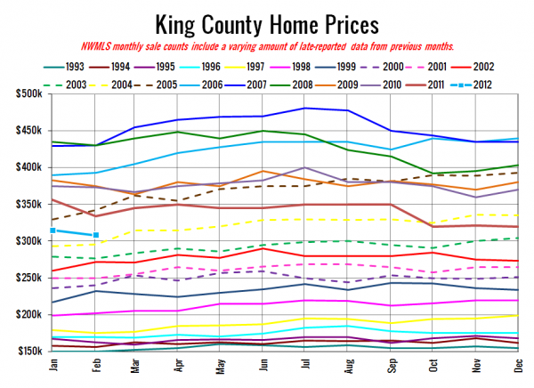
And lastly, here is the chart comparing King County SFH prices each month for every year back to 1994.
February 2012: $308,125
December 2003: $304,700
I’ll update this post with the headlines from the Seattle Times and Seattle P-I when they post their stories.
[Update: Here they are.]
Seattle Times: Median home price in King County down to February 2004 level
Seattle P-I: House prices rose in Seattle in February
Check back tomorrow for the full reporting roundup.
