November market stats were published by the NWMLS yesterday. Here’s a snippet from their press release: Home sales "chugging along," as recovery continues, but brokers expect prices, mortgage rates to rise in 2014.
Improving inventory, stabilizing prices, fewer short sales, and a healthy local economy are credited with keeping the real estate market “chugging along nicely” around western Washington, according to brokers with the Northwest Multiple Listing Service.
…
OB Jacobi, president of Windermere Real Estate, believes the slowing pace of home prices, is “actually a good thing,” saying, “As we saw in years past, continual double-digit price appreciation leads to boom and bust cycles that none of us want to relive.”
Why don’t I believe that he really thinks a less-hot market is “actually a good thing.”
On with our usual monthly stats.
NWMLS monthly reports include an undisclosed and varying number of
sales from previous months in their pending and closed sales statistics.
Here’s your King County SFH summary, with the arrows to show whether the year-over-year direction of each indicator is favorable or unfavorable news for buyers and sellers (green = favorable, red = unfavorable):
| November 2013 | Number | MOM | YOY | Buyers | Sellers |
|---|---|---|---|---|---|
| Active Listings | 3,820 | -16.5% | +2.7% |  |
 |
| Closed Sales | 1,775 | -18.8% | -2.9% |  |
 |
| SAAS (?) | 1.07 | -4.5% | +3.3% |  |
 |
| Pending Sales | 2,048 | -20.6% | -0.2% |  |
 |
| Months of Supply | 1.87 | +5.1% | +2.9% |  |
 |
| Median Price* | $414,000 | -2.8% | +7.5% |  |
 |
Feel free to download the updated Seattle Bubble Spreadsheet (Excel 2003 format), but keep in mind the caution above.
The only indicators that isn’t pointing in buyers’ favor is now prices. Inventory, sales, months of supply, and the rest are now all trending toward a buyer’s market.
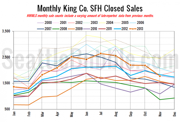
Here’s your closed sales yearly comparison chart:
Closed sales took a larger-than-usual dip between October and November this year, falling into negative year-over-year territory for the first time since May 2011.
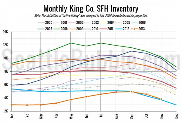
Here’s the graph of inventory with each year overlaid on the same chart.
Inventory continues to follow the same trend as every year, while remaining slightly above last year’s levels. As I predicted back in July, it looks 2013 will close out as the second-worst year on record for inventory.
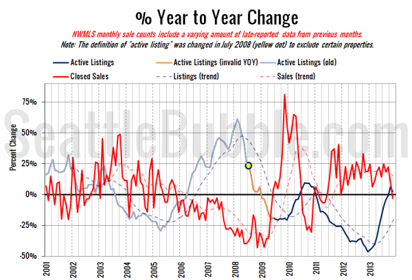
Here’s the supply/demand YOY graph. “Demand” in this chart is represented by closed sales, which have had a consistent definition throughout the decade (unlike pending sales from NWMLS).
The supply trend stayed in the black, while the demand trend moved into the red. Things are still getting better for buyers but we’re still a ways from “buyer’s market” territory.
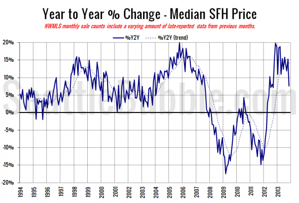
Here’s the median home price YOY change graph:
The median sale price tumbled a bit in November, dropping the year-over-year gain back to single digits.
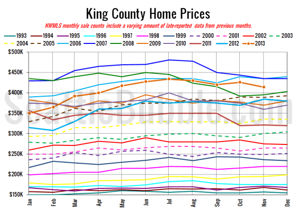
And lastly, here is the chart comparing King County SFH prices each month for every year back to 1994 (not adjusted for inflation).
November 2013: $414,000
April 2006: $419,500
Here are the articles from the Seattle Times and P-I:
Seattle Times: King County home-price gains lose some sizzle
Seattle P-I: Home sales down, but inventory remains tight
Check back tomorrow for the full reporting roundup.

