Let’s take a closer look at how listings did over the last few months of 2013 and for the year as a whole.
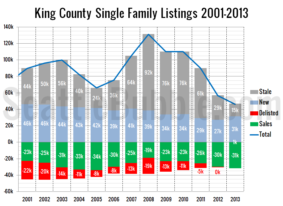
First up, let’s take a look at our yearly summary.
In theory the number of homes that are delisted should always show up as a negative number on this chart, but a combination of the tight inventory in 2013 and NWMLS reporting irregularities caused the 2013 total to be positive 649. Meanwhile, the number of stale listings was at its lowest point in 13 years. However, the number of new listings beat 2011 and 2012. The number of (pending) sales was at its highest point in 8 years.
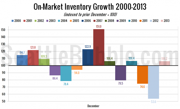
Here’s a view of how inventory has grown so far this year:
Total inventory growth during 2013 was the best it has been in three years, and on-par with 2008 and 2010.
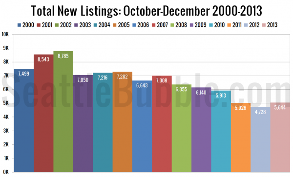
Next, the last three months’ worth of new listings, comparing 2013 to every year I’ve got data for.
October through December 2013 saw more new listings than the same period in 2012 and 2011, but the number is still far short of a normal market.
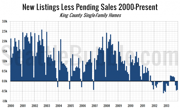
The next chart shows the difference between the number of new listings each month and the number of pending sales. Prior to late 2011 this number was almost always positive, except in December, when very few new listings hit the market. From October 2011 through March 2013 this measure was negative, indicating very tight inventory.
Not surprisingly, after flipping negative in October, this measure stayed in the red through December. Hopefully for buyers we see this back in black in January.
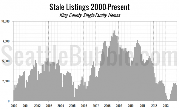
Finally, let’s take a look at the “stale listings” measure, which uses the total listings, new listings, and pending sales counts to estimate how many listings are “carried over” from one month to the next.
Stale listings dipped slightly in the last few months of the year, but remain slightly above the 2012 level.
January will set the tone for listings in 2014, so next month’s data should be interesting, one way or another.
