April market stats were published by the NWMLS yesterday. Here’s a snippet from their press release: Housing activity ranges from "red hot" to "slowly healing".
“The residential market is red hot,” reported J. Lennox Scott, chairman and CEO of John L. Scott Real Estate. He said multiple offers are the “norm” for new listings, with about two-thirds of homes near job centers selling in the first 30 days. That’s about twice the normal rate, according to Scott.
RED HOT! Yeah, mad hot. Sick hot.
On with our usual monthly stats.
NWMLS monthly reports include an undisclosed and varying number of
sales from previous months in their pending and closed sales statistics.
Here’s your King County SFH summary, with the arrows to show whether the year-over-year direction of each indicator is favorable or unfavorable news for buyers and sellers (green = favorable, red = unfavorable):
| April 2014 | Number | MOM | YOY | Buyers | Sellers |
|---|---|---|---|---|---|
| Active Listings | 3,541 | +8.7% | +9.9% |  |
 |
| Closed Sales | 2,016 | +13.8% | -3.8% |  |
 |
| SAAS (?) | 1.45 | +3.1% | +6.1% |  |
 |
| Pending Sales | 2,981 | +7.1% | -2.4% |  |
 |
| Months of Supply | 1.76 | -4.5% | +14.3% |  |
 |
| Median Price* | $430,500 | +3.7% | +7.6% |  |
 |
Feel free to download the updated Seattle Bubble Spreadsheet (Excel 2003 format), but keep in mind the caution above.
Inventory continues to make gains, however paltry, while sales slip slightly. Prices rose year-over-year and month-over-month. The gain between March and April was larger this year than last year:
Median Price March to April 2013: +2.0%
Median Price March to April 2014: +3.7%
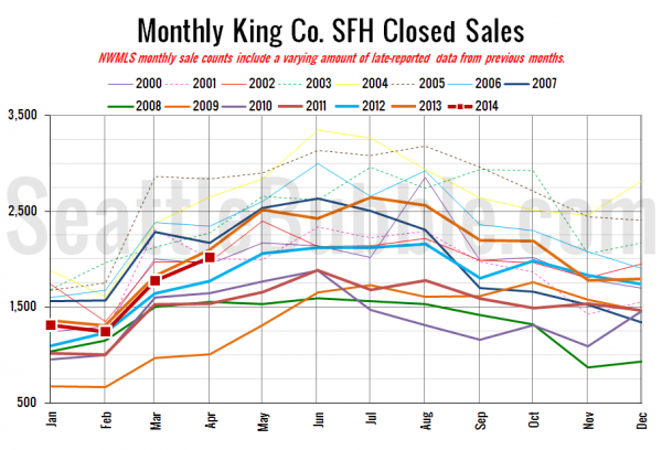
Here’s your closed sales yearly comparison chart:
April home sales came in slightly below last year, roughly in the middle of the pack compared to all the other years we have data for.
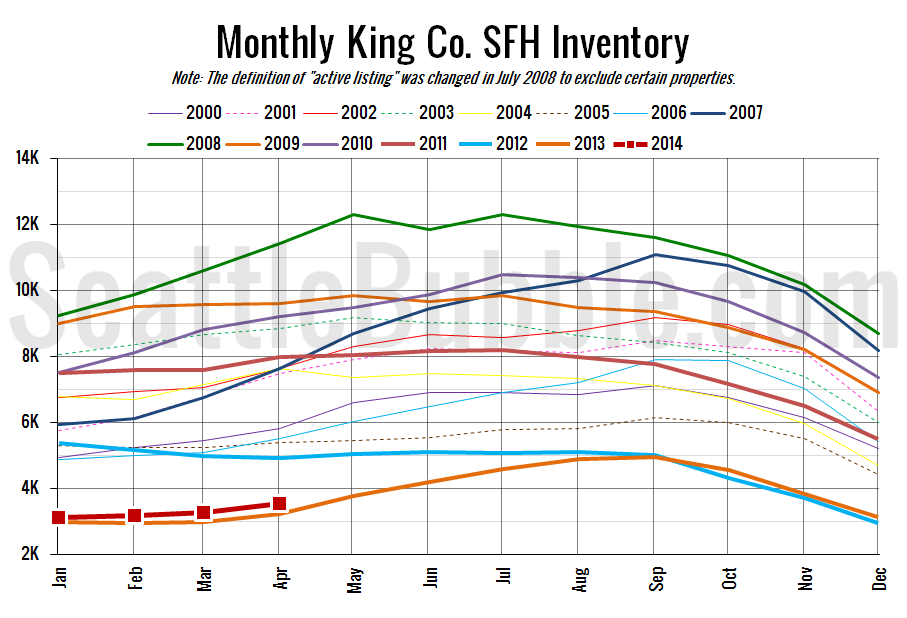
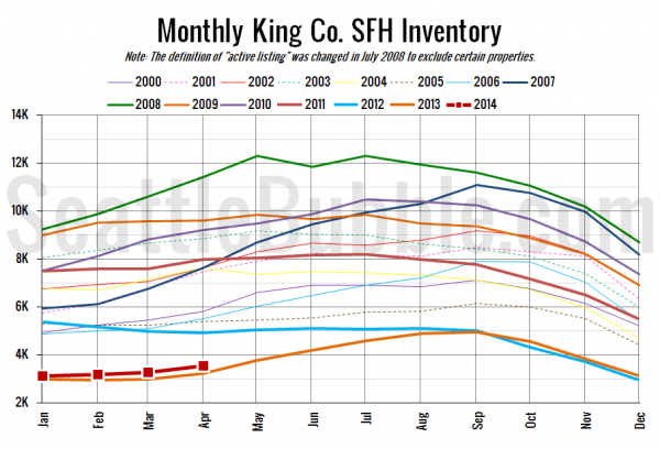
Here’s the graph of inventory with each year overlaid on the same chart.
Slowest inventory increase ever. At least it is an increase though.
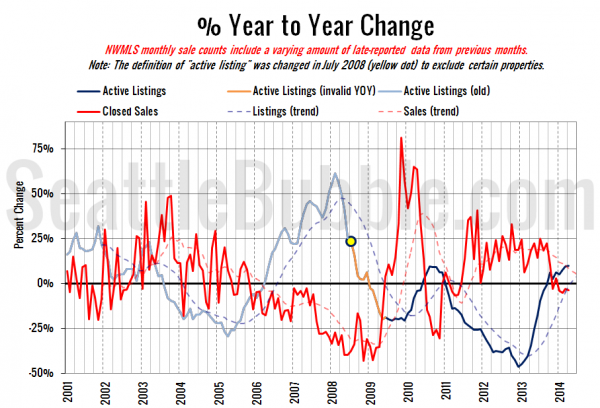
Here’s the supply/demand YOY graph. “Demand” in this chart is represented by closed sales, which have had a consistent definition throughout the decade (unlike pending sales from NWMLS).
Still creeping toward a buyer’s market, with the supply trend in the black, and the demand trend in the red. At this rate it will be a long time before we get to true buyer’s market territory, though.
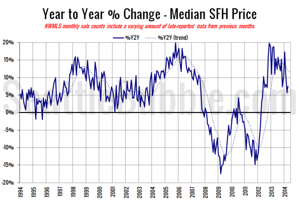
Here’s the median home price YOY change graph:
Back up a bit, but below double-digits.
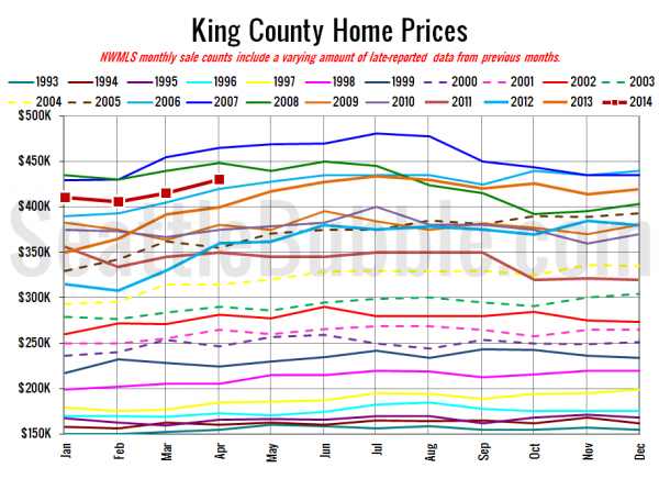
And lastly, here is the chart comparing King County SFH prices each month for every year back to 1994 (not adjusted for inflation).
April 2014: $430,500
May 2006: $427,950
Here are the articles from the Seattle Times and P-I:
Seattle Times: No thaw in home inventory despite April’s rising prices
Seattle P-I: Local home supply inches up, but remains tight
Check back this afternoon for the full reporting roundup.
