With home prices approaching or even exceeding their 2007 peak levels in parts of the Seattle area, there has been renewed talk about whether we’re in another housing bubble or not.
This week I’d like to go back to the same data I used in 2005 and 2006 to definitively recognize the bubble at a time when most people were declaring Seattle to be “different” and saying that home prices would never fall here.
First up, let’s look at home prices compared to rents. For this post I’ll be using Case-Shiller’s Home Price Index for the Seattle area (which rolls together King, Snohomish, and Pierce counties) and Bureau of Labor Statistics data on rent.
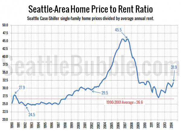
Here’s a look at the home price to rent ratio over the last 24 years:
After almost touching the long-term pre-bubble average level in early 2012, the price to rent ratio has been climbing steadily (with some expected seasonal dips), reaching its highest point in nearly four years in May.
That said, we’re well below the levels that this measure saw during the housing bubble. During 2005 and 2006—the height of the housing bubble frenzy—the average price-to-rent index was 42.2, about 32 percent higher than its current level.
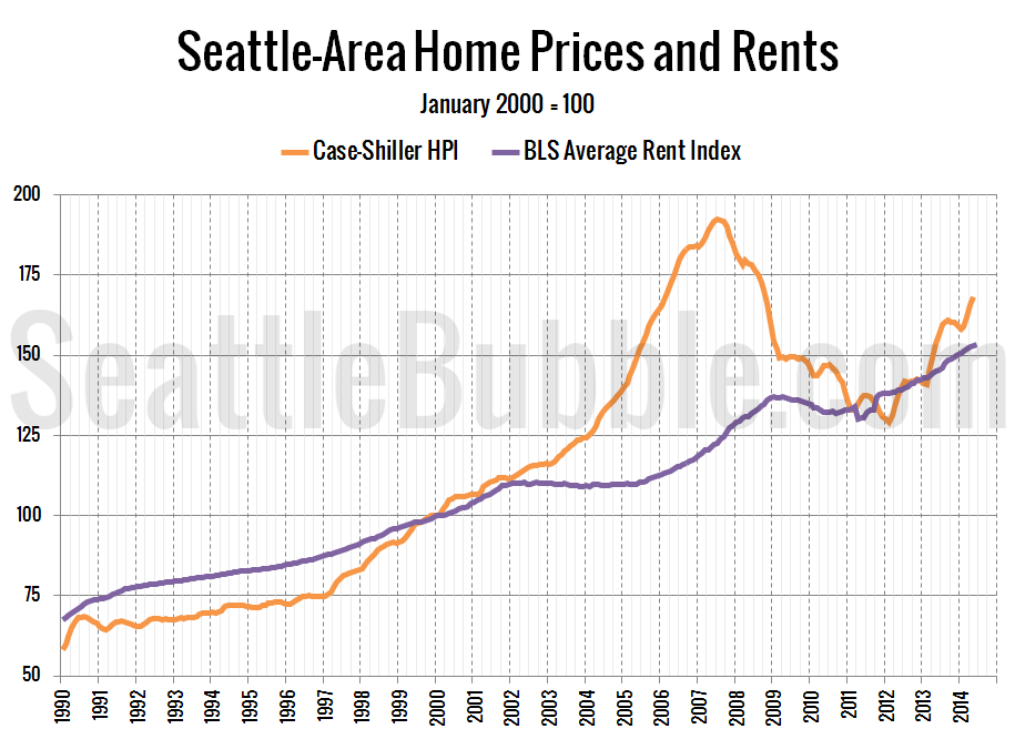
Here’s another way of looking at the same data by just plotting each index next to each other:
As of May, the Seattle area’s Case-Shiller home price index is 9.9 percent above the BLS rent index. This is the largest difference since mid-2010, but during that time home prices were still falling.
When I started Seattle Bubble in August 2005 the home price index was a whopping 41.2 percent above the rent index. The difference peaked at 57.5 percent in September 2006.
Based on the home price to rent comparison, I’d say we’re not quite “in a home price bubble” just yet, but the direction things are going we could quickly get there if things do not cool off soon.
Stay tuned in the coming days for other metrics such as price to income comparisons and the affordability index.


