October market stats were published by the NWMLS today. They haven’t published their press release to its typical location yet, so let’s just dive right into our usual monthly stats.
NWMLS monthly reports include an undisclosed and varying number of
sales from previous months in their pending and closed sales statistics.
Here’s your King County SFH summary, with the arrows to show whether the year-over-year direction of each indicator is favorable or unfavorable news for buyers and sellers (green = favorable, red = unfavorable):
| October 2014 | Number | MOM | YOY | Buyers | Sellers |
|---|---|---|---|---|---|
| Active Listings | 4,504 | -9.2% | -1.6% |  |
 |
| Closed Sales | 2,238 | +5.9% | +2.3% |  |
 |
| SAAS (?) | 1.15 | -13.3% | +2.6% |  |
 |
| Pending Sales | 2,640 | +0.9% | +2.4% |  |
 |
| Months of Supply | 2.01 | -14.2% | -3.8% |  |
 |
| Median Price* | $447,250 | -2.8% | +5.0% |  |
 |
Feel free to download the updated Seattle Bubble Spreadsheet (Excel 2003 format), but keep in mind the caution above.
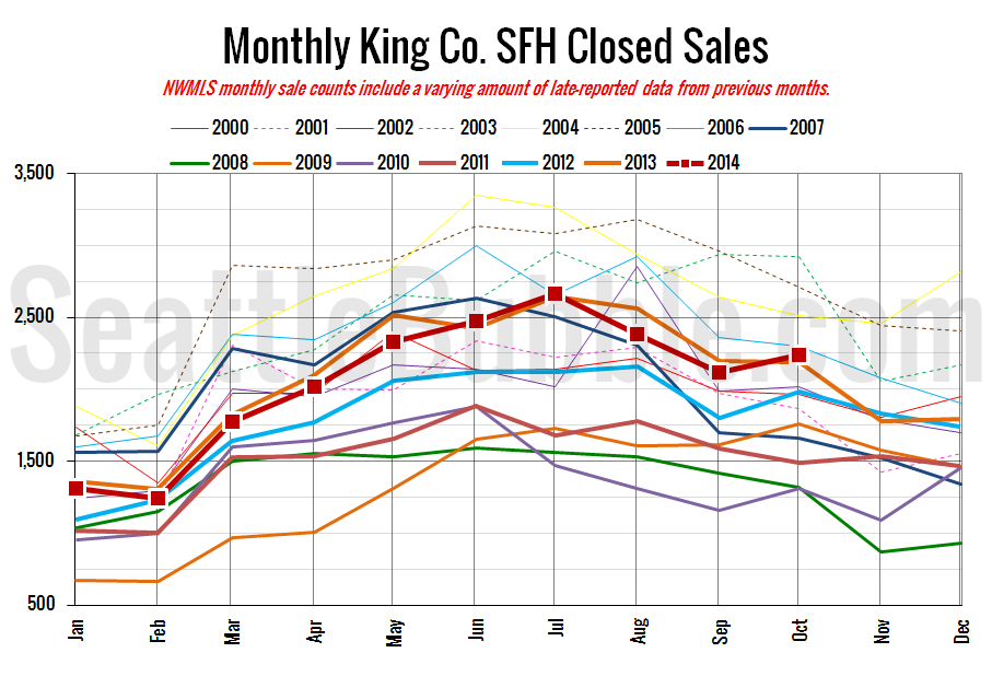
Closed sales bumped up in October, which is not as uncommon as you might think. Similar increases were seen between September and October in 2012, 2010, and 2009. Prices dipped back down a bit (once again most likely due to more shifts in the geographic mix). Meanwhile listings continued to decrease as they do at this time every year.
Here’s your closed sales yearly comparison chart:
Closed sales bumped up in the month, which is somewhat odd for this time of year, but not unprecedented. Between 2000 and 2013, sales fell an average of 6.7% between September and October, versus a gain of 5.9% this year. Sales increased in October in three other recent years: +10.2% in 2012, +13.0% in 2010, and +8.7% in 2009.
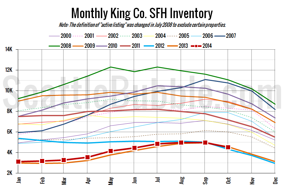
Here’s the graph of inventory with each year overlaid on the same chart.
Inventory continued its annual slide with a another monthly dip.
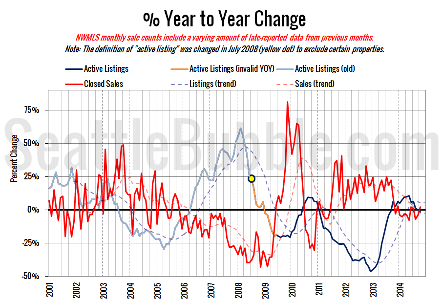
Here’s the supply/demand YOY graph. “Demand” in this chart is represented by closed sales, which have had a consistent definition throughout the decade (unlike pending sales from NWMLS).
The size of the change on this chart was small, but it did totally flip directions back to a seller’s market, with increasing sales and decreasing listings.
Here’s the median home price YOY change graph:
The year-over-year growth in median price fell back down last month to its second-lowest point in 29 months.
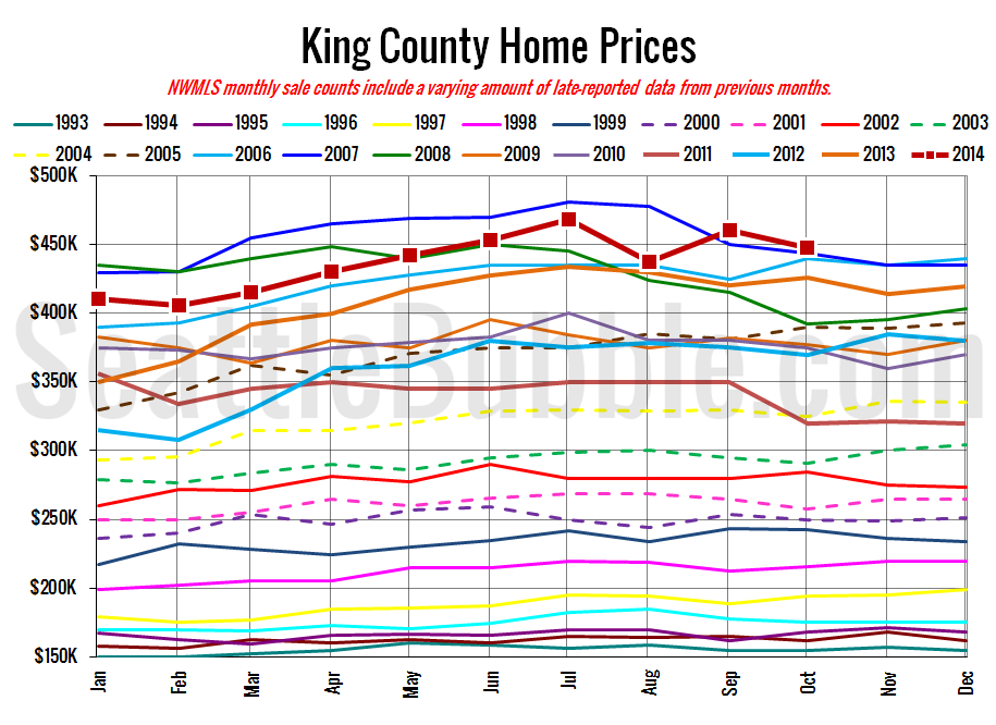
And lastly, here is the chart comparing King County SFH prices each month for every year back to 1994 (not adjusted for inflation).
Although prices fell from September, last month set a new record for the highest median price ever for an October, beating out the previous high of $443,950 set in 2007.
October 2014: $447,250
October 2007: $443,950
Here are the articles from the Seattle Times and P-I:
Seattle Times: Region’s October home prices dip slightly, but still up for year
Seattle P-I: Area house prices, sales up; inventory down
Check back tomorrow for the full reporting roundup.


