January market stats were published by the NWMLS yesterday. Before we get into our monthly stats, let’s have a look at their press release.
Spring market “not waiting for tulips” but limited inventory frustrates homebuyers
Home sales this super bowl season outpaced a year ago as sidelined buyers emerged to compete for limited inventory, according to brokers who commented on January activity.
New figures from Northwest Multiple Listing Service show year-over-year increases in pending sales, closed sales, and prices, while inventory fell by double digits.
…
[Northwest MLS director Frank] Wilson, branch managing broker at John L. Scott in Poulsbo, said the spring market is not waiting for the tulips this year – “spring has already sprung. We are seeing an increase in traffic at our open houses with more buyers out looking at our limited inventory.”
Wow. did they seriously just reference tulips? As a positive? Just wow.
NWMLS monthly reports include an undisclosed and varying number of
sales from previous months in their pending and closed sales statistics.
Here’s your King County SFH summary, with the arrows to show whether the year-over-year direction of each indicator is favorable or unfavorable news for buyers and sellers (green = favorable, red = unfavorable):
| January 2014 | Number | MOM | YOY | Buyers | Sellers |
|---|---|---|---|---|---|
| Active Listings | 2,681 | -2.8% | -14.4% |  |
 |
| Closed Sales | 1,340 | -32.4% | +2.4% |  |
 |
| SAAS (?) | 1.03 | -6.4% | -5.2% |  |
 |
| Pending Sales | 2,140 | +28.2% | +6.5% |  |
 |
| Months of Supply | 2.00 | +43.8% | -16.4% |  |
 |
| Median Price* | $441,500 | +0.3% | +7.7% |  |
 |
Feel free to download the updated Seattle Bubble Spreadsheet (Excel 2003 format), but keep in mind the caution above.
This month it’s the same basic story we’ve been seeing over most of the last year: decent sales volume, rising prices, and a lack of inventory. One thing that is interesting, which I’ll get into more later, is how the year-over-year home price growth has been trending down since late 2012.
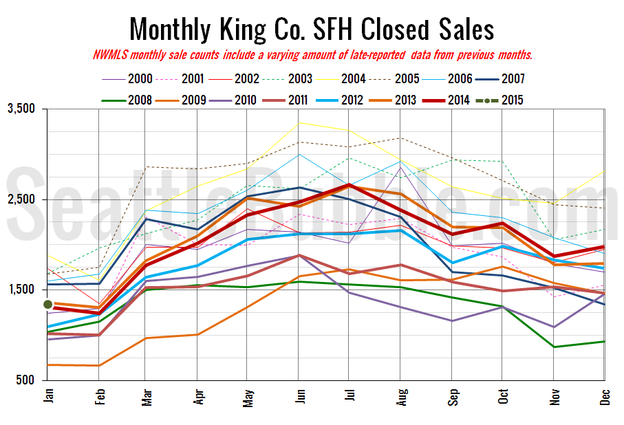
Here’s your closed sales yearly comparison chart:
Closed sales fell 32 percent from December to January, which is more than the average 24 percent decline for this time of year, but not way out of the typical range.
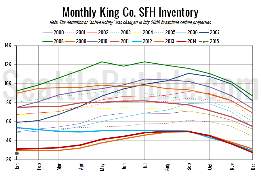
Here’s the graph of inventory with each year overlaid on the same chart.
Inventory hit another all-time low point in January.
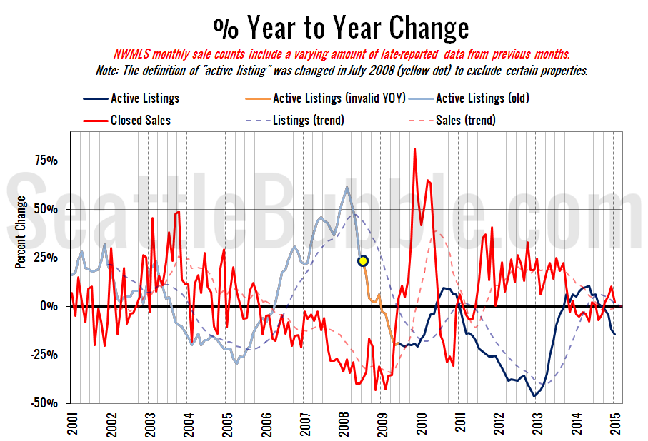
Here’s the supply/demand YOY graph. “Demand” in this chart is represented by closed sales, which have had a consistent definition throughout the decade (unlike pending sales from NWMLS).
Both supply and demand are still moving in sellers’ favor, although the demand side did drop substantially.
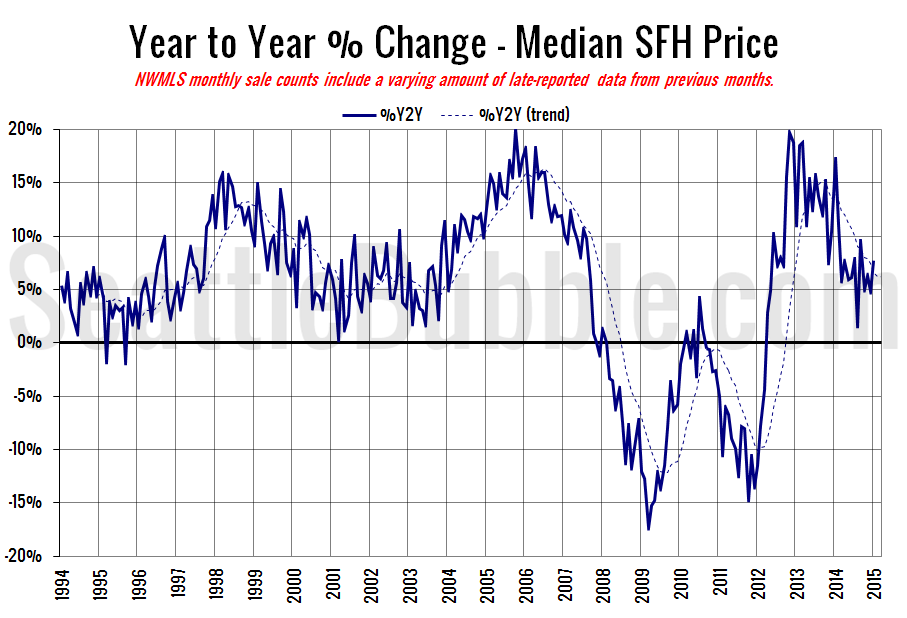
Here’s the median home price YOY change graph:
This one is particularly interesting to me. Seattle-area home prices peaked during the housing bubble in mid-2007, but the year-over-year change had been falling ever since late 2005. Currently home prices are still rising, but the year-over-year change has been falling since late 2012. Could we be in for another dip in home prices later this year?
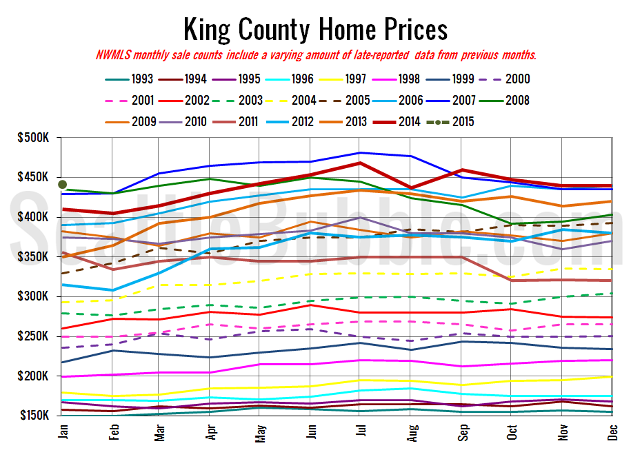
And lastly, here is the chart comparing King County SFH prices each month for every year back to 1994 (not adjusted for inflation).
Home prices have still been basically flat since May.
January 2015: $441,500
October 2006: $440,000
Here are this month’s articles from the Seattle Times and P-I:
Seattle Times: Tight house supply pushes prices up in King County
Seattle P-I: Supply of houses for sale in Seattle remains tight
Check back on Monday for the full reporting roundup.

