It has been a while since we last looked at one of our primary housing bubble metrics: local home prices compared to incomes.
In the next chart I am using the Case-Shiller Home Price Index for the Seattle area (which rolls together King, Snohomish, and Pierce counties) and Bureau of Economic Analysis data on per capita incomes for the same three-county metro area.
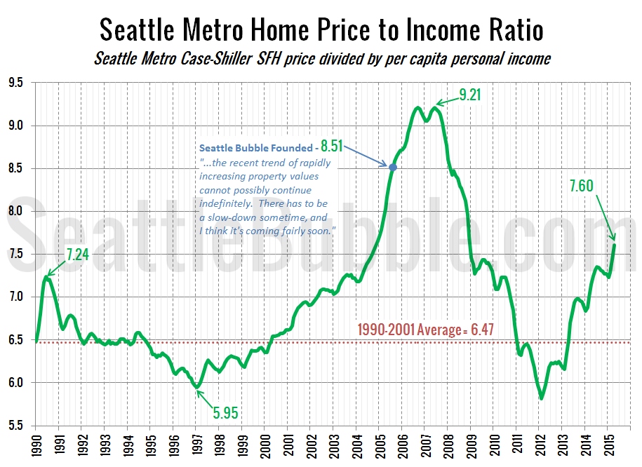
Here’s a look at the home price to income ratio over the last 24 years:
By this metric, the last housing bubble lasted from about mid-2004 when the ratio hit 7.4 through mid-2007 when it peaked at 9.2. The current level of 7.6 is definitely in bubble territory, in my opinion. This chart does show another way that this (possible) bubble is different from the last: From 2004 through mid-2006, the price-to-income ratio shot straight up—32 months without a single month-over-month dip. This time around we’re seeing consistent seasonality, with the index decreasing slightly in the fall and winter each year.
In June the price-to-income ratio hit its highest level since December 2008.
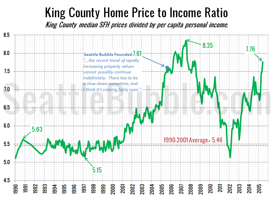
Let’s take a look at a variation of this measure, using King County median home price from the NWMLS and BEA per capita income for just King County.
The overall pattern in King County is the same as for the whole Seattle metro area, but the current level is much higher relative to the past. While the Seattle metro price-to-income ratio is currently 17 percent below its 2007 peak, the King County price-to-income ratio is only 7 percent below its peak—well into bubble territory without question.
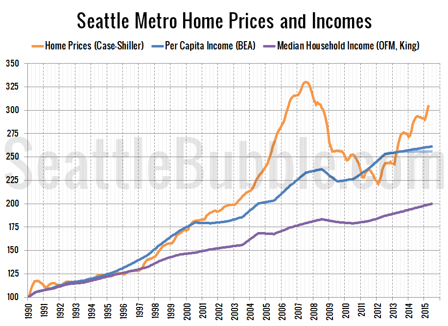
Here’s another way of looking at the same data by just plotting each index next to each other. Note that the most recent income data is for 2012, so the 2013 and 2014 data is just a linear projection of the 2009-2012 trend. I’ve also added the faded line for the “flat incomes” scenario, as well as a line for median household income, which has not tracked with home prices since the late ’90s.
As of June, the Seattle area’s Case-Shiller home price index is 17.3 percent above the per capita income index. This is the largest difference since December 2008, and roughly the same difference that we saw in November 2004 on the way up during the last bubble.
Of course, as we discussed a few months ago, all of these charts exclude an increasingly large large pool of money that may be having a big effect on the local housing market: investment returns.


