Get access to the full spreadsheets used to make the charts in this and other posts, as well as a variety of additional insider benefits by becoming a member of Seattle Bubble.
June market stats were published by the NWMLS this morning. The NWMLS press release hasn’t been posted yet, so we’ll cover that tomorrow. On with the stats!
NWMLS monthly reports include an undisclosed and varying number of
sales from previous months in their pending and closed sales statistics.
Here’s your King County SFH summary, with the arrows to show whether the year-over-year direction of each indicator is favorable or unfavorable news for buyers and sellers (green = favorable, red = unfavorable):
| June 2016 | Number | MOM | YOY | Buyers | Sellers |
|---|---|---|---|---|---|
| Active Listings | 3,177 | +17.8% | -7.1% |  |
 |
| Closed Sales | 2,894 | +15.3% | -0.3% |  |
 |
| SAAS (?) | 1.35 | +5.0% | +14.2% |  |
 |
| Pending Sales | 3,362 | -3.9% | +1.2% |  |
 |
| Months of Supply | 1.10 | +2.2% | -6.7% |  |
 |
| Median Price* | $573,522 | +2.4% | +14.7% |  |
 |
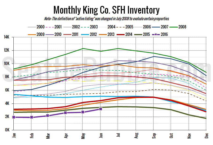
It’s still a bit early to say that we’re turning a corner, but while the overall level of inventory is still at all-time lows for this time of year, the rate of year-over-year change has been getting slightly better every month since December. Year-over-year inventory bottomed out at -37 percent in November of last year, and has been steadily improving ever since, to -7 percent last month. If we see another month-over-month increase in listings like we saw in June (+18 percent), we’ll be back in positive year-over-year territory by the end of this month. I’m not predicting that, but it doesn’t seem entirely unlikely.
Prices kept going up, and sales have basically flattened. Right now the most interesting movement is in inventory. That’s what I’ll be keeping an eye on over the next few months as a possible leading indicator to a cooler market.
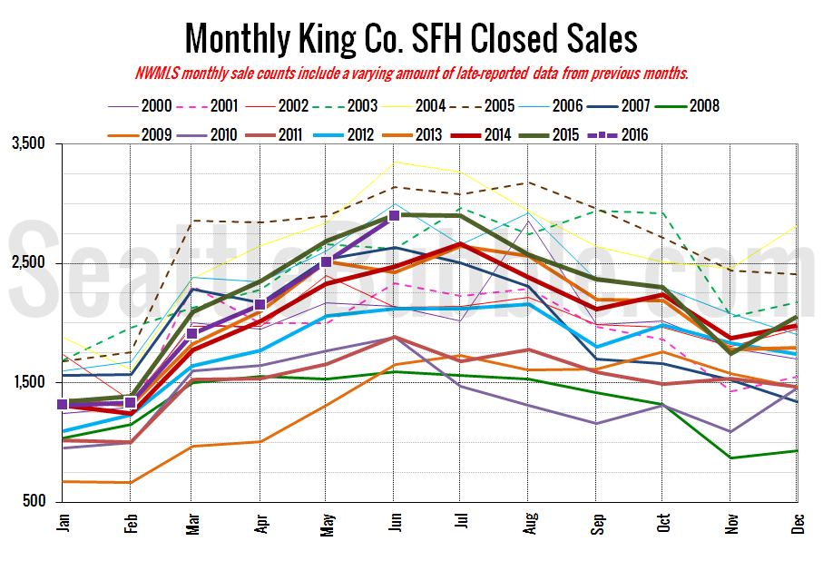
Here’s your closed sales yearly comparison chart:
Closed sales turned in a reasonably strong gain between May and June, but were basically flat year-over-year.
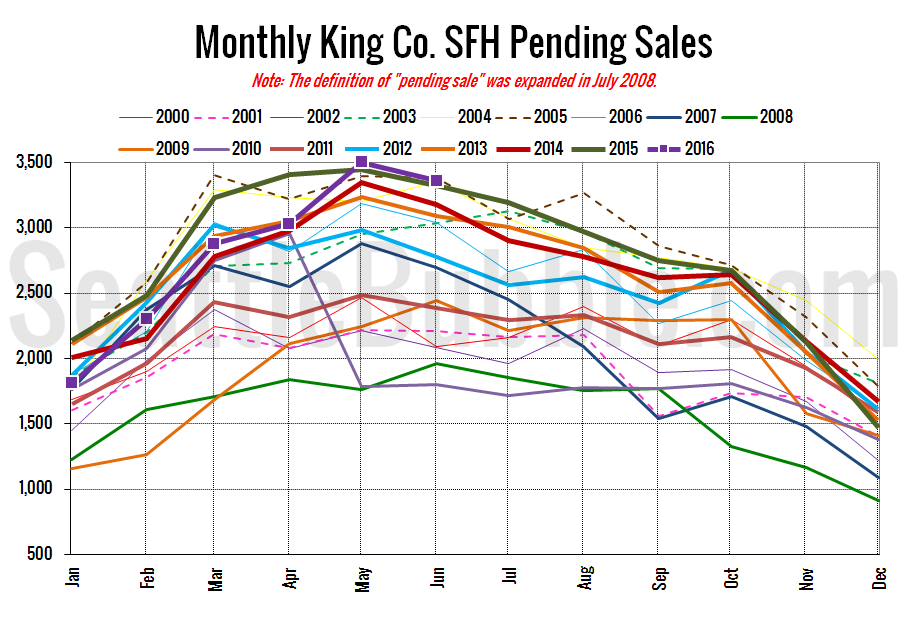
Pending sales dropped off a bit in June from the all-time high they hit in May, and were also basically flat year-over-year.
Here’s the graph of inventory with each year overlaid on the same chart.
Total inventory is at its lowest June level on record, but the (sort of) good news for buyers is that the year-over-year drop in inventory was the smallest we’ve seen since November 2014.
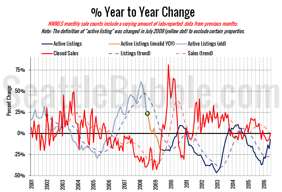
Here’s the supply/demand YOY graph. “Demand” in this chart is represented by closed sales, which have had a consistent definition throughout the decade (unlike pending sales from NWMLS).
The blue supply line turned back up, resuming the trend it has been on since late last year toward a balanced market. Meanwhile the red demand line is right at zero, and trending up over the last couple months.
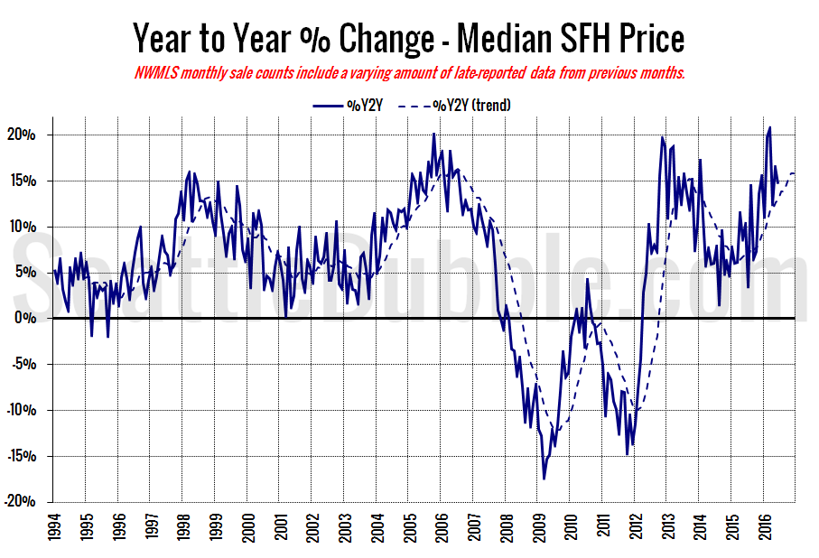
Here’s the median home price YOY change graph:
Year-over-year price growth dipped slightly from 16.4 percent in May to 14.7 percent in June.
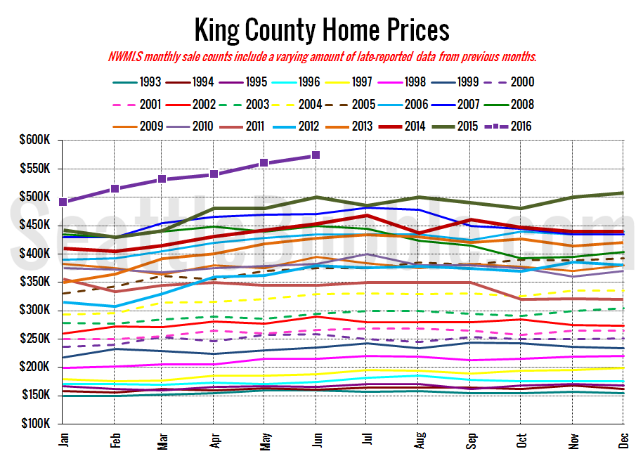
And lastly, here is the chart comparing King County SFH prices each month for every year back to 1994 (not adjusted for inflation).
It’s still true: there has never been a better time to sell your home.
June 2016: $573,522
July 2007: $481,000 (previous cycle high)
Check back tomorrow for our monthly reporting roundup with links to the news reports on this data from other sources.
