Get access to the full spreadsheets used to make the charts in this and other posts, as well as a variety of additional insider benefits by becoming a member of Seattle Bubble.
January market stats have been published by the NWMLS. They haven’t put up their press release yet, so let’s get on with the stats.
NWMLS monthly reports include an undisclosed and varying number of
sales from previous months in their pending and closed sales statistics.
Here’s your King County SFH summary, with the arrows to show whether the year-over-year direction of each indicator is favorable or unfavorable news for buyers and sellers (green = favorable, red = unfavorable):
| January 2017 | Number | MOM | YOY | Buyers | Sellers |
|---|---|---|---|---|---|
| Active Listings | 1,569 | -4.3% | -18.9% |  |
 |
| Closed Sales | 1,582 | -26.6% | +20.4% |  |
 |
| SAAS (?) | 0.80 | -16.4% | -21.8% |  |
 |
| Pending Sales | 1,939 | +18.2% | +7.0% |  |
 |
| Months of Supply | 0.99 | +30.4% | -32.6% |  |
 |
| Median Price* | $525,000 | -4.5% | +6.9% |  |
 |
Still no sign of hope for buyers here or on the near horizon. Listings are way down, sales are still strong, and while the median price did dial back a bit from December to January, it’s still within five percent of the all-time high.
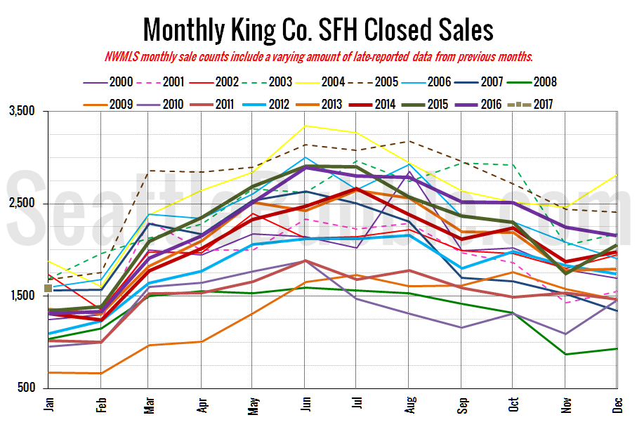
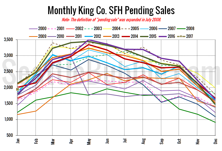
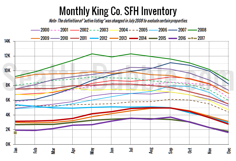
Note that in the following charts the point for January 2017 is a light brown square on the left.
Here’s your closed sales yearly comparison chart:
Closed sales dropped off 27 percent from December to January, but were still up twenty percent from a year ago.
Pending sales rose eighteen percent in January, and were also up seven percent year-over-year.
Here’s the graph of inventory with each year overlaid on the same chart.
Listings fell four percent from December to January, unusual for this time of year. Typically listings actually increase slightly between December and January. The drop this year is the largest we’ve seen. Not exactly setting up 2017 for an inventory recovery.
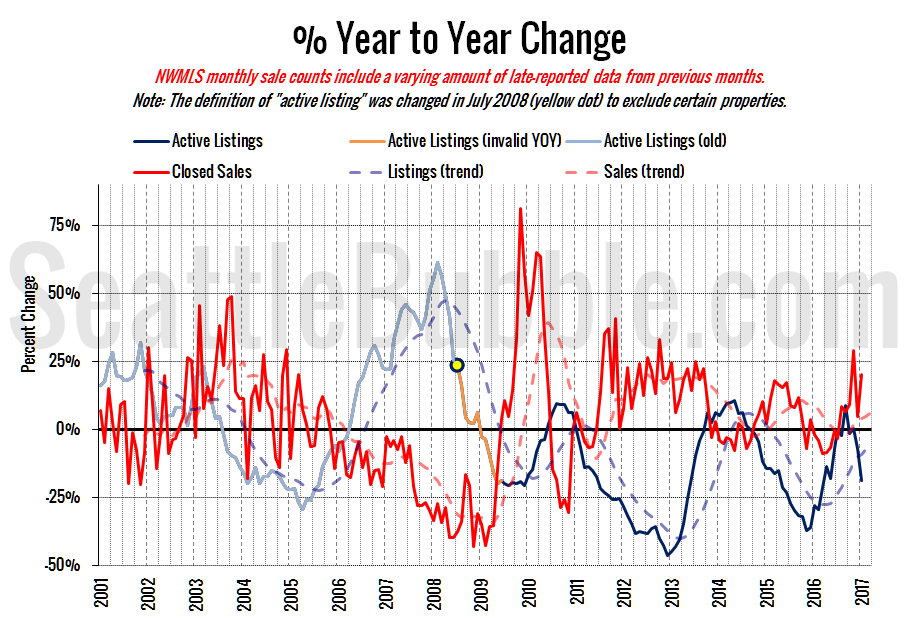
Here’s the supply/demand YOY graph. “Demand” in this chart is represented by closed sales, which have had a consistent definition throughout the decade (unlike pending sales from NWMLS).
Everything is still strongly in seller’s market territory.
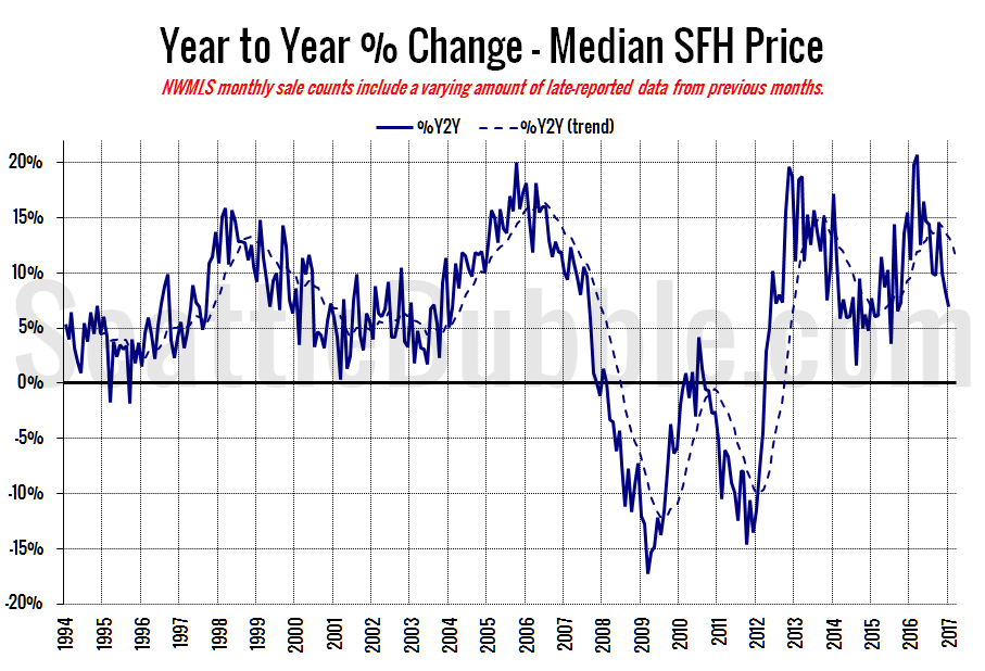
Here’s the median home price YOY change graph:
Year-over-year home price gains have declined in recent months from nearly fifteen percent in October to “just” seven percent in January, the lowest level since September 2015.
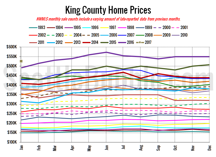
And lastly, here is the chart comparing King County SFH prices each month for every year back to 1994 (not adjusted for inflation).
Unless things suddenly turn around we will probably be hitting new all-time highs again in a few months.
January 2017: $525,000
July 2007: $481,000 (previous cycle high)
Here’s the article from the Seattle Times: Seattle home prices grow at slowest pace in three years
