Get unlimited access to the full spreadsheets used to make the charts in this and other posts, and support the ongoing work of this site by becoming a member of Seattle Bubble.
It’s been nearly a year since we took a look at the in-county breakdown data from the NWMLS to see how the sales mix shifted around the county. I like to keep an eye on this not only to see how individual neighborhoods are doing but also to see how the sales mix shift affects the overall county-wide median price.
In order to explore this concept, we break King County down into three regions, based on the NWMLS-defined “areas”:
- low end: South County (areas 100-130 & 300-360)
- mid range: Seattle / North County (areas 140, 380-390, & 700-800)
- high end: Eastside (areas 500-600)
Here’s where each region’s median prices came in as of February data:
- low end: $360,000-$500,000
- mid range: $480,000-$961,200
- high end: $820,000-$2,070,000
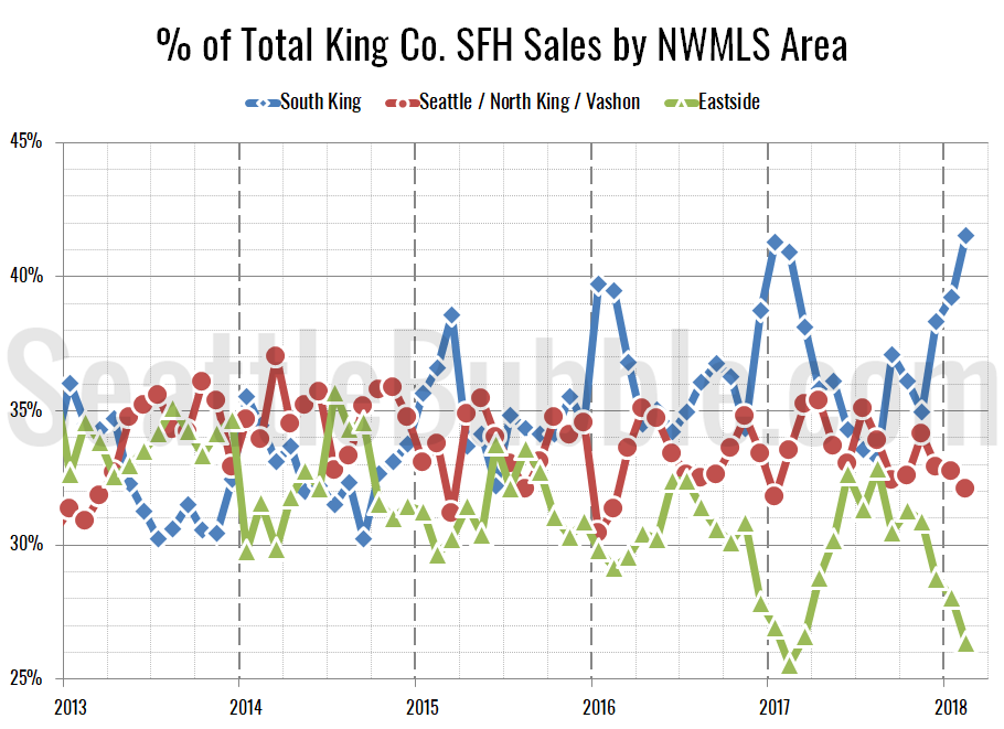
First let’s look at the percentage of each month’s closed sales that took place in each of the three regions.
The most interesting thing in this data is that in February the share of sales in the South King regions hit an all-time high at 41.6 percent, just edging out the previous high of 41.4 percent set in November 2007 (just four months after prices peaked). Despite this continued shift in sales toward the lower-priced regions, the county-wide median price continues to push upward.
The raw number of sales in all three tiers increased between January and February. Month-over-month sales were up eighteen percent in the low tier, up nine percent in the middle tier, and up five percent in the high tier.
Meanwhile, year-over-year sales were up in the low and high tiers, but down slightly in the middle tier. Compared to a year ago, sales increased five percent in the low tier, fell one percent in the middle tier, and rose seven percent in the high tier.
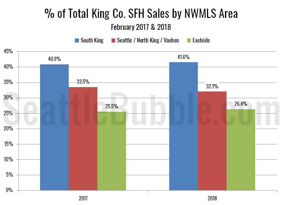
As of February 2018, 41.6 percent of sales were in the low end regions (up from 40.9 percent a year ago), 32.1 percent in the mid range (down from 33.5 percent a year ago), and 26.4 percent in the high end (up from 25.5 percent a year ago).
Here’s that information in a visual format:
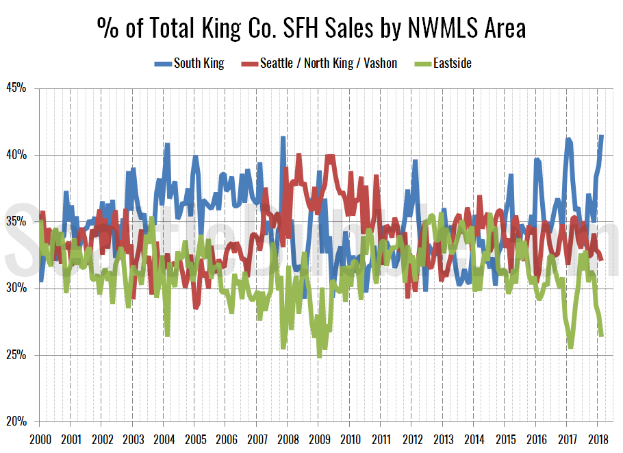
Here’s an updated look at the percentage of sales data all the way back through 2000:
The thing that always stands out to me about this chart is how the bubble years of 2004-2006 stick out with a much larger percent of sales taking place in the low tier regions, and a steady decrease in the sales share for the high tier Eastside regions. The last year has been a lot more variable, but the same trend seems to be shaping up again.
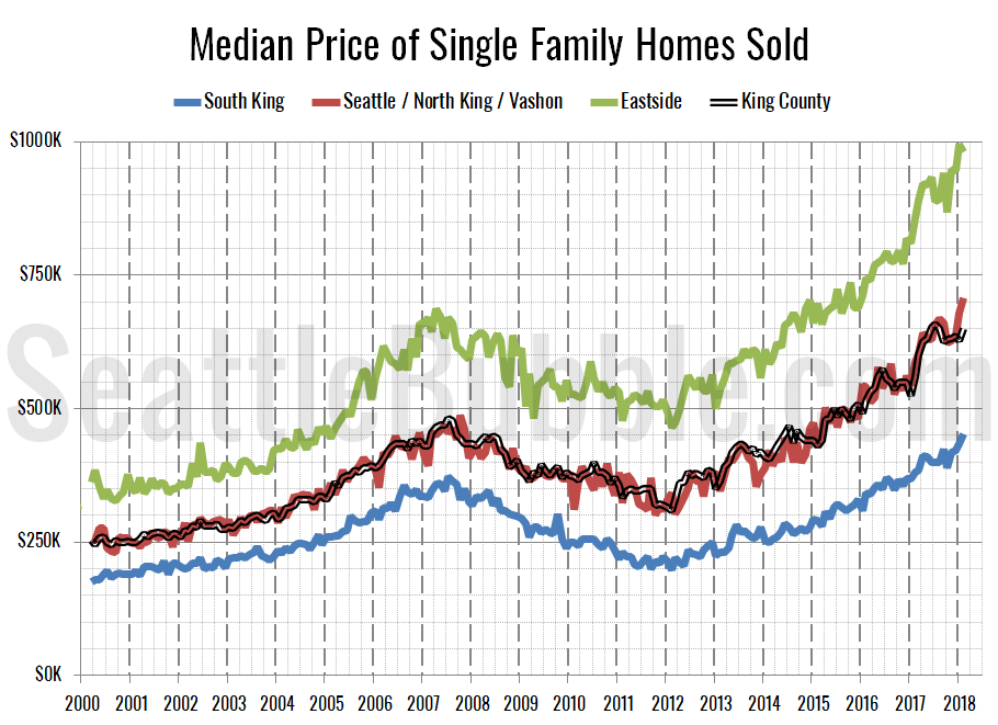
Finally, let’s have a look at each region’s (approximate) median price (actually the median of the medians for each area within the region).
The low and mid tiers both saw month-over-month gains in their respective median-median price, each setting a new all-time record high, while the high tier regions fell slightly from the all-time high set in January. Month-over-month, the median price in the low tier rose four percent, the middle tier increased four percent, and the high tier lost one percent.
Twenty-seven of the twenty-nine NWMLS regions in King County with single-family home sales in February had a higher median price than a year ago, while nineteen had a month-over-month increase in the median price. The two areas that had a lower median prices than a year ago were Area 350—Renton–Highlands & Kennydale and Area 520—Bellevue–West of 405.
Here’s how the median prices changed year-over-year. Low tier: up 19.1 percent, middle tier: up 20.5 percent, high tier: up 14.5 percent.


