Get access to the full spreadsheets used to make the charts in this and other posts, as well as a variety of additional insider benefits by becoming a member of Seattle Bubble.
May market stats have been published by the NWMLS, but their press release isn’t out yet, so let’s just dive into the numbers.
NWMLS monthly reports include an undisclosed and varying number of
sales from previous months in their pending and closed sales statistics.
Here’s your King County SFH summary, with the arrows to show whether the year-over-year direction of each indicator is favorable or unfavorable news for buyers and sellers (green = favorable, red = unfavorable):
| May 2018 | Number | MOM | YOY | Buyers | Sellers |
|---|---|---|---|---|---|
| Active Listings | 2,912 | +37.5% | +35.5% |  |
 |
| Closed Sales | 2,474 | +16.6% | -4.0% |  |
 |
| SAAS (?) | 1.59 | +16.2% | +21.7% |  |
 |
| Pending Sales | 3,312 | +24.1% | -4.1% |  |
 |
| Months of Supply | 1.18 | +17.9% | +41.1% |  |
 |
| Median Price* | $726,275 | +0.2% | +14.9% |  |
 |
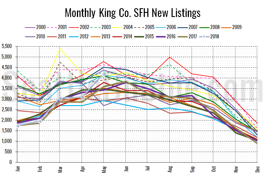
The big news in this month’s numbers is the big bump in both new listings and total on-market inventory. The last time we had more than 4,000 new single-family listings in a single month in King County was July 2007.
If that month sounds familiar it may be because that was also coincidentially (?) the month that home prices peaked in the Seattle area during the previous housing bubble. Hmm…
In my opinion it is still too early to call an inflection point yet, but this surge in listings definitely has my attention.
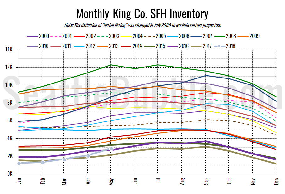
Here’s the graph of inventory with each year overlaid on the same chart.
Inventory rose thirty-seven percent from April to May, and was up thirty-six percent from last year. That’s a non-trivial increase.
Here’s the chart of new listings:
New listings were up seventeen percent from a year ago, and hit their highest level in over a decade.
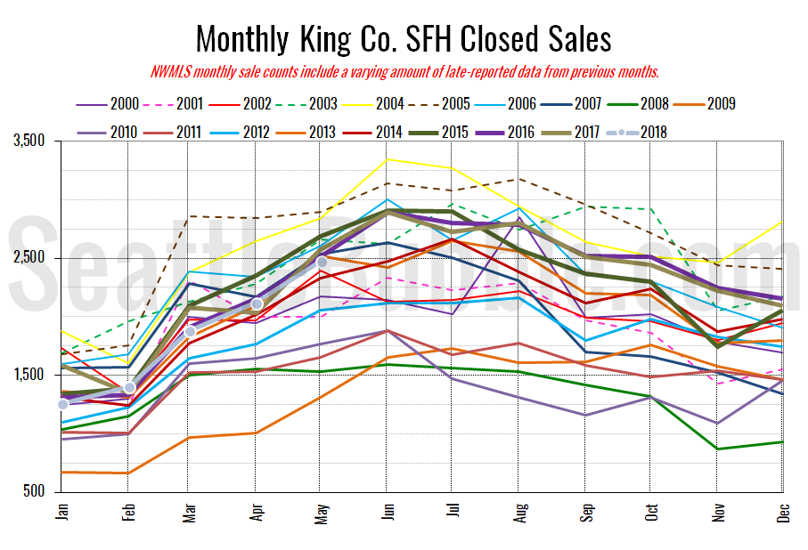
Here’s your closed sales yearly comparison chart:
Closed sales rose seventeen percent between April and May. Last year over the same period closed sales were up twenty-seven percent. Year-over-year closed sales were down four percent.
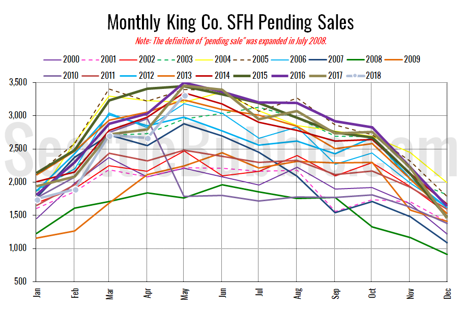
Pending sales were up twenty-four percent from April to May, and were also down four percent year-over-year.
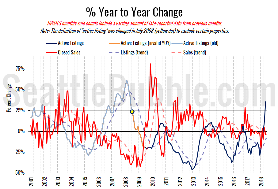
Here’s the supply/demand YOY graph. “Demand” in this chart is represented by closed sales, which have had a consistent definition throughout the decade (unlike pending sales from NWMLS).
That is a huge spike up into the black for the inventory/supply line. For buyers’ sake, I hope the trend continues and isn’t just a one-month flash.
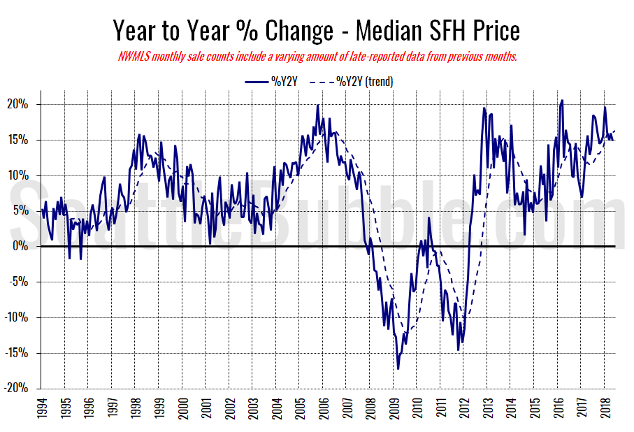
Here’s the median home price YOY change graph:
Year-over-year home price movement continues to hover in the fifteen percent range.
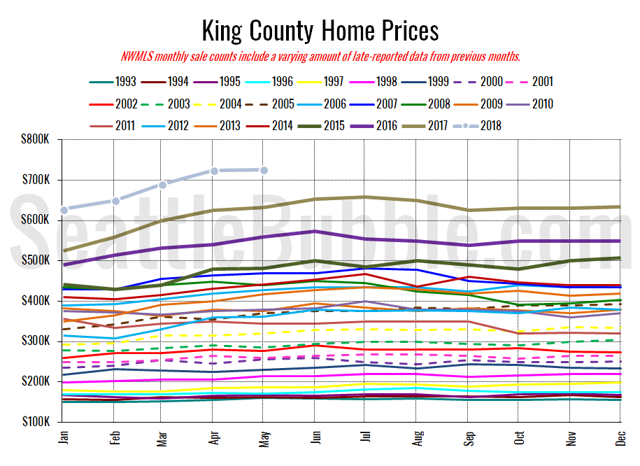
And lastly, here is the chart comparing King County SFH prices each month for every year back to 1994 (not adjusted for inflation).
Another new all-time high, just barely.
May 2018: $726,275
July 2007: $481,000 (previous cycle high)
The Seattle Times hasn’t posted a story yet, when they do I’ll likely update this post.
Update: Here’s the story from the Times: Seattle-area home prices reach record highs, but increasing inventory offers a ray of hope
