Let’s have a look at the latest data from the Case-Shiller Home Price Index. According to September data that was released today, Seattle-area home prices were:
Down 1.3 percent August to September
Up 8.4 percent YOY.
Up 30.2 percent from the July 2007 peak
Last year at this time prices were down 0.3 percent month-over-month and year-over-year prices were up 12.9 percent.
Seattle’s streak of dead last for month-over-month price changes increased to three months in September. Quite a flip from the four-month streak at #1 earlier in the year.
Seattle is still at #3 in year-over-year price growth, but falling fast. Two metro areas had higher price growth from a year earlier in September: Las Vegas at 13.5 percent and San Francisco at 9.9 percent.

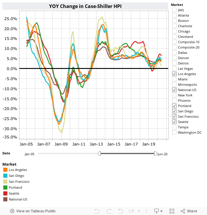
Here’s a Tableau Public interactive graph of the year-over-year change for all twenty Case-Shiller-tracked cities. Check and un-check the boxes on the right to modify which cities are showing:
Here’s how the month-over-month price changes looked for all twenty markets:

Hit the jump for the rest of our monthly Case-Shiller charts, including the interactive chart of raw index data for all 20 metro areas.
Just three metro areas hit new all-time highs in September (down from 11 in July and 6 in August): Atlanta, Charlotte, and Cleveland. Those are definitely not the typically “hot” markets.
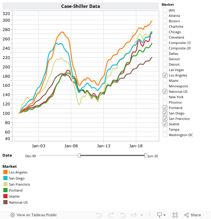
Here’s the interactive chart of the raw HPI for all twenty metro areas through September.
Here’s an update to the peak-decline graph, inspired by a graph created by reader CrystalBall. This chart takes the twelve metro areas whose peak index was greater than 175, and tracks how far they have fallen so far from their peak. The horizontal axis shows the total number of months since each individual city peaked.

In the 134 months since the 2007 price peak in Seattle prices are up 30.2 percent.
Lastly, let’s see how Seattle’s current prices compare to the previous bubble inflation and subsequent burst. Note that this chart does not adjust for inflation.

The latest few data points in this chart definitely look quite a bit different than recent years’ seasonal flattening. To be honest it looks a lot more like it did in late 2007…
Here’s the Seattle Times’ story about this month’s numbers: Metro Seattle home prices falling at fastest rate in U.S.
(Home Price Indices, Standard & Poor’s, 2018-11-27)