Get access to the full spreadsheets used to make the charts in this and other posts, as well as a variety of additional insider benefits by becoming a member of Seattle Bubble.
Five posts in a single day! This has to be some kind of record.
The NWMLS just updated their June stats, so let’s take a look at how the month shook out for the housing market. The King County median price of single-family homes was down year-over-year again in June, the fourth month in a row of declines. Inventory was up from a year ago again, but the as we mentioned in the preview post earlier this morning, the rate of increase is rapidly declining from the all-time high set in December. Closed sales were down a bit from a year earlier, while pending sales were up slightly.
The NWMLS hasn’t published their press release yet, so let’s get straight into the numbers.
NWMLS monthly reports include an undisclosed and varying number of
sales from previous months in their pending and closed sales statistics.
Here’s your King County SFH summary, with the arrows to show whether the year-over-year direction of each indicator is favorable or unfavorable news for buyers and sellers (green = favorable, red = unfavorable):
| June 2019 | Number | MOM | YOY | Buyers | Sellers |
|---|---|---|---|---|---|
| Active Listings | 4,625 | +2.5% | +24.4% |  |
 |
| Closed Sales | 2,718 | +2.9% | -1.5% |  |
 |
| SAAS (?) | 1.32 | -16.2% | -9.4% |  |
 |
| Pending Sales | 3,166 | -6.6% | +6.3% |  |
 |
| Months of Supply | 1.70 | -0.3% | +26.2% |  |
 |
| Median Price* | $695,000 | -0.7% | -2.8% |  |
 |
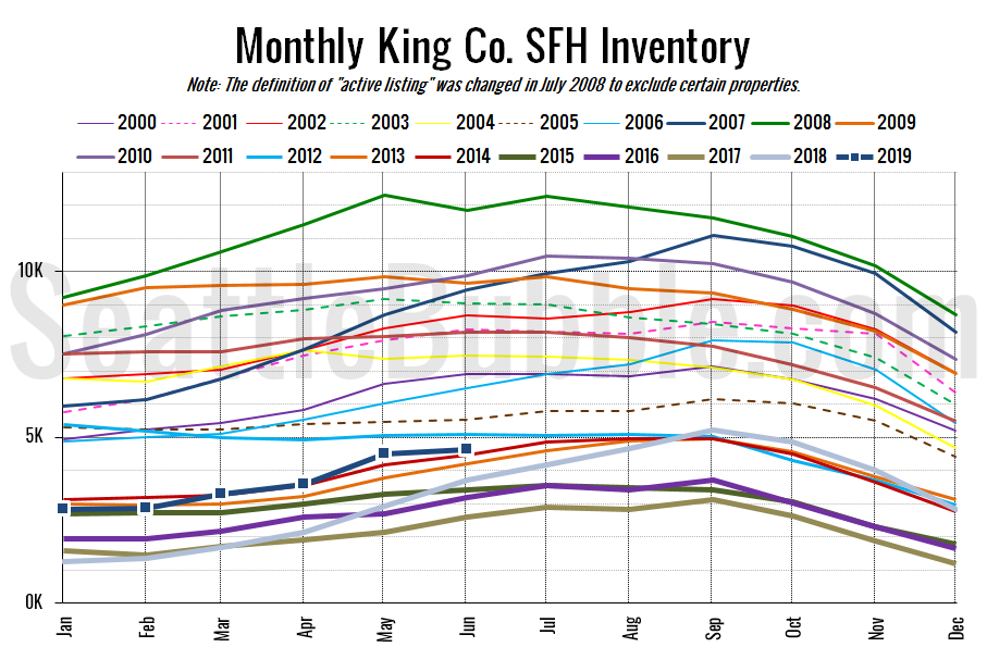
Here’s the graph of inventory with each year overlaid on the same chart.
Inventory was up just 2.5 percent from May to June, which is much smaller than the double-digit gains we have seen over the same period during the last three years. June of last year saw a 28 percent month-over-month gain. That said, this month’s inventory level is still the highest we’ve seen at the end of June since 2012. Overall, the supply situation is still a marginally good sign for buyers.
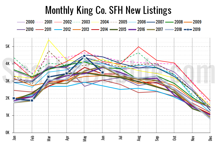
Here’s the chart of new listings:
New listings were down 22 percent from May to June, and were down 11 percent from a year ago. That’s a bit concerning for those of us who were hoping to see a continued expansion of supply.
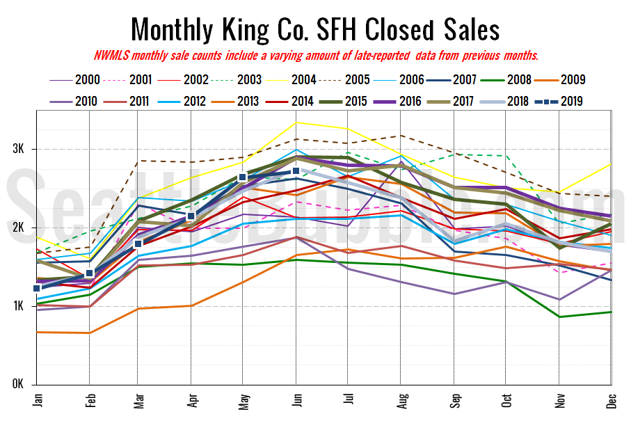
Here’s your closed sales yearly comparison chart:
Closed sales rose just 3 percent between May and June, and were down 1 percent from last year. Closed sales have been in a fairly tight range between about 2,400 and 2,900 in June every year since 2013, and this year fell right in the middle of that range at 2,718.
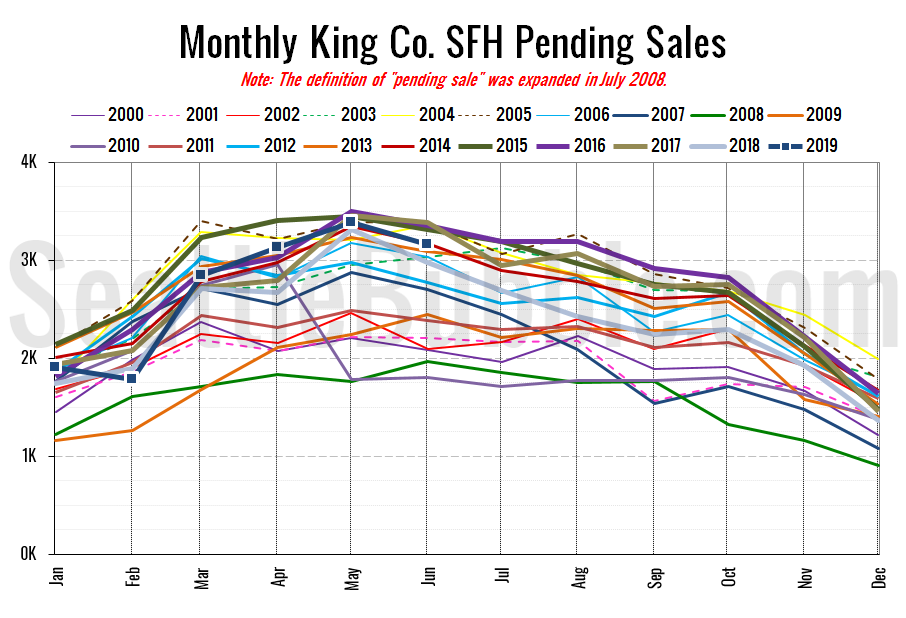
Pending sales fell 7 percent month-over-month but were up 6 percent year-over-year. At the same time last year, pending sales were down 10 percent month-over-month.
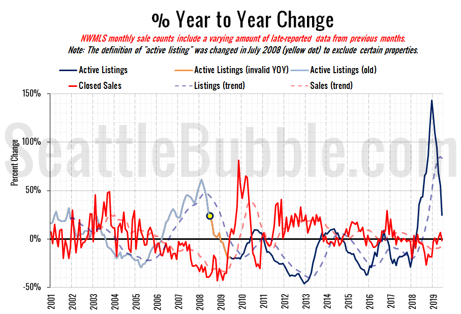
Here’s the supply/demand YOY graph. “Demand” in this chart is represented by closed sales, which have had a consistent definition throughout the decade (unlike pending sales from NWMLS).
The good news is that even after the steep drop-off since December, we’re still at a higher point than any other time after mid-2008.
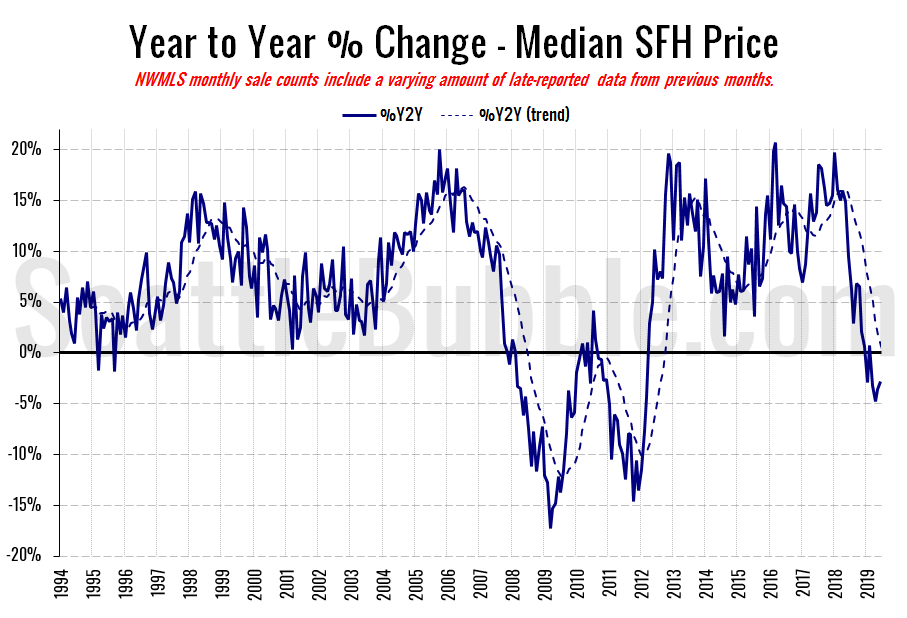
Here’s the median home price YOY change graph:
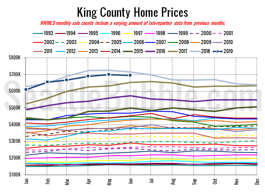
That’s four months in a row now that we have seen falling prices compared to a year ago. It seems that $700,000 appears to be a bit of a price ceiling right now for King County single-family homes.
And lastly, here is the chart comparing King County SFH prices each month for every year back to 1994 (not adjusted for inflation).
June 2019: $695,000
June 2018: $715,000
July 2007: $481,000 (previous cycle high)
So far there’s no story posted yet on the June data from the Seattle Times. I’ll update this post when their story goes up.
Update: Here’s their story, by Paul Roberts: June real-estate numbers tell a now-familiar story: Seattle is losing buyers to Tacoma, other outlying spots
