By request, here are a few alternative takes on recent home listing activity. Since one of the biggest issues driving the current crazy market is a lack of enough home listings, we can get an idea of whether or not there is any relief on the horizon for buyers by looking at listing activity.
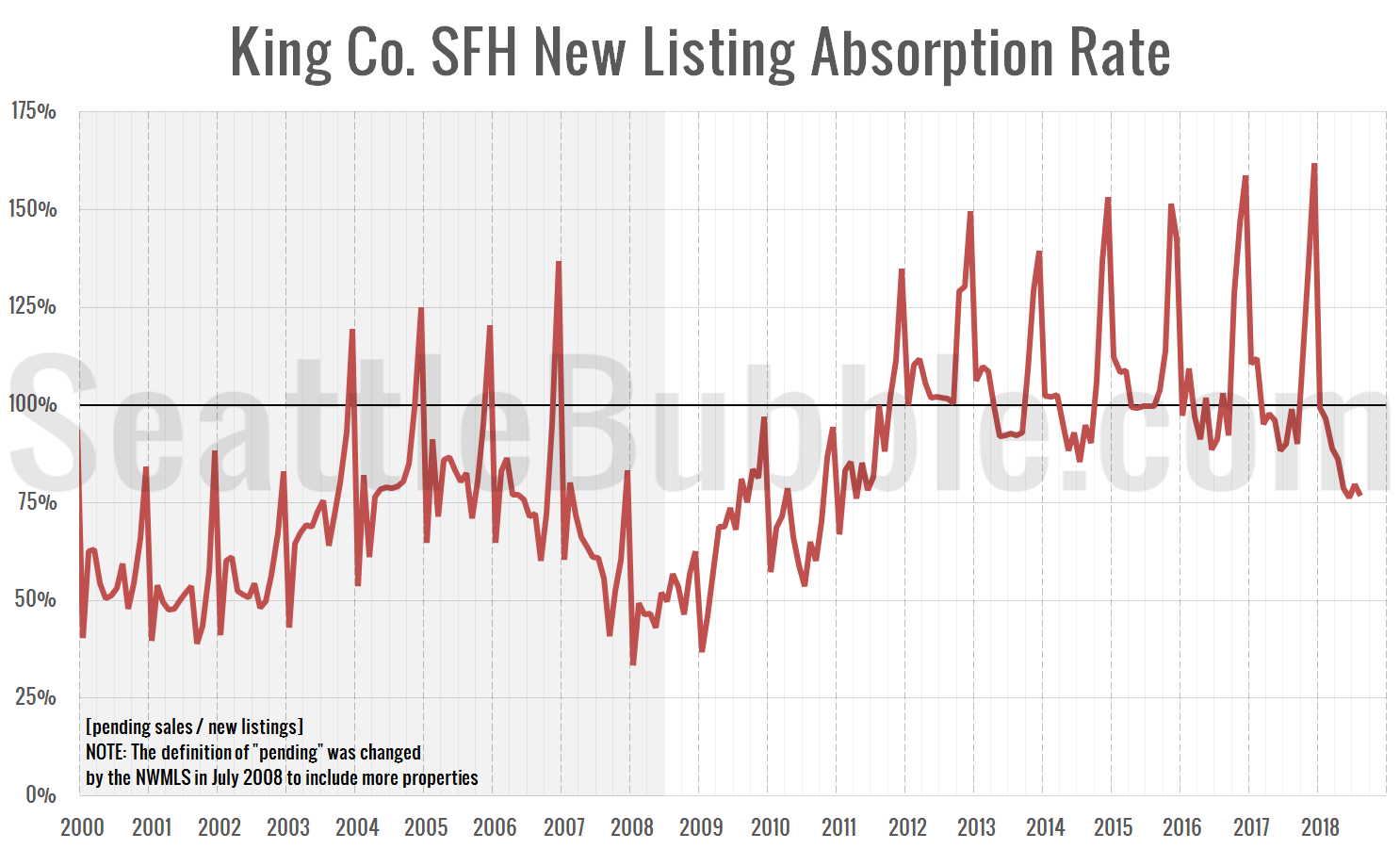
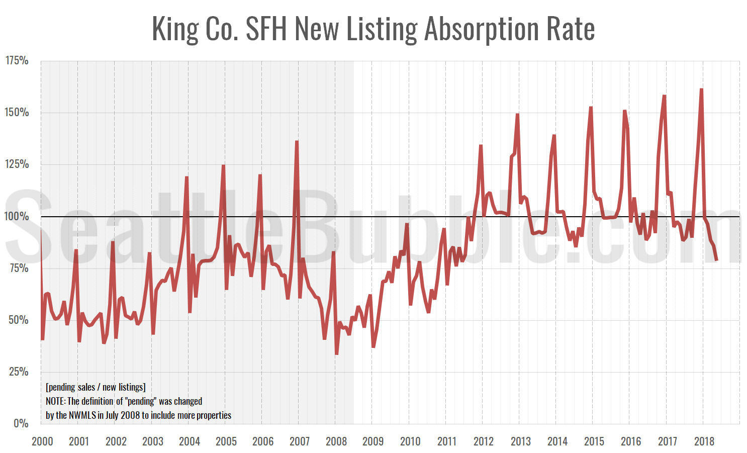
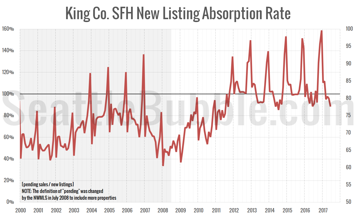
First up, here’s a chart I just created: New listing absorption. This is a simple look at the ratio of pending sales to new listings. If more homes are going pending in a month than there are being listed, this ratio goes above 100 percent, which is obviously not great for buyers.
…what’s interesting to me about this chart is that just last December we saw new listing absorption an all-time high of 159%, while as of June it has fallen to almost the lowest level since the market bottomed out in 2011. However, this is obviously a very seasonal metric, and the low point for the year usually comes in June or July, so it would not be surprising if this is the lowest level we see this year.
