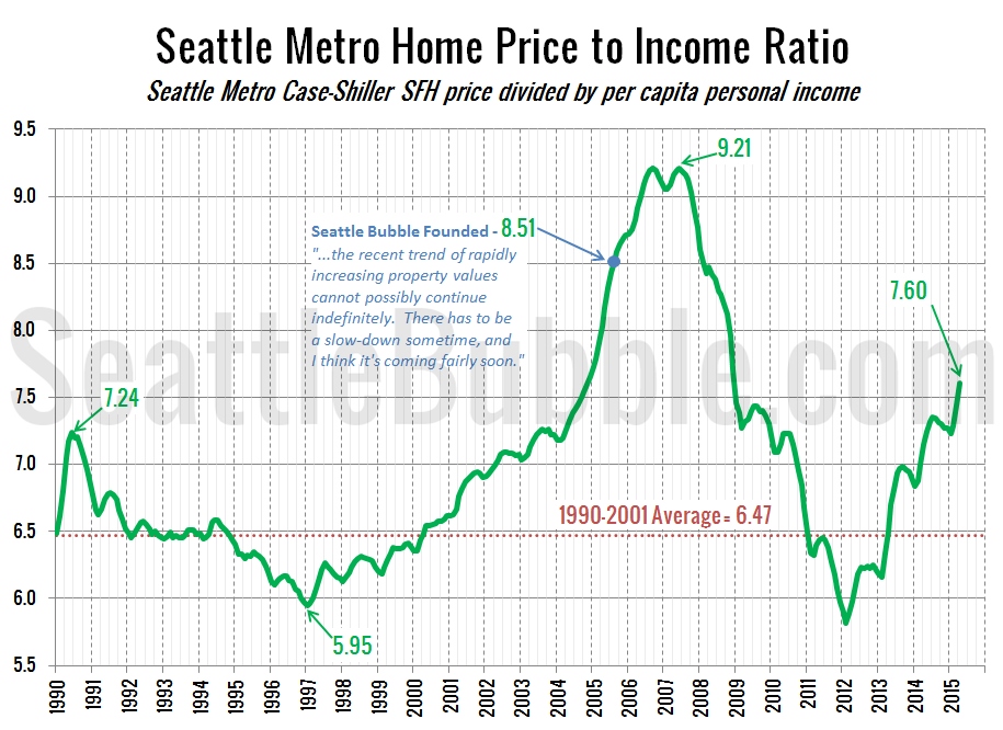
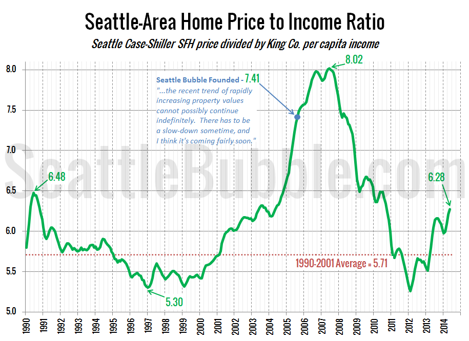
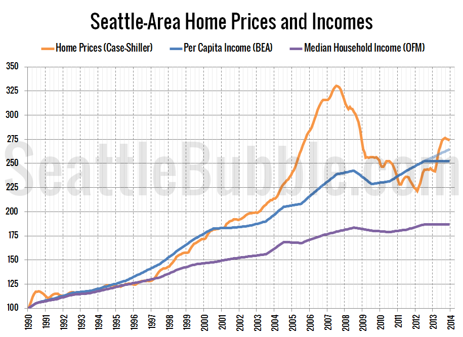
It has been a while since we last looked at one of our primary housing bubble metrics: local home prices compared to incomes. In the next chart I am using the Case-Shiller Home Price Index for the Seattle area (which rolls together King, Snohomish, and Pierce counties) and Bureau of Economic Analysis data on per…
Tag: price-to-income
Are Seattle Homes Being Purchased With Income, Or…
Gene Balk posted an interesting piece on the Seattle Times last week that explores how the number of low, middle, and high income households have grown or shrunk around King County since 2000: Mapping King County’s disappearing middle class The map is cool (click through to the article for an interactive version), and Gene’s overall…
Another Bubble? Home Prices Rapidly Outgain Incomes
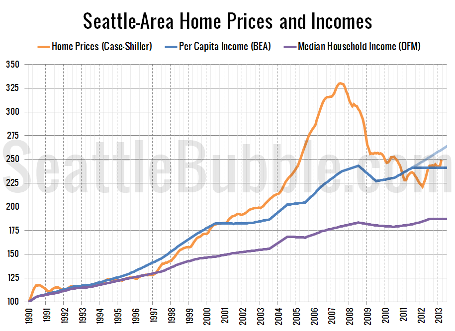
Continuing the “Another Bubble?” series we began yesterday, let’s take a look at another housing bubble metric: home prices compared to incomes. For this post I’ll be using the Case-Shiller Home Price Index for the Seattle area (which rolls together King, Snohomish, and Pierce counties) and Bureau of Economic Analysis data on per capita incomes…
Undervalued to Overvalued in Less Than a Year
Local home prices gone from undervalued to overvalued in just a year. In January 2013, Seattle-area home prices as measured by the Case-Shiller Home Price Index were four or five percent below where local per capita incomes would suggest they should have been and one percent below where rents suggested. By December 2013, massive gains…
Seattle-Area Price to Income Ratio Near Historic Average
It’s been a while since we’ve taken look at how local home prices compare to local incomes, so let’s update those charts. First, let’s check out the ratio between home prices and per capita income from the BEA: Overall the Seattle area is just a little bit above the long-term average, and almost entirely thanks…


