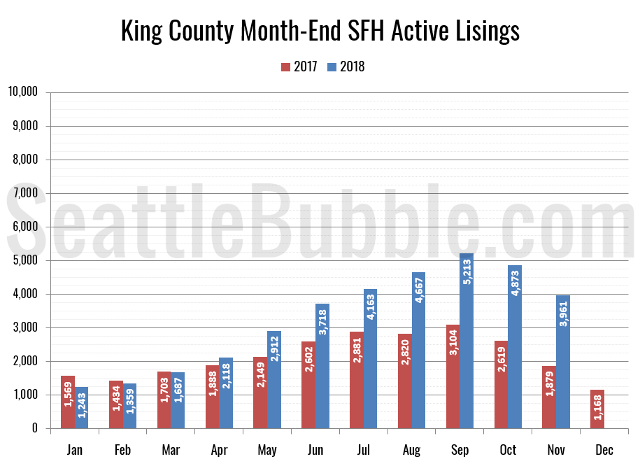
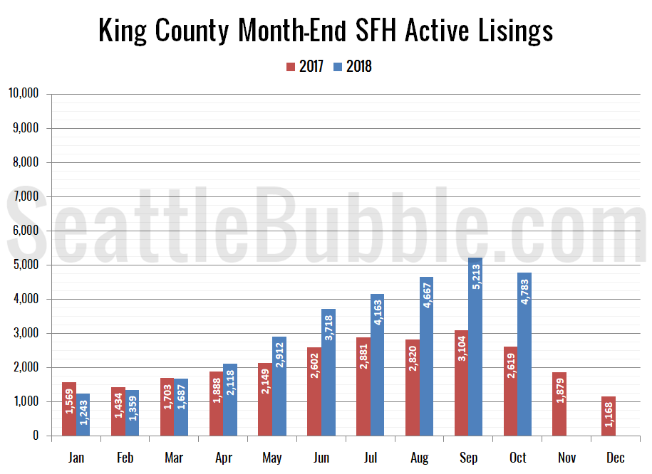
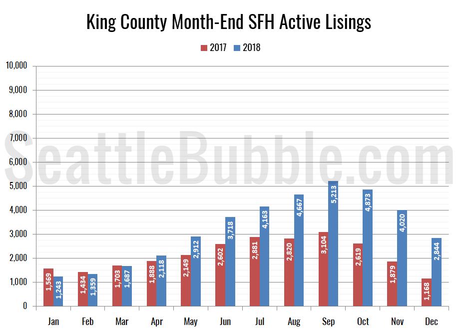
Seattle Bubble

News & discussion about real estate & the housing bubble in the Seattle area.

Seattle Bubble - News & discussion about real estate & the housing bubble in the Seattle area.

Entries Tagged as 'inventory'

Puget Sound Counties February NWMLS Update

Posted by The Tim on March 18th, 2008 at 7:00 AM · 33 Comments

Here’s an update to the NWMLS statistics for all six Puget Sound counties. I don’t personally want to live in King County, and maybe you don’t either. So, here’s a little graphical look at what the market looks like around the sound.

Here’s where each of the six counties stand as of February 2008:

King - Price: -0.0% | Listings: +61.3% | Sales: -32.3% | MOS: 6.1
Snohomish - Price: -0.3% | Listings: +44.5% | Sales: -36.3% | MOS: 7.4
Pierce - Price: -7.4% | Listings: +26.0% | Sales: -28.2% | MOS: 8.6
Kitsap - Price: -12.3% | Listings: +35.5% | Sales: -35.2% | MOS: 9.7
Thurston - Price: +2.0% | Listings: +14.8% | Sales: -17.7% | MOS: 6.0
Skagit - Price: +9.2% | Listings: +23.2% | Sales: -20.6% | MOS: 8.4

Following below are updates to the seven graphs I introduced with January’s data earlier this month. Click below to continue reading.

[Read more →]

Categories: Statistics
Tags: , , , , , , , , , ,

$100,000+ Price Cuts in Suburbs Around Seattle

Posted by The Tim on March 17th, 2008 at 10:20 AM · 66 Comments

Aubrey Cohen is on a roll lately, doing a great job of reporting what’s really going on with the Seattle-area real estate market, instead of just painting the rosy picture that agents and builders would like to see printed. Here is Cohen’s latest, on the drastic price-cutting measures that builders just outside Seattle are taking to clear their stagnant inventory.

Karen Waters thought she got a good deal last March when she paid $425,000 for a new house in the SouthRidge at Silver Creek development near Puyallup.

After all, the price was about $100,000 less than buyers had paid builder Centex Homes for similar houses on the block the previous fall. By February, however, neighboring homes were selling for about $350,000.

“I totally wished I would have waited,” Waters said last month.

The Seattle-area housing market has held up better than many, largely because it did not have as much overbuilding as places such as Las Vegas and Phoenix. Still, the local market has slowed and builders are taking dramatic steps to clear out housing inventory in suburban areas.

“The reality is, our real estate market is in the tank,” said Don Dutton, managing broker of Windermere Real Estate’s Puyallup Office.

Overbuilding deserves the biggest share of the blame, he said.

Read the whole thing. This is exactly the kind of thing that was happening in Florida and California 1-2 years ago. This is great news for those of us that don’t care to live in Seattle or Bellevue proper. No, it hasn’t hit downtown Seattle yet, and I don’t expect things to get as drastic in Seattle proper as they are and will further out.

This article demonstrates that the “running out of land” and “we didn’t overbuild” arguments really only make sense if you are talking about Seattle proper. Even then, it’s debatable whether we’ve overbuilt the condo market or not. I suppose in a year or two we’ll find out.

(Aubrey Cohen, Seattle P-I, 04.16.2008)

Update: A reader pointed out a similar article in the Everett Herald this weekend: Why Snohomish County builders aren’t building.

Drive through newer residential areas in Marysville and witness what happens when buyers stop buying houses and developers keep developing.

Empty lots line roads and the edges of cul-de-sacs. Many have sidewalks, utilities and roads, but no houses.

The supply of buildable lots and new homes ready to be sold in Snohomish County has ballooned to nearly a three-year supply, according to New Home Trends, a real estate research and consulting firm.

That means headaches for developers who bought land at sky-high prices a few years ago and now can’t sell it. It means builders are applying the brakes on new-home construction and off-loading what they’ve already built.

Of course the Herald article goes on to quote various “experts” (such as real estate agents), who say that it’s just a “breather,” a “normal market,” and that “the market is coming back.”

Sure it is. Any day now.

(Debra Smith, Everett Herald, 04.16.2008)

Categories: News
Tags: , , , ,

February Neighborhood Inventory Update

Posted by The Tim on March 10th, 2008 at 10:26 AM · 70 Comments

Here’s an update to the King County single-family neighborhood inventory growth charts I first posted last month.

The data that makes up these charts is publicly available from the NWMLS, and can be found in the NWMLS King County Breakout pdfs. Keep in mind that what’s being plotted here is total percent growth since January 2007. If it would be more helpful to present the data in a different way, I’m open to suggestions. Each graph still has the same scale on the vertical axis, for easy comparison. The King County aggregate figure is plotted in red with circles marking the data points.

[Read more →]

Categories: Neighborhoods · Statistics
Tags: , , , ,

NWMLS Statistics from Around the Sound

Posted by The Tim on March 5th, 2008 at 12:00 PM · 13 Comments

A number of readers have pointed out that despite what Seattle residents may think, there is in fact a world outside of King County. These inquiring readers are interested in seeing what the stats we discuss on Seattle Bubble look like for other local counties around the Puget Sound. Well, this post is for you. Following is a graphical look at the NWMLS data on prices, listings, and pending sales from January 2000 through January 2008 for King, Snohomish, Pierce, Kitsap, Thurston, and Skagit counties. It doesn’t get much more Puget Sound than this.

This post has a total of seven different graphs, so click below to continue reading.

[Read more →]

Categories: Statistics
Tags: , , , , , , , , , ,

What happens to listings?

Posted by deejayoh on February 22nd, 2008 at 8:00 AM · 14 Comments

As a follow-on to Tim’s post yesterday about the practice of relisting properties, here is a look at what has been happening to inventory over the past few years, and how the trends have changed over time.

The questions “what is happening with all of those listings” and “how many sellers just give up?” have come up a number of time from readers. The latter question is particularly interesting - because it might tell you something about seller psychology. Logically, one would expect sellers to rarely pull listings in an up market. The rising tide is probably lifting all boats. But in a down market, what happens? Will sellers start pulling listings because they expect prices to go up soon and want to wait out the dip? Will they keep their homes on the market because they need to sell, or because they think things will be worse if they wait?

The NWMLS reporting on inventory is decidedly opaque. They report homes sold, pending, added, and active. What they don’t tell you is how many homes remained on the market, or how many sellers just gave up and took their homes off the market. However, if one looks across months, some pretty basic algebra allows you to back into how many homes are de-listed versus left on the market.

  • You can get to delisted inventory as follows: [(Beginning inventory + New listings) - (Pending listings (sold) + Ending Inventory) = Delisted]. Take the available stock less what is either sold or left over, and it tells you how many homes disappeared from the listings that month without being sold…
  • Armed with that, you can calculate how many homes stayed on the market as follows: [Beginning inventory - Pending listings (sold) - Delisted = Stayed]. Take the total starting inventory, and subtract those that sold or gave up, and all you have left is the stuff that stayed on the market!

Using those formulas applied to the last 9 years of inventory data, we can peer inside what has been happening with listings before and during the boom:

What happens to Listings?

On the left axis, we have the average number of homes delisted, sold, added, and staying on the market for each year from 1999-2007. These are displayed as stacked columns, with the reductions from inventory shown as negative, and the additions/remaining inventory shown as positive. On the right axis, we have average inventory throughout the year displayed as the black line.

What you can see on this chart is that new listing activity and sales activity were remarkably even across the past 9 years. New listings averaged about 4500 homes per month, plus or minus no more than 500 units. Sales averaged about 3,000 homes per month and again were typically plus or minus less than 500 units (2005-06 were +~700). Based on the consistency of this data, it appears that the bulk of the of the variability in average inventory levels is driven by whether sellers choose to stay on the market or give up.

Staying on market versus delisted

During the period for which I have data - the average ratio of delisted/stayed was 1:3. In other words, sellers were 3 times as likely to stay on the market as they were to pull their listing. However, the average is deceiving. Over the course of the boom, this ratio has fallen steadily: from just over 1:2 in 1999 to the current level of 1:5, where it has been from 2003-07. Sellers psychology during the boom years appears to have shifted to where they have been over twice as likely to “ride it out” than they were previously.

I don’t know what the long term averages are, they could be higher or lower. Either way, it will be interesting to see if this behavior changes significantly as the market slows down.

Categories: Statistics
Tags: , , , ,

2007 Neighborhood Inventory Breakdown

Posted by The Tim on February 11th, 2008 at 1:23 PM · 22 Comments

In a lot of the feedback we’ve been getting lately, two recurring themes are a desire for more number-crunching and more neighborhood analysis. So, let’s have some of both those things. Let’s take a more detailed look at single-family house inventory over the last year, broken down by neighborhood.

What I’ve done below is to take the “Res Only” data from the NWMLS King County Breakout pdfs for January 2007 through January 2008, and plot the total percent growth. I’ve broken the data into five separate graphs (the same groups the NWMLS uses in the breakout pdfs), in order to make it more digestable, but each graph still has the same scale on the vertical axis, so they can be easily compared. Additionally, each graph has the King County aggregate figure plotted in red with circles marking the data points.
[Read more →]

Categories: Neighborhoods · Statistics
Tags: , , , ,