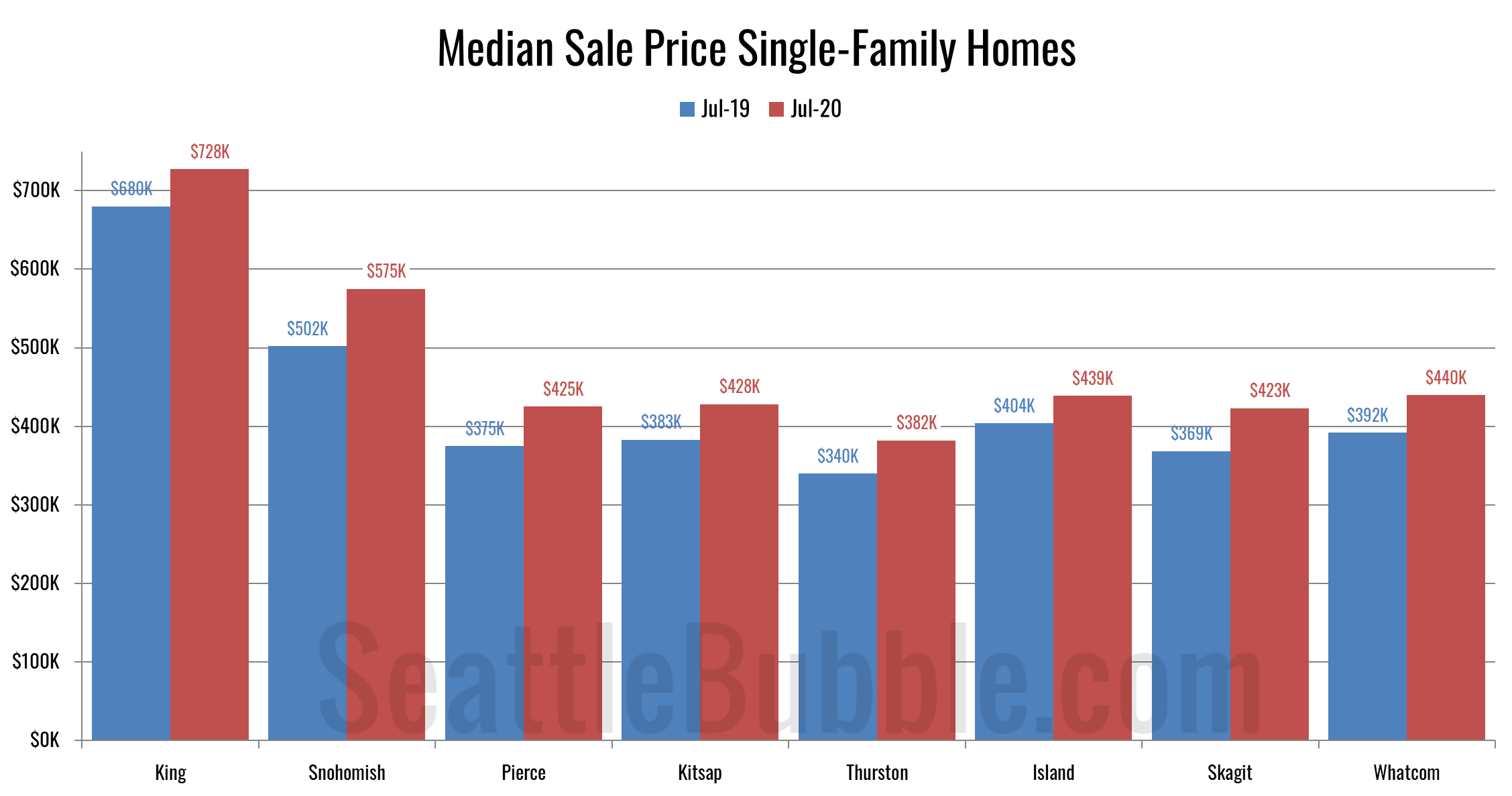
I promised an updated look at June data for the outlying counties, so let’s have a look at that. Here’s the latest update to our “Around the Sound” statistics for King, Snohomish, Pierce, Kitsap, Thurston, Island, Skagit, and Whatcom counties.
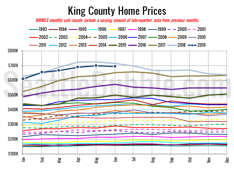
King County is the only place where prices are declining, and it also has the largest increase in active listings compared to a year ago. On the flip side, pending sales were up the most in King County, and it had one of the smallest declines in closed sales (sales rose in Skagit though). In most of the other Puget Sound counties, sales are declining, and listings are either falling or not increasing by much, and prices are rising.