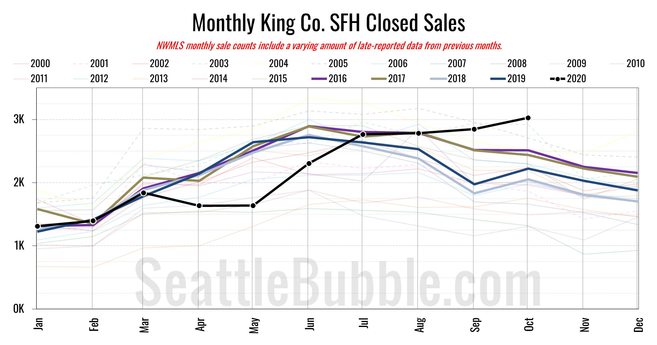
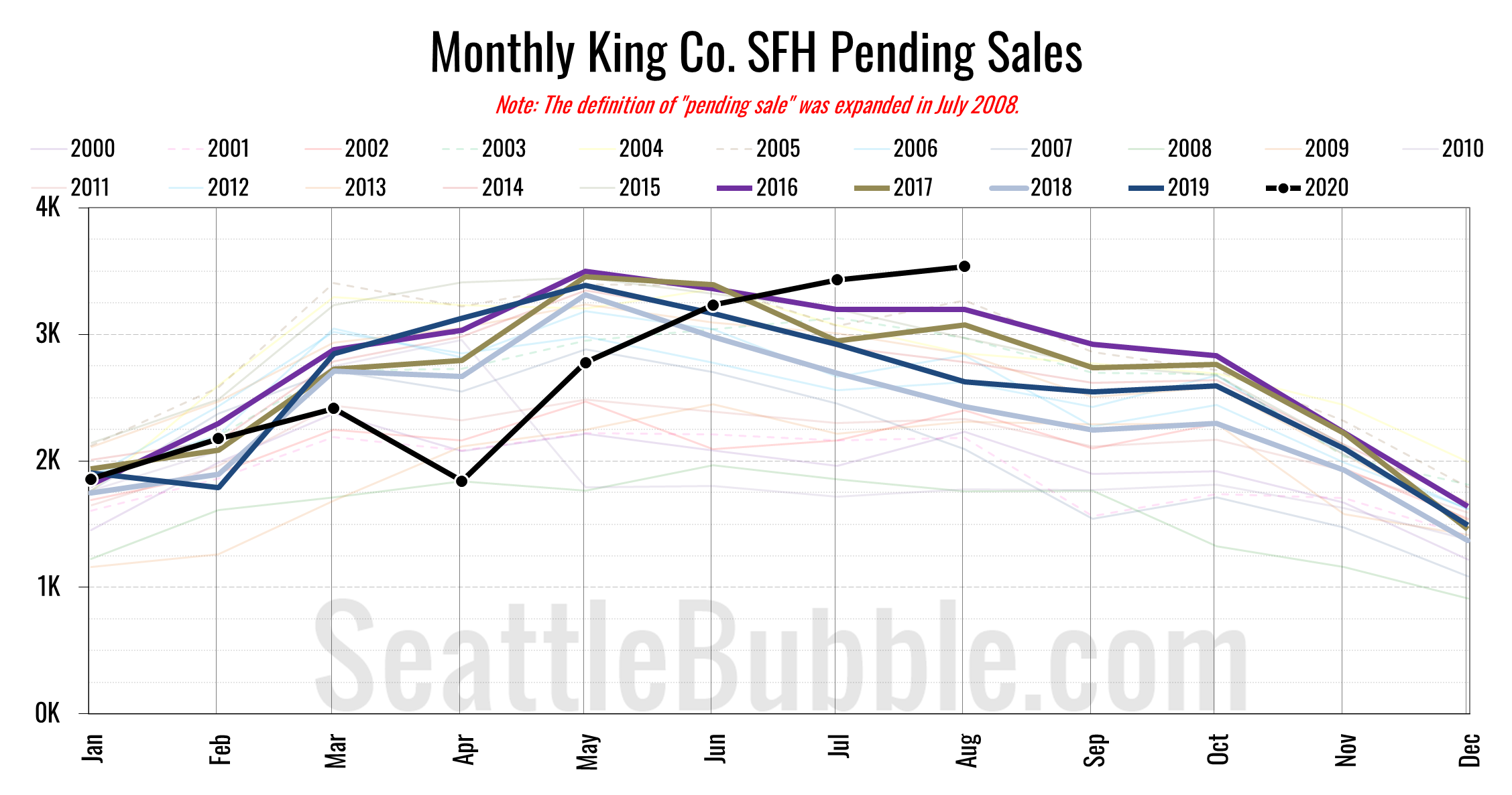
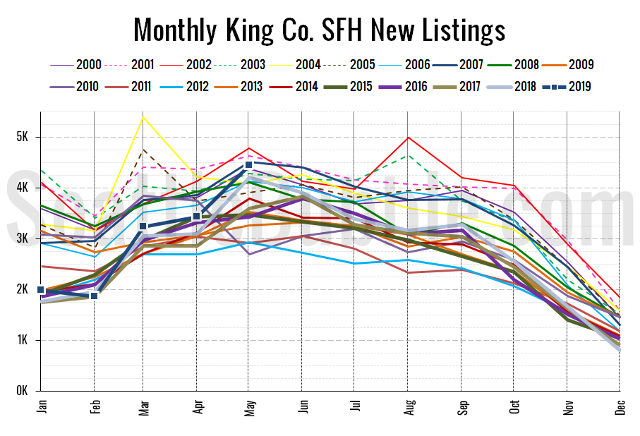
Seattle Bubble

News & discussion about real estate & the housing bubble in the Seattle area.

Seattle Bubble - News & discussion about real estate & the housing bubble in the Seattle area.

Entries Tagged as 'SAAS'

October Seasonally-Adjusted Active Supply by Neighborhood

By The Tim on November 17th, 2009 at 12:33 PM · 15 Comments

Let’s check in on our October monthly neighborhood update to Seasonally-Adjusted Active Supply (SAAS). For an explanation of what seasonally-adjusted active supply is, please refer to this post. Also, you may view a map of the areas discussed in this post.

As usual, the sweet interactive data visualizations (new and improved!) in today’s post come to you courtesy Tableau Software.

In the charts below I have taken the calculated value for SAAS and subtracted 2, in order to better visualize the difference between a buyer’s market and a seller’s market. Using this method, negative SAAS values indicate a seller’s market, while positive values indicate a buyer’s market.

Summary

King County’s overall SAAS continued to drop below the “balanced” level, coming in at 1.59 for October (September was 1.80). 18 of 30 areas came in below 1.75 as seller’s markets (over half for the first time in recent years), Only 1 of 30 came in above 2.25 as a buyer’s market, and the remaining 11 were more or less balanced between 1.75 and 2.25.

Hit the jump for the rest of this month’s interactive charts and commentary.

[Read more →]

→ 15 CommentsCategories: Statistics
Tags: , , , , ,

Puget Sound Counties Interactive October Update

By The Tim on November 13th, 2009 at 6:00 AM · 51 Comments

Let’s take a look at October NWMLS statistics from around the sound. As usual, courtesy Tableau Software, the Around the Sound update is rocking sweet interactive data visualizations.

Feel free to download the old charts in Excel 2007 and Excel 2003 format. To get specific info about a certain point on any graph in the post below, float your mouse pointer over the data.

Before we get to the cool stuff, here’s the usual table of YOY stats for each of our seven covered counties as of October 2009.

October 2009 King Snohomish Pierce Kitsap Thurston Island Skagit Whatcom
Median Price 3.7% 12.3% 10.3% 0.4% 10.7% 7.0% 10.1% 5.0%
Listings 19.7% 23.8% 22.8% 26.1% 14.5% 7.3% 4.2% 10.1%
Closed Sales 33.3% 42.5% 24.0% 5.5% 5.7% 26.8% 9.0% 19.0%
Seasonally Adjusted Active Supply 1.6 1.8 1.7 1.6 1.6 1.7 2.0 1.8

Summary

Hit the jump for the rest of this month’s interactive charts.

[Read more →]

→ 51 CommentsCategories: Statistics
Tags: , , , , , , , , , , , , , ,

NWMLS: Fake Expiration of Wasteful Tax Credit Boosts October Sales

By The Tim on November 5th, 2009 at 12:32 PM · 67 Comments

Let’s have a look at October market statistics from the NWMLS. Here’s the NWMLS press release: Tax credit spurs big surge in Western Washington home sales.

Here’s your King County SFH summary, with the arrows to show whether the year-over-year direction of each indicator is positive or negative news for buyers and sellers:

October 2009 Number MOM YOY Buyers Sellers
Active Listings 8,869 -5.2% -19.7%
Closed Sales 1,758 +8.7% +33.3%
SAAS (?) 1.61 -11.4% -27.9%
Pending Sales 2,295 +0.3% +72.9%
Months of Supply 3.86 -5.5% -53.6%
Median Price* $377,500 -1.2% -3.7%

In a great big surprise to absolutely nobody, closed sales bumped up in a seasonally unnatural pattern in October, no doubt due to the belief many buyers had that the $8,000 tax credit would be expiring at the end of November (it is now foolishly being renewed and extended, pushed through Congress on the back of an unrelated extension of unemployment benefits).

At this point it still looks unlikely that closed sales will manage to break through the 2,000 mark this year. In the past, closed sales have fallen an average of 15% from October to November. I suspect that this year we may see sales hold steady or possibly even post a slight increase, but a 14% increase would be surprising, especially with the tax credit now having been extended.

Here’s how the closed sales situation is shaping up compared to previous years:

King County SFH Closed Sales

Thanks to an apparent abundance of eager homebuyers that aren’t very good at math, closed sales made a clear break from the trend seen every other year since 2000, ticking up from September to October. I expect a similar market distortion to appear next month as well.

Feel free to download the updated Seattle Bubble Spreadsheet, and here’s a copy in Excel 2003 format. Click below for the rest of the usual monthly graphs.

[Read more →]

→ 67 CommentsCategories: Statistics
Tags: , ,

Puget Sound Counties Interactive September Update

By The Tim on November 2nd, 2009 at 8:00 AM · 5 Comments

Whoops, sorry this is late. It took a little extra time to put together this month, as I finally switched the data over from months of supply to Seasonally Adjusted Active Supply. So, let’s have our September data checkup of NWMLS statistics from around the sound. As usual, courtesy Tableau Software, the Around the Sound update is rocking exclusive interactive data visualizations.

Feel free to download the old charts in Excel 2007 and Excel 2003 format. To get specific info about a certain point on any graph in the post below, float your mouse pointer over the data.

Before we get to the cool stuff, here’s the usual table of YOY stats for each of our seven covered counties as of September 2009.

September 2009 King Snohomish Pierce Kitsap Thurston Island Skagit Whatcom
Median Price 7.9% 11.1% 8.2% 4.6% 2.8% 1.8% 2.0% 8.7%
Listings 19.4% 23.6% 25.8% 25.1% 15.8% 2.0% 4.9% 9.7%
Closed Sales 14.3% 14.6% 12.4% 14.5% 1.5% 11.5% 20.9% 19.3%
Seasonally Adjusted Active Supply 2.0 2.1 1.8 2.0 1.9 2.5 3.0 1.5

Hit the jump for this month’s interactive charts.

[Read more →]

→ 5 CommentsCategories: Statistics
Tags: , , , , , , , , , , , , , ,

September Seasonally-Adjusted Active Supply by Neighborhood

By The Tim on October 29th, 2009 at 6:00 AM · 5 Comments

Let’s check in again on our regular monthly neighborhood update to Seasonally-Adjusted Active Supply (SAAS). For an explanation of what seasonally-adjusted active supply is, please refer to this post. Also, you may view a map of the areas discussed in this post.

As usual, the sweet interactive data visualizations (new and improved!) in today’s post come to you courtesy Tableau Software.

In the charts below I have taken the calculated value for SAAS and subtracted 2, in order to better visualize the difference between a buyer’s market and a seller’s market. Using this method, negative SAAS values indicate a seller’s market, while positive values indicate a buyer’s market.

Summary

King County’s overall SAAS dropped further below the “balanced” level, coming in at 1.80 for September (August was 1.88). 11 of 30 areas came in below 1.75 as seller’s markets, 5 of 30 came in above 2.25 as buyer’s markets, and the remaining 14 were more or less balanced between 1.75 and 2.25.

Hit the jump for the rest of this month’s interactive charts and commentary.

[Read more →]

→ 5 CommentsCategories: Statistics
Tags: , , , , ,

NWMLS: Closed Sales Volume in Summer Holding Pattern

By The Tim on October 5th, 2009 at 1:14 PM · 47 Comments

Looks like it’s time for September market statistics from the NWMLS. Here’s the NWMLS press release: Northwest MLS brokers agree "there’s a lot to be optimistic about".

Here’s your King County SFH summary, with the arrows to show whether the year-over-year direction of each indicator is positive or negative news for buyers and sellers:

September 2009 Number MOM YOY Buyers Sellers
Active Listings 9,360 -1.4% -19.4%
Closed Sales 1,618 +0.6% +14.3%
SAAS (?) 1.82 -5.1% -19.3%
Pending Sales 2,289 -1.0% +29.5
Months of Supply 4.09 -0.4% -37.8%
Median Price* $382,160 +1.9% -7.9%

Closed sales were basically in a holding pattern the last four months, trending similarly to the pattern we have seen in pending sales since roughly April. April – September pending sales have ranged between 2,114 and 2,447, while June – September closed sales have ranged between 1,609 and 1,727.

I suspect we will see a much stronger November for closed sales than usual, due to the impending expiration of the free money handout for knife-catchers, but I doubt that it will climb much above the 1,600-1,700 range we have seen through the summer. Historically (2000-2008), November closed sales volume has averaged 71% of June volume. 71% of this year’s June volume would be 1,179 sales this November. I’m guessing it will be higher than that, but I don’t see it going much above 1,500 – 1,600.

Here’s a visual of June volume (usually at or near the peak in the summer) vs. November volume since 2000:

King County SFH Closed Sales: June & November

Here’s how the closed sales situation is shaping up compared to previous years:

King County SFH Closed Sales

Feel free to download the updated Seattle Bubble Spreadsheet, and here’s a copy in Excel 2003 format. Click below for the graphs and the rest of the post.

[Read more →]

→ 47 CommentsCategories: Statistics
Tags: , ,