Get unlimited access to the full spreadsheets used to make the charts in this and other posts, and support the ongoing work of this site by becoming a member of Seattle Bubble.
It’s been a few months since we took a look at the in-county breakdown data from the NWMLS to see how the sales mix shifted around the county. I like to keep an eye on this not only to see how individual neighborhoods are doing but also to see how the sales mix shift affects the overall county-wide median price.
As of March, prices are up from a year ago in the low-end regions, flat in the mid-range regions, and down in the high-end regions. Meanwhile, the share of sales is tilting toward the low-end regions.
In order to explore this concept, we break King County down into three regions, based on the NWMLS-defined “areas”:
- low end: South County (areas 100-130 & 300-360)
- mid range: Seattle / North County (areas 140, 380-390, & 700-800)
- high end: Eastside (areas 500-600)
Here’s where each region’s median prices came in as of March data:
- low end: $379,000-$593,750
- mid range: $615,000-$1,090,000
- high end: $814,037-$2,586,183
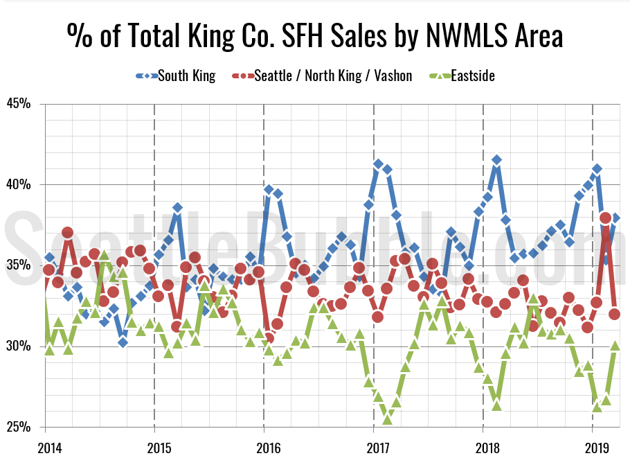
First let’s look at the percentage of each month’s closed sales that took place in each of the three regions.
The last few years have each followed a similar pattern: while sales in the mid-range regions maintain a fairly steady share of sales in the county each month, sales in the cheaper parts of the county (South King) surge in the winter and dip in the summer, with sales in the most expensive parts (Eastside) doing the opposite. Except for a big spike in Seattle in February, so far we’re seeing the same pattern this year.
The raw number of sales in all three tiers increased between February and March. Month-over-month sales were up 35 percent in the low tier, up six percent in the middle tier, and up 42 percent in the high tier.
Meanwhile, year-over-year sales were down in all three tiers. Compared to a year ago, sales decreased five percent in the low tier, fell seven percent in the middle tier, and dropped four percent in the high tier.
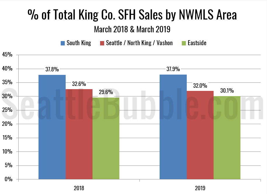
As of March 2019, 37.9 percent of sales were in the low end regions (basically flat from 37.8 percent a year ago), 32.0 percent in the mid range (down slightly from 32.6 percent a year ago), and 30.1 percent in the high end (up from 29.6 percent a year ago).
Here’s that information in a visual format:
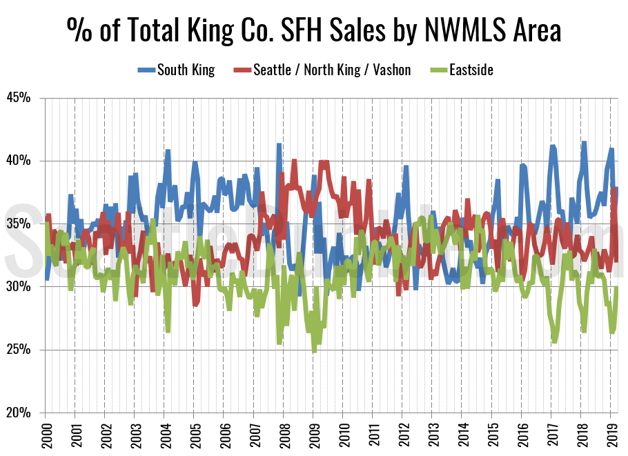
Here’s an updated look at the percentage of sales data all the way back through 2000:
During the housing bubble that burst in 2008, South King consistently had the largest share of sales. We’ve seen the same thing over the last few years as prices have once again grown to astronomical levels. In the lead-up to the big 2008 bust, sales in South King fell as sales in Seattle gained ground. February’s spike in Seattle’s sales share could be a portent of a similar pattern, or it could just be a blip. We’ll see over the next few months.
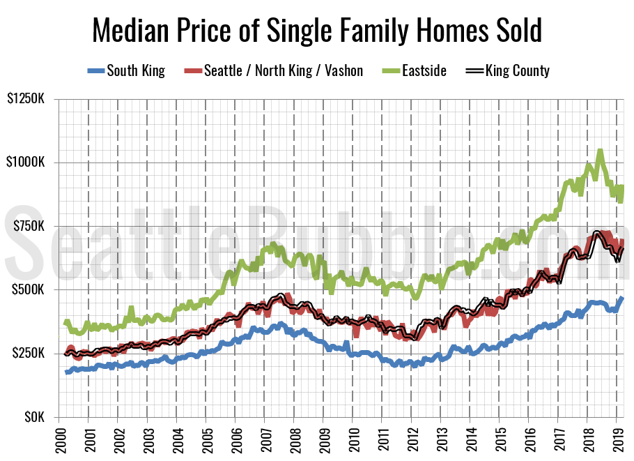
Finally, let’s have a look at each region’s (approximate) median price (actually the median of the medians for each area within the region).
All three tiers saw month-over-month gains in their respective median-median price, but only the low tier is currently at an all-time record high. Month-over-month, the median price in the low tier rose three percent, the middle tier increased eight percent, and the high tier gained nine percent.
Eighteen of the twenty-nine NWMLS regions in King County with single-family home sales in March had a higher median price than a year ago, while 23 had a month-over-month increase in the median price.
Here’s how the median prices changed year-over-year. Low tier: up 5.2 percent, middle tier: up 0.1 percent, high tier: down 4.7 percent.


