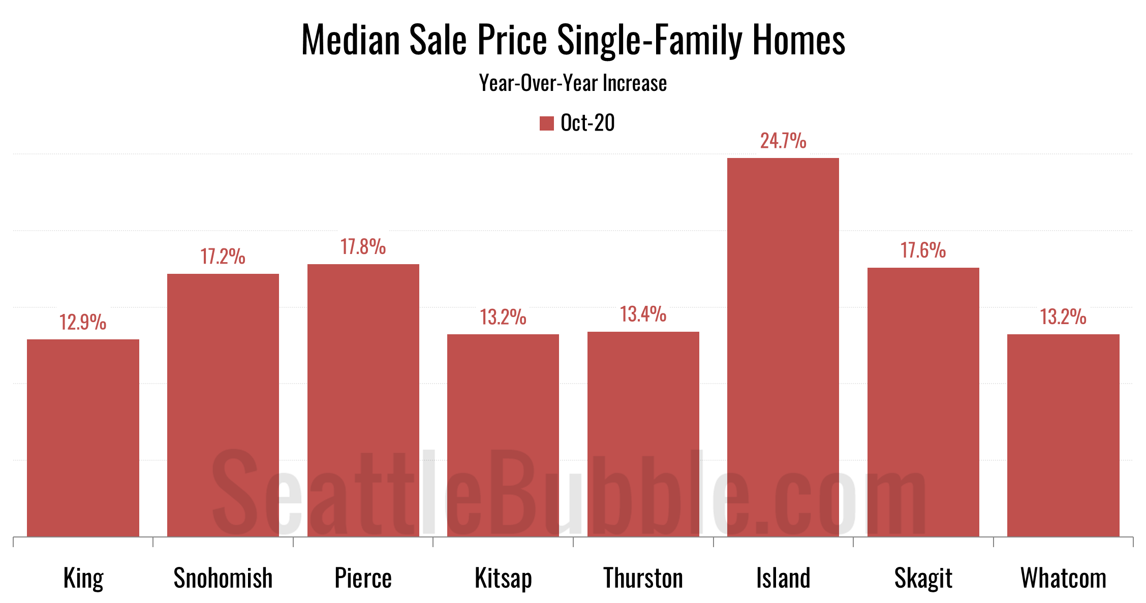
Let’s take a look at our stats for the local regions outside of the King/Snohomish core. Here’s your October update to our “Around the Sound” statistics for Pierce, Kitsap, Thurston, Island, Skagit, and Whatcom counties…
local real estate news, statistics, and commentary without the sales spin.
Let’s take a look at our stats for the local regions outside of the King/Snohomish core. Here’s your October update to our “Around the Sound” statistics for Pierce, Kitsap, Thurston, Island, Skagit, and Whatcom counties…
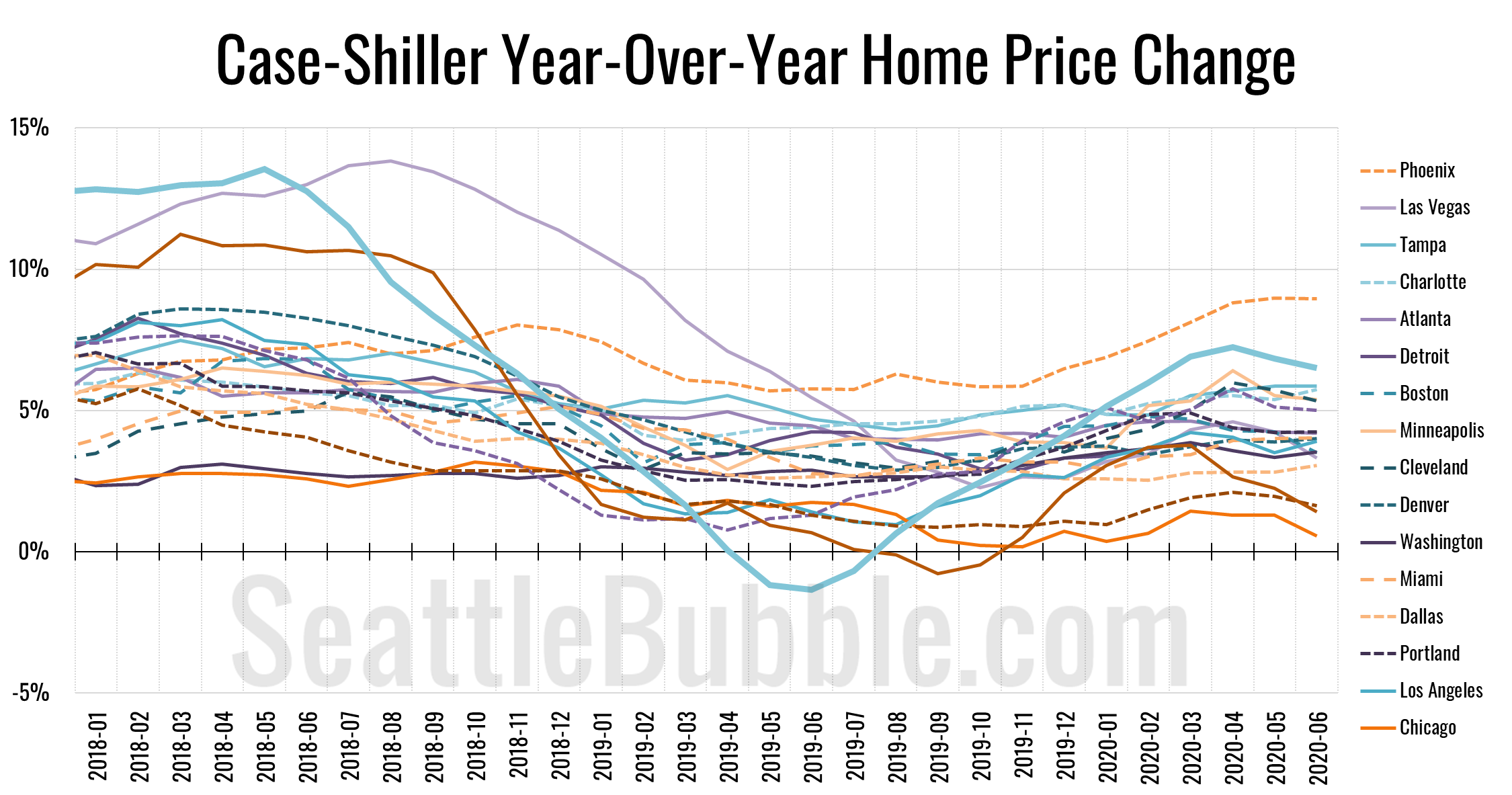
Let’s catch up a bit on our Case-Shiller data. According to June data that was released this week, Seattle-area home prices were up 0.2 percent May to June and up 6.5 percent YOY…
Okay, let’s get back to the data. It’s about time. Okay, it’s way past time. Anyway, whatever. Here’s some data. Since it’s been a while, let’s start with a few high-level stats from around the Puget Sound…
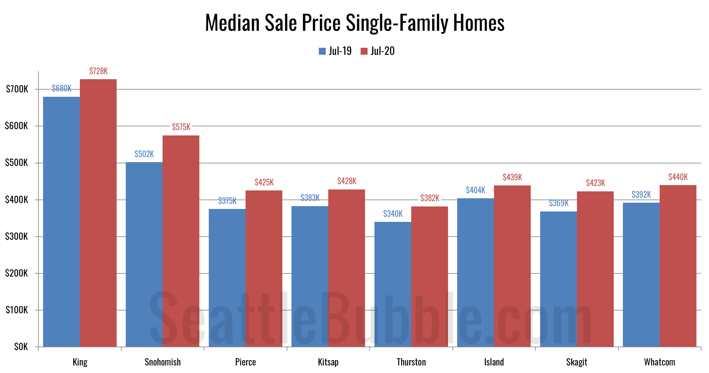
I promised an updated look at June data for the outlying counties, so let’s have a look at that. Here’s the latest update to our “Around the Sound” statistics for King, Snohomish, Pierce, Kitsap, Thurston, Island, Skagit, and Whatcom counties.
King County is the only place where prices are declining, and it also has the largest increase in active listings compared to a year ago. On the flip side, pending sales were up the most in King County, and it had one of the smallest declines in closed sales (sales rose in Skagit though). In most of the other Puget Sound counties, sales are declining, and listings are either falling or not increasing by much, and prices are rising.
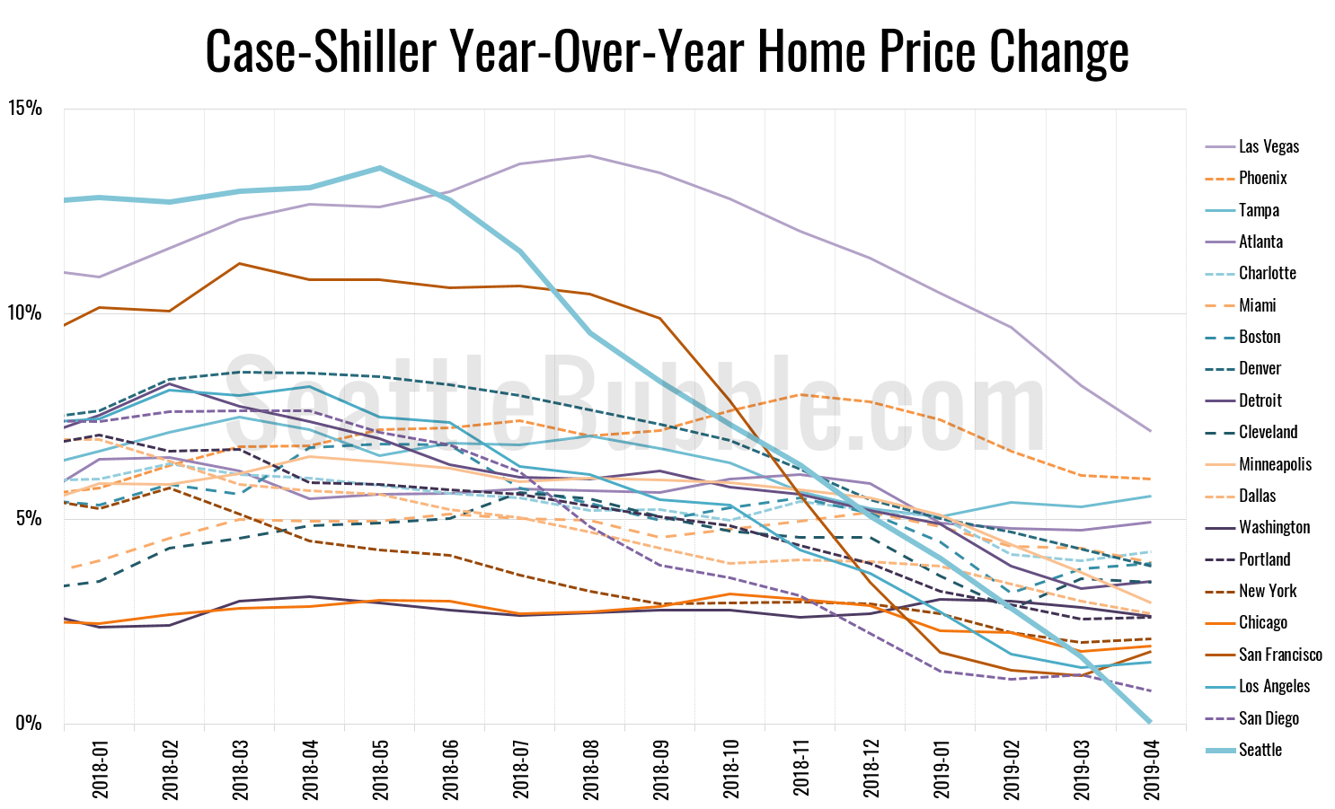
Let’s play a bit of catch-up today with some stats that I’ve allowed to fall behind. First up, the latest Case-Shiller data from a couple weeks ago. According to April data that was released late June, Seattle-area home prices were:
Up 1.1 percent March to April
Up less than 0.1 percent YOY.
Up 30.9 percent from the July 2007 peak
Last year at this time prices were up 2.7 percent month-over-month and year-over-year prices were up 13.1 percent.