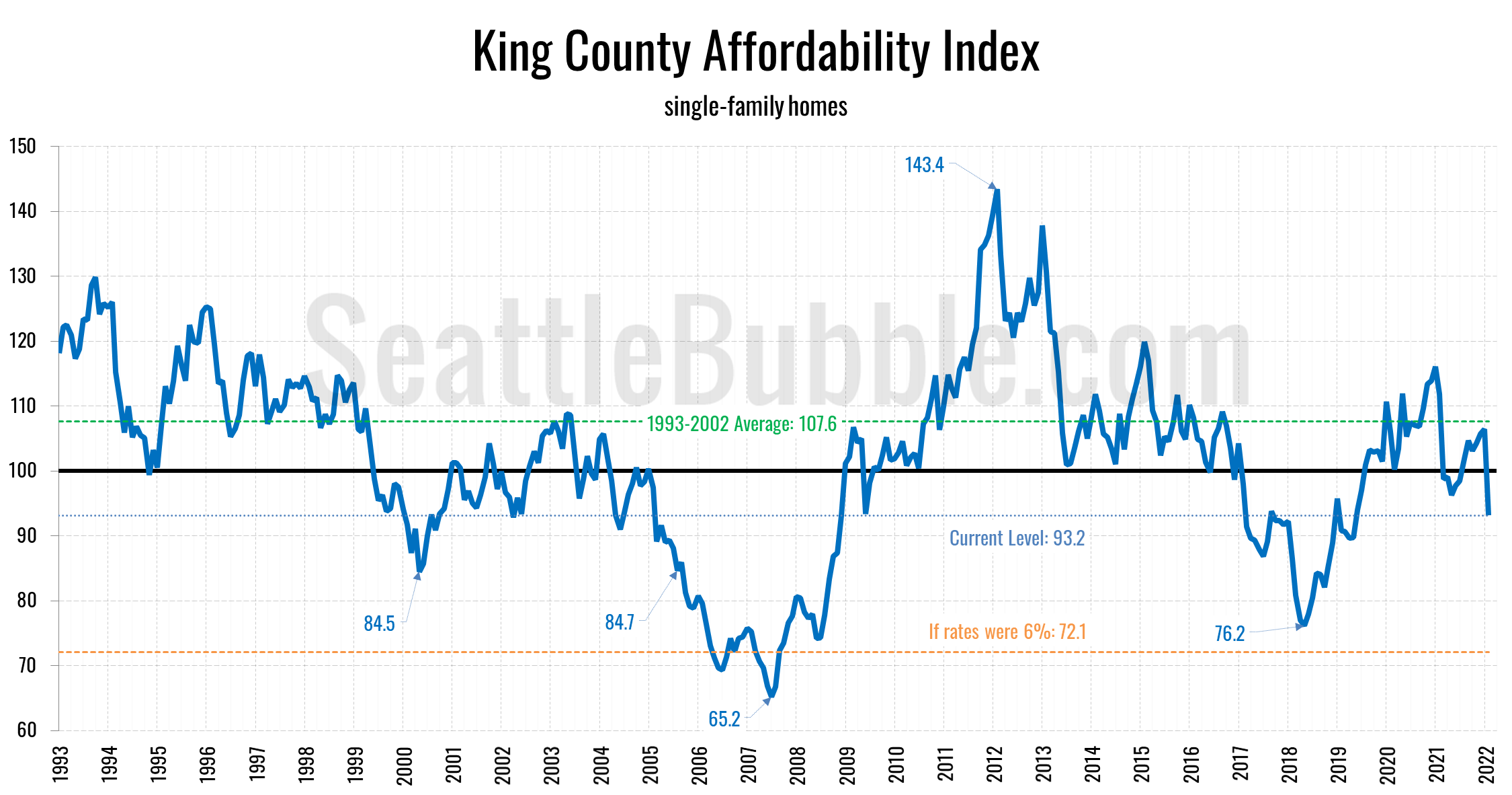
Seattle Bubble

News & discussion about real estate & the housing bubble in the Seattle area.

Seattle Bubble - News & discussion about real estate & the housing bubble in the Seattle area.

Entries Tagged as 'NWMLS'

October Seasonally-Adjusted Active Supply by Neighborhood

By The Tim on November 17th, 2009 at 12:33 PM · 15 Comments

Let’s check in on our October monthly neighborhood update to Seasonally-Adjusted Active Supply (SAAS). For an explanation of what seasonally-adjusted active supply is, please refer to this post. Also, you may view a map of the areas discussed in this post.

As usual, the sweet interactive data visualizations (new and improved!) in today’s post come to you courtesy Tableau Software.

In the charts below I have taken the calculated value for SAAS and subtracted 2, in order to better visualize the difference between a buyer’s market and a seller’s market. Using this method, negative SAAS values indicate a seller’s market, while positive values indicate a buyer’s market.

Summary

King County’s overall SAAS continued to drop below the “balanced” level, coming in at 1.59 for October (September was 1.80). 18 of 30 areas came in below 1.75 as seller’s markets (over half for the first time in recent years), Only 1 of 30 came in above 2.25 as a buyer’s market, and the remaining 11 were more or less balanced between 1.75 and 2.25.

Hit the jump for the rest of this month’s interactive charts and commentary.

[Read more →]

→ 15 CommentsCategories: Statistics
Tags: , , , , ,

Puget Sound Counties Interactive October Update

By The Tim on November 13th, 2009 at 6:00 AM · 51 Comments

Let’s take a look at October NWMLS statistics from around the sound. As usual, courtesy Tableau Software, the Around the Sound update is rocking sweet interactive data visualizations.

Feel free to download the old charts in Excel 2007 and Excel 2003 format. To get specific info about a certain point on any graph in the post below, float your mouse pointer over the data.

Before we get to the cool stuff, here’s the usual table of YOY stats for each of our seven covered counties as of October 2009.

October 2009 King Snohomish Pierce Kitsap Thurston Island Skagit Whatcom
Median Price 3.7% 12.3% 10.3% 0.4% 10.7% 7.0% 10.1% 5.0%
Listings 19.7% 23.8% 22.8% 26.1% 14.5% 7.3% 4.2% 10.1%
Closed Sales 33.3% 42.5% 24.0% 5.5% 5.7% 26.8% 9.0% 19.0%
Seasonally Adjusted Active Supply 1.6 1.8 1.7 1.6 1.6 1.7 2.0 1.8

Summary

Hit the jump for the rest of this month’s interactive charts.

[Read more →]

→ 51 CommentsCategories: Statistics
Tags: , , , , , , , , , , , , , ,

Quick Look: October 2009 in Bar Charts

By The Tim on November 10th, 2009 at 6:00 AM · 32 Comments

Here’s another installment of “quick look,” a series of posts in which I present a fresh set of charts for some recent data with minimal commentary.

Today’s theme is King County SFH October stats in bar charts compared to each October since 2000.

King Co. SFH Closed Sales: October

King Co. SFH New Listings: October

King Co. SFH End of Month Active Listings: October

Note that the definition of “Active Listings” was revised in July 2008 to exclude certain listings.

King Co. SFH MOM Price Change: October

King Co. SFH YOY Price Change: October

→ 32 CommentsCategories: Statistics
Tags: , , , , ,

Another Look at Pending and Closed Sales for 2009

By The Tim on November 9th, 2009 at 8:15 AM · 13 Comments

On Friday I posted this graph of 2009’s pending and closed sales to demonstrate just how out of whack the two have become:

2009 Pending and Closed King Co. SFH Sales

In the comments, a reader claimed that I was “reading this graph wrongly,” and that plotting the data in this manner “will always see a giant gap.”

Since there is typically a delay between when a sale goes pending and when it actually closes, this would make sense logically. Unfortunately, the data does not bear this theory out. In general, the gap tends to appear only in the spring, with pending and closed sales generally evening out in the summer and fall.

Pending and Closed King Co. SFH Sales: 2000-2008 Monthly Average

Here’s another way to visualize the difference between this year and previous years:

Closed Sales Less Same Month Pending Sales: King Co. SFH

Six of the ten months so far this year have blown past the lowest average monthly difference in 2000-2008 (-635 in February).

If you’re interested, I have also plotted the pre-bubble years 2000-2003 individually:

No matter which way you slice it, this year is incredibly out of whack when it comes to the number of pending sales that actually turn into closed deals.

→ 13 CommentsCategories: Statistics
Tags: , , ,

NWMLS: Fake Expiration of Wasteful Tax Credit Boosts October Sales

By The Tim on November 5th, 2009 at 12:32 PM · 67 Comments

Let’s have a look at October market statistics from the NWMLS. Here’s the NWMLS press release: Tax credit spurs big surge in Western Washington home sales.

Here’s your King County SFH summary, with the arrows to show whether the year-over-year direction of each indicator is positive or negative news for buyers and sellers:

October 2009 Number MOM YOY Buyers Sellers
Active Listings 8,869 -5.2% -19.7%
Closed Sales 1,758 +8.7% +33.3%
SAAS (?) 1.61 -11.4% -27.9%
Pending Sales 2,295 +0.3% +72.9%
Months of Supply 3.86 -5.5% -53.6%
Median Price* $377,500 -1.2% -3.7%

In a great big surprise to absolutely nobody, closed sales bumped up in a seasonally unnatural pattern in October, no doubt due to the belief many buyers had that the $8,000 tax credit would be expiring at the end of November (it is now foolishly being renewed and extended, pushed through Congress on the back of an unrelated extension of unemployment benefits).

At this point it still looks unlikely that closed sales will manage to break through the 2,000 mark this year. In the past, closed sales have fallen an average of 15% from October to November. I suspect that this year we may see sales hold steady or possibly even post a slight increase, but a 14% increase would be surprising, especially with the tax credit now having been extended.

Here’s how the closed sales situation is shaping up compared to previous years:

King County SFH Closed Sales

Thanks to an apparent abundance of eager homebuyers that aren’t very good at math, closed sales made a clear break from the trend seen every other year since 2000, ticking up from September to October. I expect a similar market distortion to appear next month as well.

Feel free to download the updated Seattle Bubble Spreadsheet, and here’s a copy in Excel 2003 format. Click below for the rest of the usual monthly graphs.

[Read more →]

→ 67 CommentsCategories: Statistics
Tags: , ,

Puget Sound Counties Interactive September Update

By The Tim on November 2nd, 2009 at 8:00 AM · 5 Comments

Whoops, sorry this is late. It took a little extra time to put together this month, as I finally switched the data over from months of supply to Seasonally Adjusted Active Supply. So, let’s have our September data checkup of NWMLS statistics from around the sound. As usual, courtesy Tableau Software, the Around the Sound update is rocking exclusive interactive data visualizations.

Feel free to download the old charts in Excel 2007 and Excel 2003 format. To get specific info about a certain point on any graph in the post below, float your mouse pointer over the data.

Before we get to the cool stuff, here’s the usual table of YOY stats for each of our seven covered counties as of September 2009.

September 2009 King Snohomish Pierce Kitsap Thurston Island Skagit Whatcom
Median Price 7.9% 11.1% 8.2% 4.6% 2.8% 1.8% 2.0% 8.7%
Listings 19.4% 23.6% 25.8% 25.1% 15.8% 2.0% 4.9% 9.7%
Closed Sales 14.3% 14.6% 12.4% 14.5% 1.5% 11.5% 20.9% 19.3%
Seasonally Adjusted Active Supply 2.0 2.1 1.8 2.0 1.9 2.5 3.0 1.5

Hit the jump for this month’s interactive charts.

[Read more →]

→ 5 CommentsCategories: Statistics
Tags: , , , , , , , , , , , , , ,