Let’s check up on what’s happening with the Seattle-area housing market in early 2023, shall we?

local real estate news, statistics, and commentary without the sales spin.
Let’s check up on what’s happening with the Seattle-area housing market in early 2023, shall we?
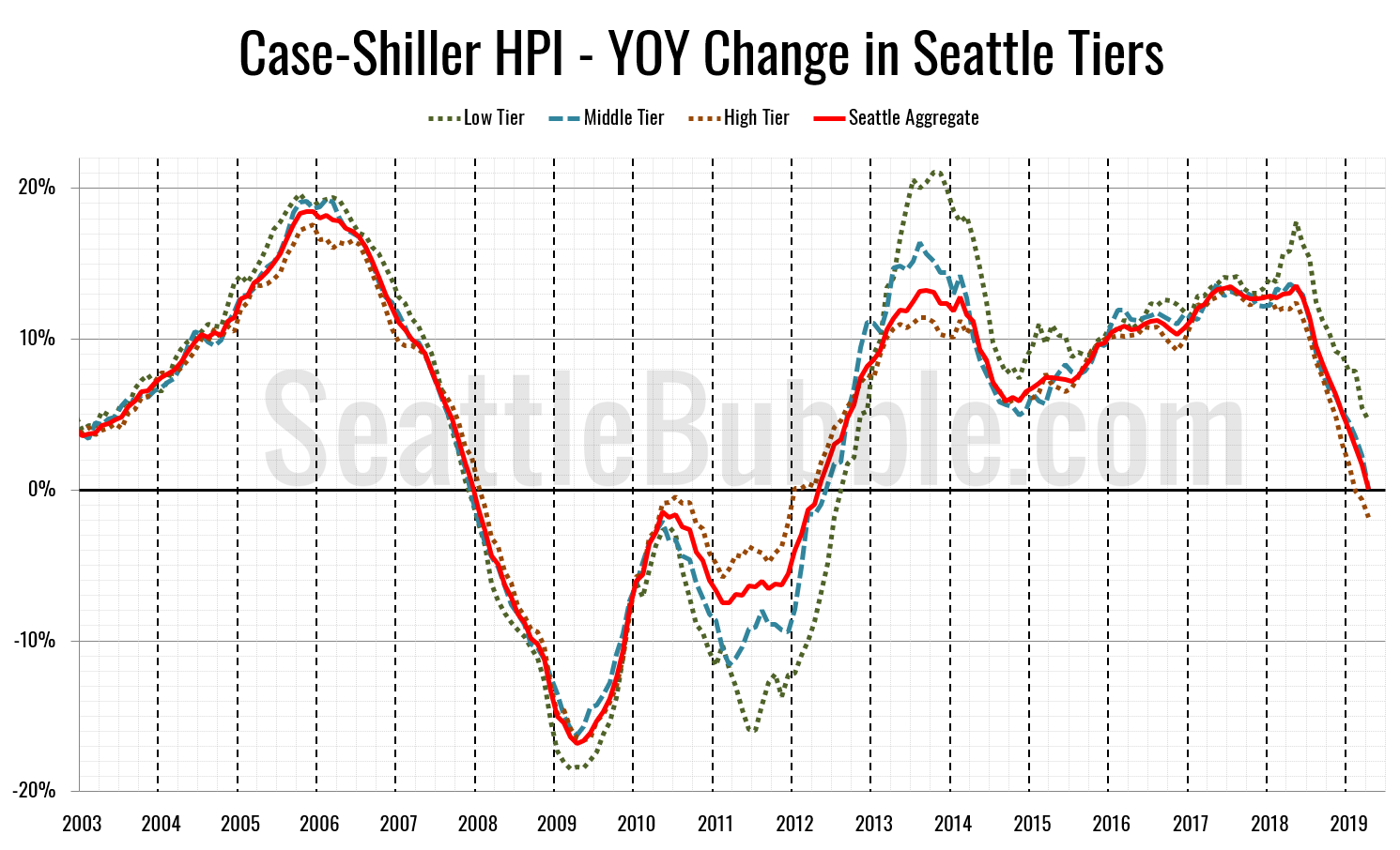
Let’s check out the three price tiers for the Seattle area, as measured by Case-Shiller. Remember, Case-Shiller’s “Seattle” data is based on single-family home repeat sales in King, Pierce, and Snohomish counties.
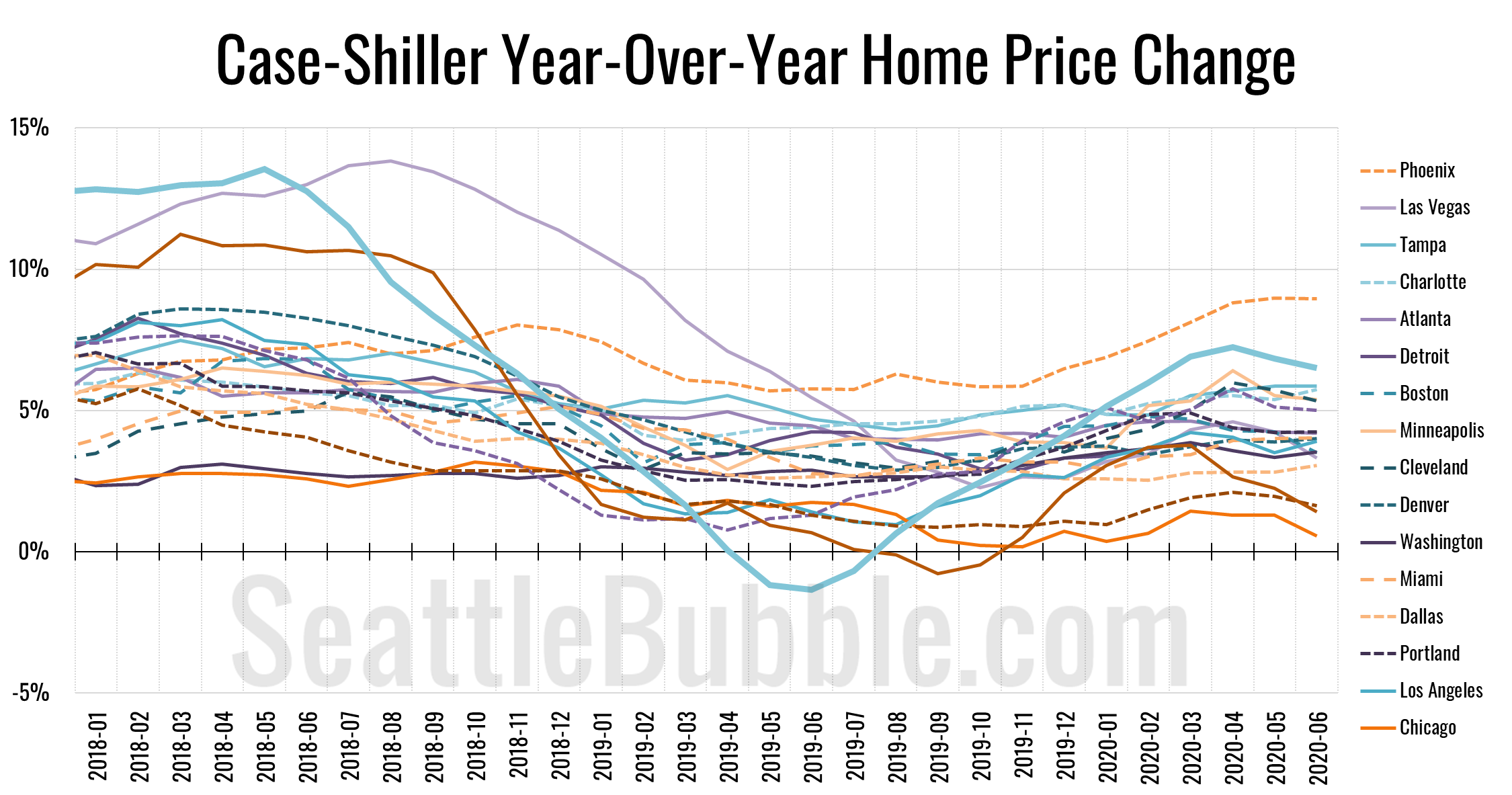
Let’s catch up a bit on our Case-Shiller data. According to June data that was released this week, Seattle-area home prices were up 0.2 percent May to June and up 6.5 percent YOY…
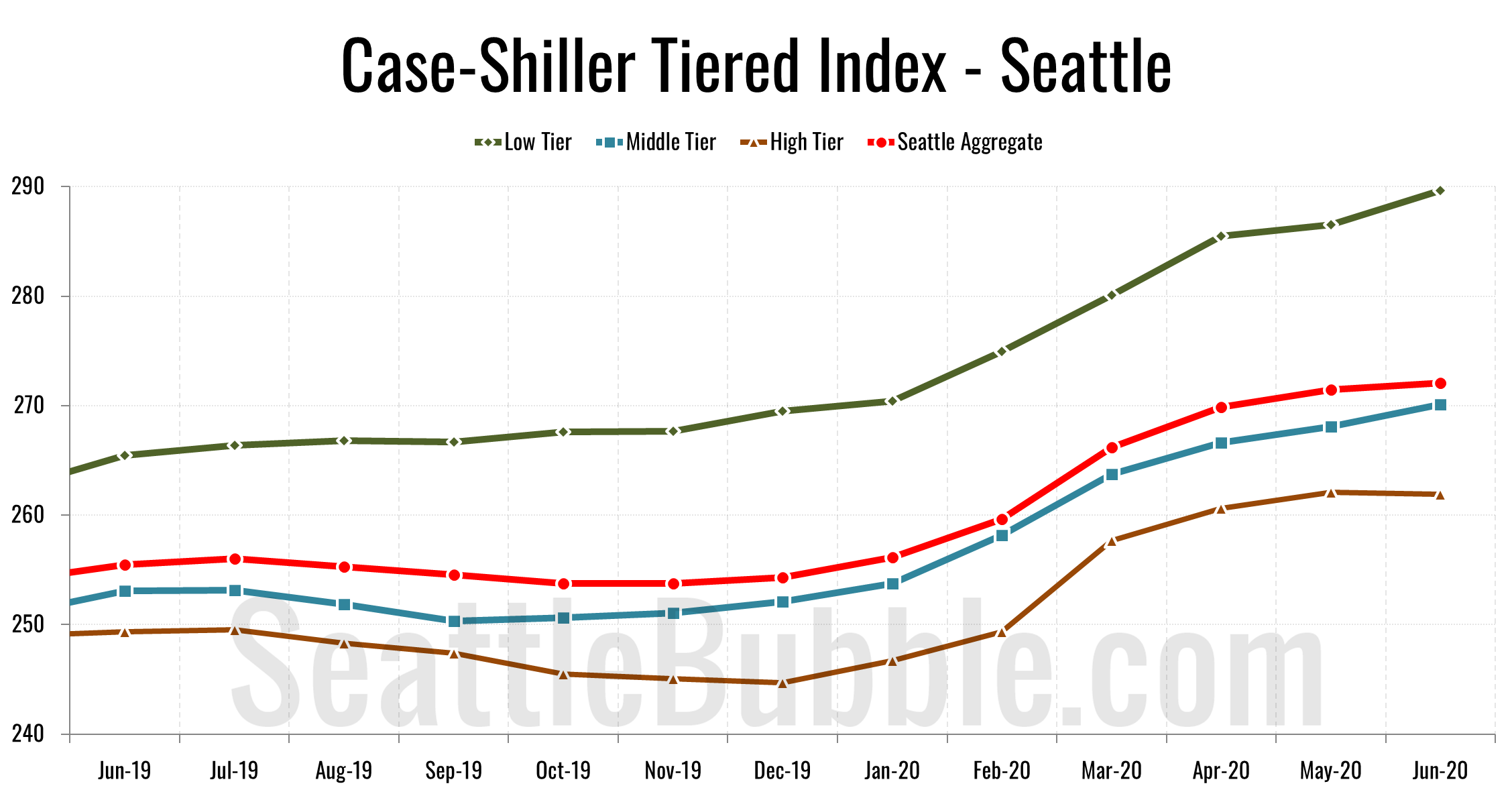
Let’s check out the three price tiers for the Seattle area, as measured by Case-Shiller. Remember, Case-Shiller’s “Seattle” data is based on single-family home repeat sales in King, Pierce, and Snohomish counties.
Year-over-year price growth is falling in all three tiers, with the high tier having flipped to year-over-year losses as of February.
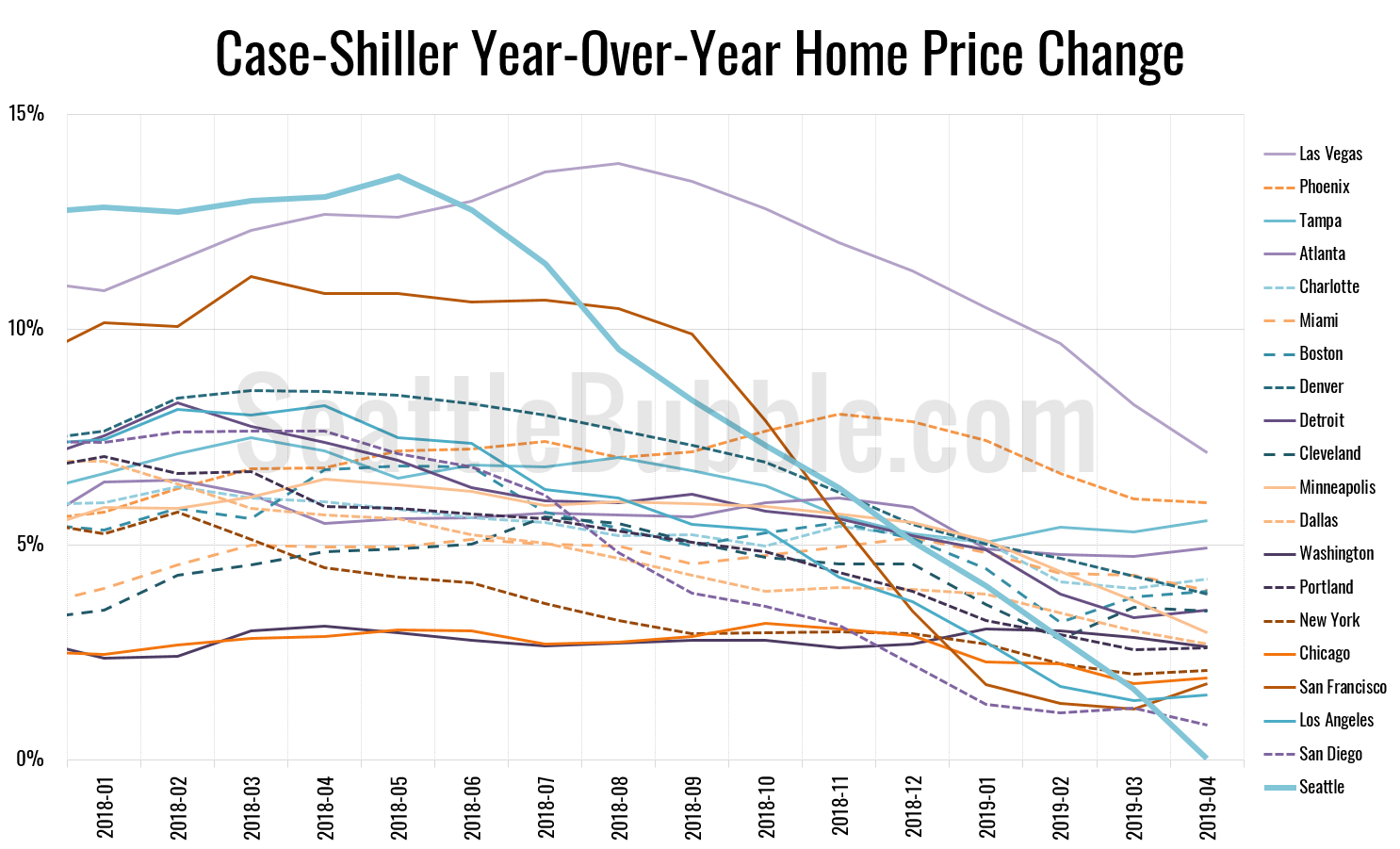
Let’s play a bit of catch-up today with some stats that I’ve allowed to fall behind. First up, the latest Case-Shiller data from a couple weeks ago. According to April data that was released late June, Seattle-area home prices were:
Up 1.1 percent March to April
Up less than 0.1 percent YOY.
Up 30.9 percent from the July 2007 peak
Last year at this time prices were up 2.7 percent month-over-month and year-over-year prices were up 13.1 percent.