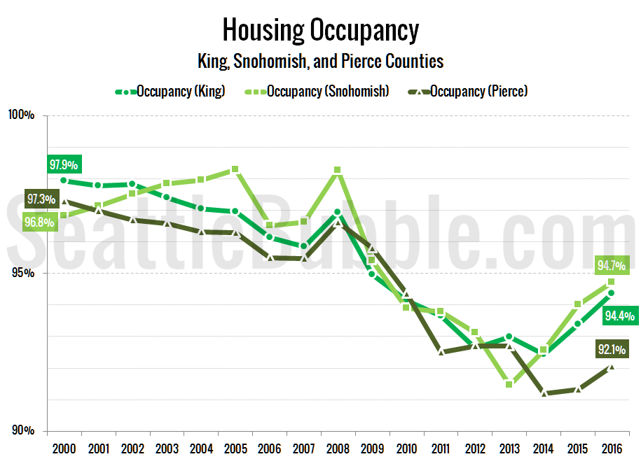
Seattle Bubble

News & discussion about real estate & the housing bubble in the Seattle area.

Seattle Bubble - News & discussion about real estate & the housing bubble in the Seattle area.

Entries Tagged as 'population'

List Prices: Seattle vs. Other Large Cities

By The Tim on September 23rd, 2009 at 12:00 PM · 72 Comments

Admittedly, yesterday’s post comparing home prices in Seattle to a remote location in Wisconsin really wasn’t fair. Granted, it was posted more for humor than for serious consideration, but there are certainly better comparisons that we could have made.

So what would be more fair? How about if we take the top 25 cities in the country by population, and see how Seattle home prices stack up?

Here are the top 25 cities in the United States, sorted by population based on Census Bureau estimates from July 2008 (source):

Top 25 US Cities by Population

And here’s the same list of cities, sorted by population density (people per square mile):

Top 25 US Cities by Population

Now here’s the same list of cities, sorted by median list price (source):

Top 25 US Cities by Population, Sorted by Median List Price

Detroit at #25 makes sense to me. Seattle at #3 above New York, Los Angeles, Boston, and Chicago… not so much. I guess Seattle is still special (at least in the minds of sellers)!

→ 72 CommentsCategories: Statistics
Tags: , , , , ,

Crosscut: Seattle Population is Nowhere Near Current Capacity

By The Tim on August 11th, 2009 at 1:04 PM · 44 Comments

Interesting article over on Crosscut today: Why Seattle won’t grow as fast as planners say

If Seattle’s current estimated population is 602,000 and we add the hypothetical 180,000 and you get 782,000 people by 2040 — considerably short of the 1.2 million that some claim are on the way.

The assumption is that right now, without changing or increasing any zoning at all, Seattle has the capacity to provide housing for up to 800,000 people without changing the rules to make buildings more dense like the proposed multifamily update or up zoning single family neighborhoods. Theoretically the capacity is already there.

Whichever means of calculating you use, it turns out we aren’t anywhere near capacity.

According to Seattle’s own numbers from January 2005 through March of 2009, over 28,000 housing units have been added to Seattle’s stock either built (16,504 units) or permitted and at various stages of construction (11,721 units). Seattle in just 51 months has reached 60 percent of its 20-year target. At this rate we’ll add over 110,000 units under current zoning by 2024, over twice the rate needed to fulfill our targets.

It should be noted that this article is focusing on Seattle proper, not the entire metro area. That being said, the author points out some interesting facts that would seem to point to continued downward pressure on home prices, even in the “close in” in-city neighborhoods.

It is also worth mentioning that I made similar points back in 2007 that apply on a county-wide basis.

→ 44 CommentsCategories: News
Tags: , , , , ,

Declining Appreciation Closely Tied to Sales Volume

By The Tim on December 10th, 2008 at 2:52 PM · 6 Comments

I was going back and updating some of my lesser-used spreadsheets today when I came upon one that I thought was particularly interesting. The graph below is an updated version of something I presented originally in the post Home Buying Demand vs. Price Changes back in April.

The chart below takes the year-to-year change in the single-family median home price as reported by the NWMLS and compares it to the persons per closed (SFH) sale, using the monthly Civilian Labor Force series from Workforce Explorer. All of the data is for King County as a whole.

YOY Price Change vs. People per Sale (King Co. SFH)

The green dots represent the period of increasing home price appreciation from July 2003 through January 2006, while the red dots are the data from January 2006 through November 2008, when home price appreciation has been on the decline. The unfilled white dots represent January 2000 through June 2003, when appreciation was in a state of fluctuation.

There is no time-shifting in this chart, just the rolling averages to smooth out the noisy data sets. Here’s a plot of the raw data (thin dashed lines) and the rolling averages for each set:

YOY Price Change & People per Sale (King Co. SFH)

To be honest, I’m not entirely sure what to make of this data. I realize that the last time I posted charts similar to these some folks railed into me (rightly so) for some statistical nonsense in a few of the charts. This time I have attempted to keep things simple, and I think the results are quite interesting.

From what I can tell, there seems to be a very close relationship between the number of sales as a percentage of the population and the change in price. The strange thing to me is how different the slopes are on the red and green lines.

I would postulate that the closely clustered white dots represent the relationship between sales volume and price changes in a “normal” or “balanced” market, while the dramatically-sloped green dots are a result of the out-of-whack mentality of the bubble market, and the red dots are the result of a correcting post-bubble market.

So what do you think? I know there are quite a few readers out there that are more statistically-inclined than myself, and I’d love to have some of you download the data for yourself and give me your take on it.

→ 6 CommentsCategories: Statistics
Tags: , , ,

Poll: If home prices never again become affordable around Seattle, when would you consider moving away?

By The Tim on August 3rd, 2008 at 12:05 AM · 79 Comments

Please vote in this poll using the sidebar.

If home prices never again become affordable around Seattle, when would you consider moving away?

  • 2 years or less. (28%, 66 Votes)
  • 3-5 years. (29%, 67 Votes)
  • 5-10 years. (11%, 26 Votes)
  • 11+ years. (5%, 11 Votes)
  • Never. (27%, 64 Votes)

Total Voters: 233


This poll will be active and displayed on the sidebar through 08.09.2008.

→ 79 CommentsCategories: Polls
Tags: ,

Housing Bust Slowing Population Growth

By The Tim on July 3rd, 2008 at 10:34 AM · 38 Comments

Aubrey Cohen reports on some interesting population growth data just released by the state Office of Financial Management.

…difficulty selling homes elsewhere has slowed population growth here over the past year, according to new estimates from the state Office of Financial Management.

Seattle and King County grew 1.1 percent and 1.2 percent, respectively, between April 1, 2007, and April 1, 2008, down from growth rates of 1.3 percent and 1.4 percent the previous year. Seattle is now home to 592,800 of King County’s 1.88 million residents.

The state grew 1.5 percent to nearly 6.59 million people as of April 1. The growth rate was down from 1.8 percent in the previous year.

Population gain from net migration — the number of people moving in minus those leaving — was 59,000 statewide over the past year, down from 70,000 in 2007 and 81,000 in 2006. King County’s net migration gain was just over 10,000, down from nearly 13,000 in 2007 and 15,500 in 2006.

The nationwide housing slowdown is starting to have a local impact, said Chandler Felt, demographer with the King County Office of Management and Budget.

“We’re not totally insulated from it, and I think we may be seeing more of it in the coming year,” he said.

Another fact not mentioned in the article is that as home prices drop more rapidly in sunny, desirable locations such as California and Florida than they do in Seattle, those places become even more desirable, which can only lead to some people leaving Seattle for more affordable, sunny locales.

(Aubrey Cohen, Seattle P-I, 07.03.2008)

→ 38 CommentsCategories: News
Tags: , ,

Home Buying Demand vs. Price Changes

By The Tim on April 24th, 2008 at 11:38 AM · 45 Comments

In theory, there are two factors that affect the price of homes: supply and demand. We’ve looked extensively at the relationship between supply (inventory) and price in the past. Let’s take a look at the relationship between demand and price.

For the purpose of this post, we will measure demand by looking at the relationship between the number of closed sales in a month and the total population. For population, I’ll be using the “Civilian Labor Force” data from Workforce Explorer Washington, since it is reported monthly. Note that the number I’m using is not the number of people employed, but the total number of employable people. For the median price and total number of closed sales, I’ll be using the single-family home data released monthly by the NWMLS. All of the data will be for King County as a whole.

First, let’s have a look at a raw chart of all the data, which is available through early 1999:

King County SFH Sales and Labor Force
Click to enlarge

In order to keep the graph from being an unintelligible mess, I’ve graphed the “1 Sale per X People” as a 12-month rolling average. This smooths out the large spikes that occur due to the highly seasonal nature of home sales. The YOY price change is also a rolling average, but only 6 months was necessary to smooth it out. You can see the raw data for both series in faint dashed lines.

Just by looking at this graph, you can see that there seems to be a relationship between the two—when the number of people per closed sale decreases, the price changes increase, and vice versa. Let’s take a closer look at this by graphing the two running averages on a scatter plot.

YOY Price Change vs. People per Sale
Click to enlarge

Clearly there’s some sort of relationship going on here, but with an R2 of just over 0.5, it’s not very strong. Let’s take a page out of Deejayoh’s playbook and see what it looks like if we compare each month’s rolling-average sales data with price change data sometime in the future. I looked at 3, 6, 9, and 12-month delays, and found that the strongest relationship was in a 9-month delay:

YOY Price Change vs. People per Sale (9-month delay)
Click to enlarge

With an R2 of 0.81, now we’re talking. But what’s with that trail of dots (that I have highlighted in green) deviating so severely from the pattern of all the rest? Those represent the YOY price change data from the last 6 months, October through March. If we stop the series in September, the R2 jumps up to over 0.9.

So clearly there was a strong relationship between demand and home price changes, at least until late last year, when things began to fall apart.

But hold on a minute. Let’s go back to that first scatter plot again. I’ve highlighted the last six data points again in green, and given them their own trend line:

YOY Price Change vs. People per Sale
Click to enlarge

Whoa. Granted, 6 months of data isn’t much to go by, but still, R2 of nearly 1.0 is pretty hard to ignore. I think this is definitely a trend to keep an eye on. If we make the fairly reasonable assumptions that population will continue to grow at the average rate it has grown the last 12 months and YOY sales will continue to drop at the average rate of the last 6 months, this trend line would result in YOY median price drops approaching 20% by the end of 2008.

I am not saying that is what will happen, although it certainly could. I just find it interesting that the time-delay in the relationship between demand and prices seems to have all but vanished with the recent changes in the housing market. Who knows how long it will continue, and who knows what population and sales will really do. What I do know is that I will definitely be paying close attention to this relationship as the mess continues to unfold here in Seattle.

Sources:
Sales & Prices: NWMLS
Labor Force: Workforce Explorer Washington

→ 45 CommentsCategories: Statistics
Tags: , , ,