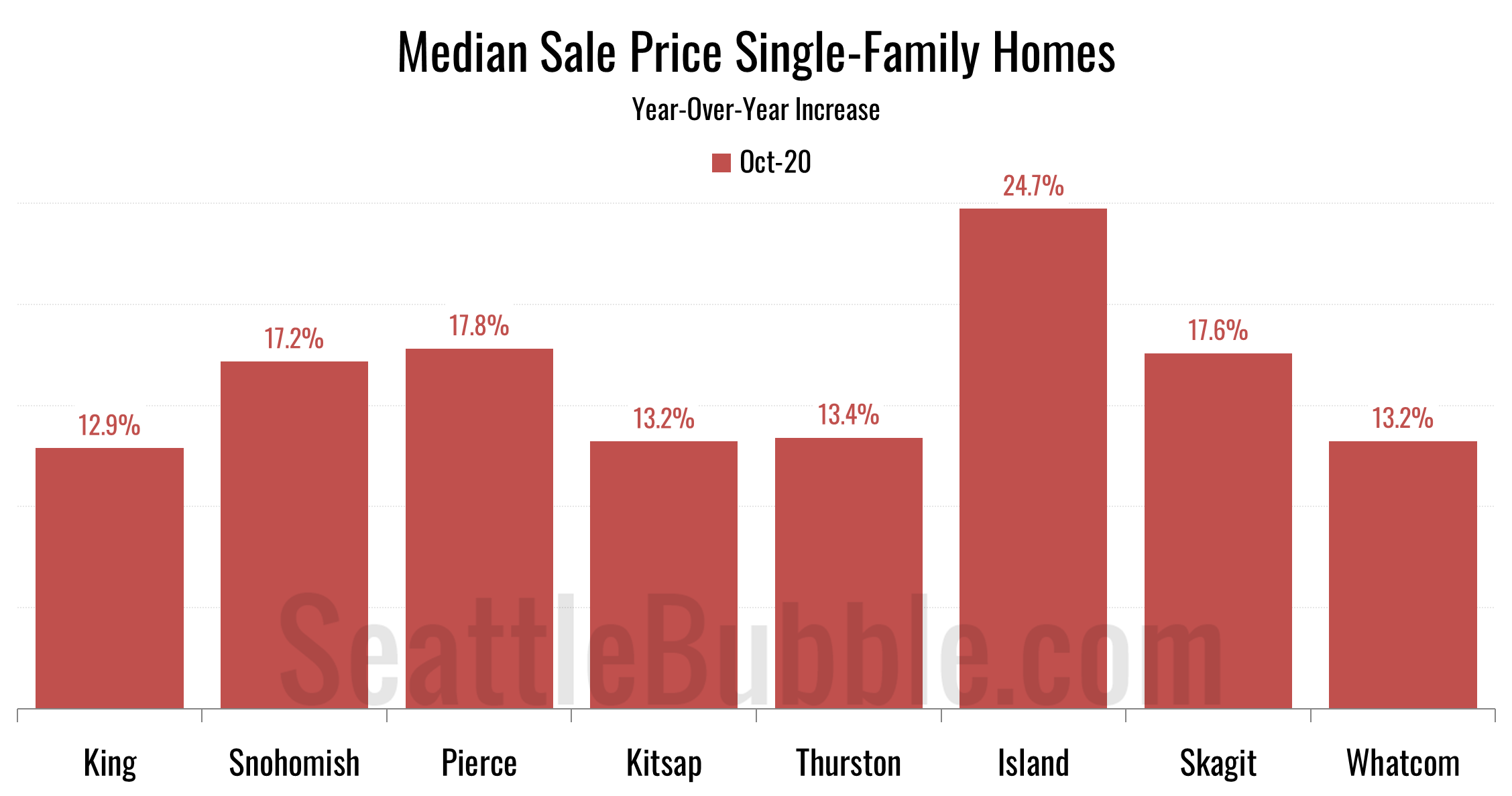
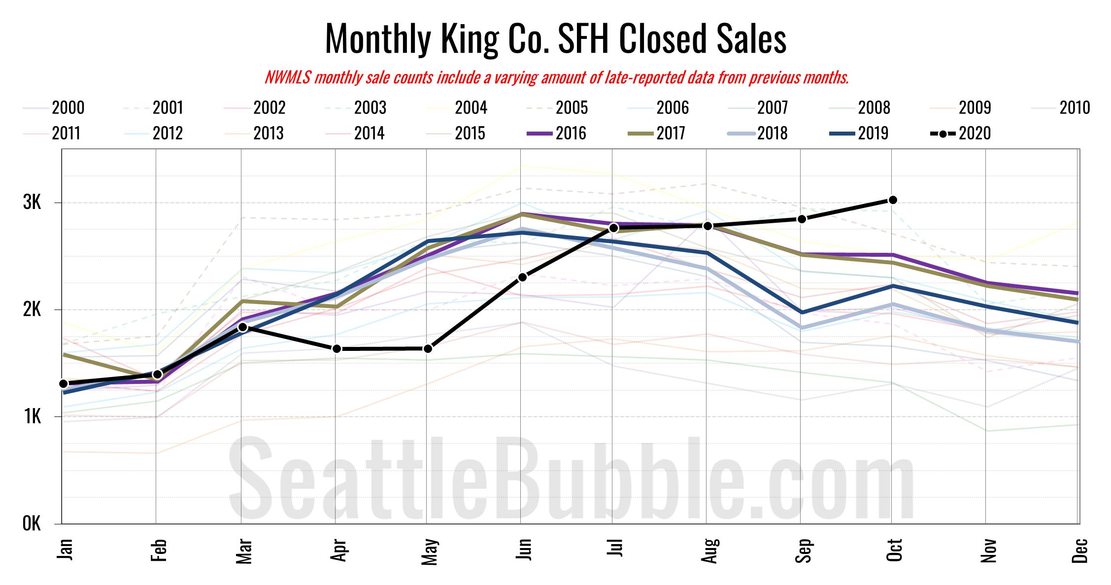
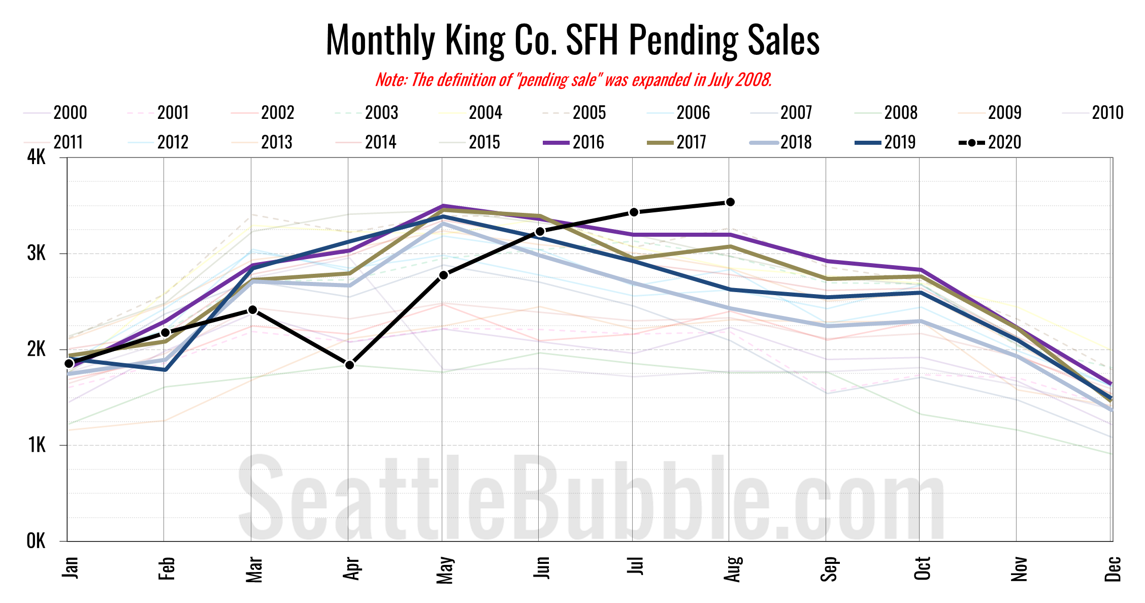
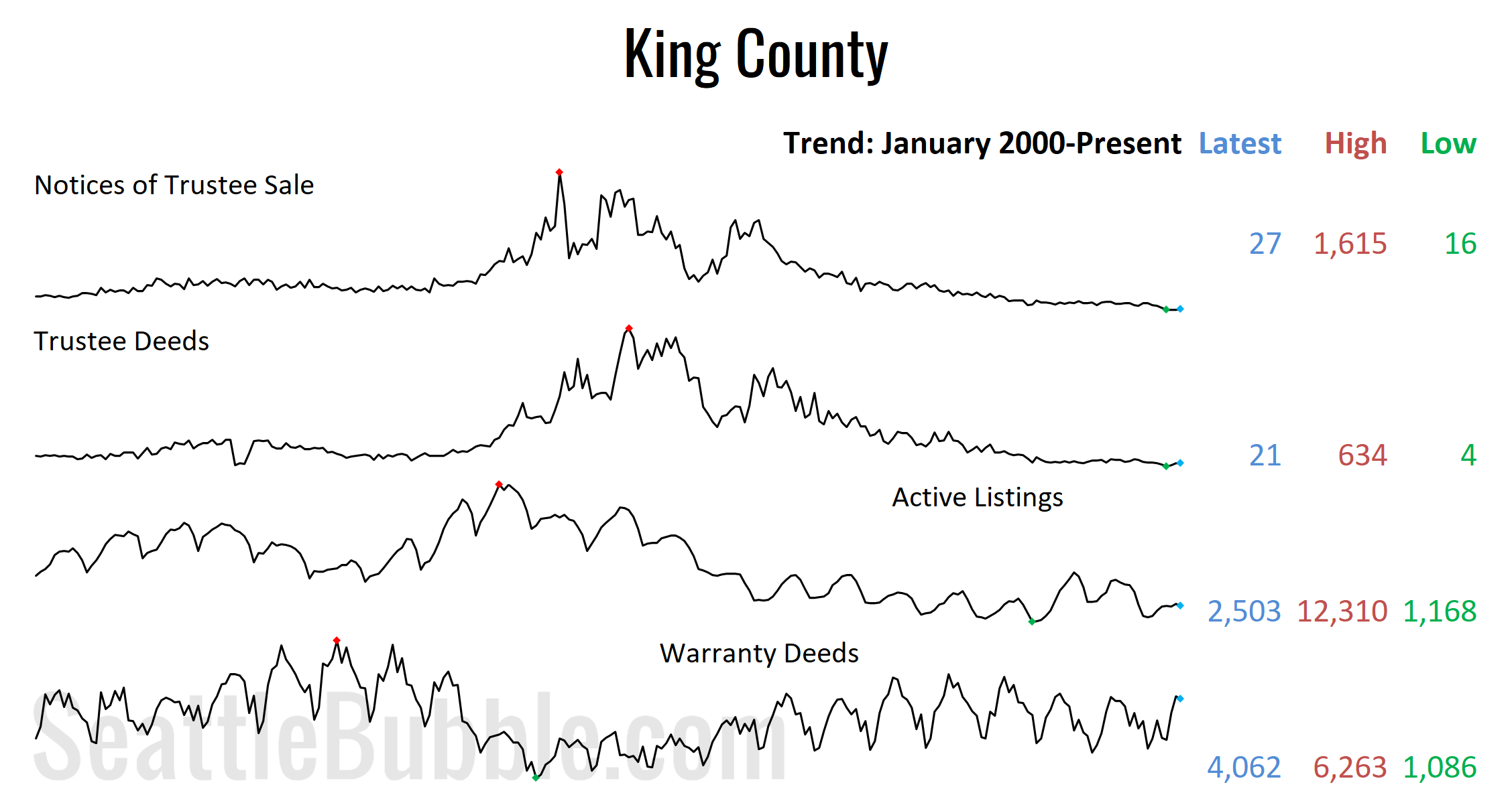
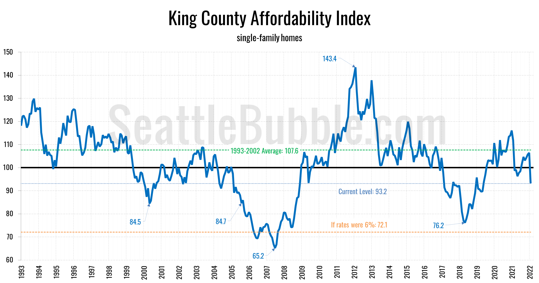
Seattle Bubble

News & discussion about real estate & the housing bubble in the Seattle area.

Seattle Bubble - News & discussion about real estate & the housing bubble in the Seattle area.

Entries Tagged as 'Statistics'

NWMLS: Fake Expiration of Wasteful Tax Credit Boosts October Sales

By The Tim on November 5th, 2009 at 12:32 PM · 59 Comments

Let’s have a look at October market statistics from the NWMLS. Here’s the NWMLS press release: Tax credit spurs big surge in Western Washington home sales.

Here’s your King County SFH summary, with the arrows to show whether the year-over-year direction of each indicator is positive or negative news for buyers and sellers:

October 2009 Number MOM YOY Buyers Sellers
Active Listings 8,869 -5.2% -19.7%
Closed Sales 1,758 +8.7% +33.3%
SAAS (?) 1.61 -11.4% -27.9%
Pending Sales 2,295 +0.3% +72.9%
Months of Supply 3.86 -5.5% -53.6%
Median Price* $377,500 -1.2% -3.7%

In a great big surprise to absolutely nobody, closed sales bumped up in a seasonally unnatural pattern in October, no doubt due to the belief many buyers had that the $8,000 tax credit would be expiring at the end of November (it is now foolishly being renewed and extended, pushed through Congress on the back of an unrelated extension of unemployment benefits).

At this point it still looks unlikely that closed sales will manage to break through the 2,000 mark this year. In the past, closed sales have fallen an average of 15% from October to November. I suspect that this year we may see sales hold steady or possibly even post a slight increase, but a 14% increase would be surprising, especially with the tax credit now having been extended.

Here’s how the closed sales situation is shaping up compared to previous years:

King County SFH Closed Sales

Thanks to an apparent abundance of eager homebuyers that aren’t very good at math, closed sales made a clear break from the trend seen every other year since 2000, ticking up from September to October. I expect a similar market distortion to appear next month as well.

Feel free to download the updated Seattle Bubble Spreadsheet, and here’s a copy in Excel 2003 format. Click below for the rest of the usual monthly graphs.

[Read more →]

→ 59 CommentsCategories: Statistics
Tags: , ,

October Housing Market Stats Preview

By The Tim on November 3rd, 2009 at 6:00 AM · 26 Comments

Now that October is behind us, let’s have a look at the monthly stats preview. Most of the charts below are based on broad county-wide data that is available through a simple search of King County Records. If you have additional stats you’d like to see in the “preview,” drop a line in the comments and I’ll see what I can do.

Here’s your preview of October’s foreclosure and home sale stats:

First up, total home sales as measured by the number of “Warranty Deeds” filed with the county:

King County Warranty Deeds

County sales as measured by warranty deeds were up significantly (16.7%) from last year in October, and marked another month-to-month increase (5.2%). This is no surprise, since as I mentioned last month, the impending expiration of the $8,000 mortgage subsidy is definitely having an effect on the people who have been duped into thinking we have already hit bottom.

Next, here’s Notices of Trustee sale, which are an indication of the number of homes currently in the foreclosure process:

King County Notices of Trustee Sale

Foreclosure notices actually declined from September, which could signal either an easing in the foreclosure “crisis” or possibly just a continued lag as the pipeline from SB 5810 continues to fill. We probably won’t really know for sure which one it is until sometime next year.

Here’s another measure of foreclosures, looking at Trustee Deeds, which is the type of document filed with the county when the bank actually repossesses a house through the trustee auction process. Note that there are other ways for the bank to repossess a house that result in different documents being filed, such as when a borrower “turns in the keys” and files a “Deed in Lieu of Foreclosure.”

King County Trustee Deeds

A new record high in October, lagging the peak month for Trustee Sale notices by four months.

Lastly, here’s an approximate guess at where the month-end inventory was, based on our sidebar inventory tracker (powered by Estately):

King County SFH Active Listings

Looks like listings will be down around 13% year-over-year, and 6% month-to-month.

Stay tuned later this month a for more detailed look at each of these metrics as the “official” data is released from various sources.

→ 26 CommentsCategories: Statistics
Tags: , , , , , , , ,

Puget Sound Counties Interactive September Update

By The Tim on November 2nd, 2009 at 8:00 AM · 5 Comments

Whoops, sorry this is late. It took a little extra time to put together this month, as I finally switched the data over from months of supply to Seasonally Adjusted Active Supply. So, let’s have our September data checkup of NWMLS statistics from around the sound. As usual, courtesy Tableau Software, the Around the Sound update is rocking exclusive interactive data visualizations.

Feel free to download the old charts in Excel 2007 and Excel 2003 format. To get specific info about a certain point on any graph in the post below, float your mouse pointer over the data.

Before we get to the cool stuff, here’s the usual table of YOY stats for each of our seven covered counties as of September 2009.

September 2009 King Snohomish Pierce Kitsap Thurston Island Skagit Whatcom
Median Price 7.9% 11.1% 8.2% 4.6% 2.8% 1.8% 2.0% 8.7%
Listings 19.4% 23.6% 25.8% 25.1% 15.8% 2.0% 4.9% 9.7%
Closed Sales 14.3% 14.6% 12.4% 14.5% 1.5% 11.5% 20.9% 19.3%
Seasonally Adjusted Active Supply 2.0 2.1 1.8 2.0 1.9 2.5 3.0 1.5

Hit the jump for this month’s interactive charts.

[Read more →]

→ 5 CommentsCategories: Statistics
Tags: , , , , , , , , , , , , , ,

September Seasonally-Adjusted Active Supply by Neighborhood

By The Tim on October 29th, 2009 at 6:00 AM · 5 Comments

Let’s check in again on our regular monthly neighborhood update to Seasonally-Adjusted Active Supply (SAAS). For an explanation of what seasonally-adjusted active supply is, please refer to this post. Also, you may view a map of the areas discussed in this post.

As usual, the sweet interactive data visualizations (new and improved!) in today’s post come to you courtesy Tableau Software.

In the charts below I have taken the calculated value for SAAS and subtracted 2, in order to better visualize the difference between a buyer’s market and a seller’s market. Using this method, negative SAAS values indicate a seller’s market, while positive values indicate a buyer’s market.

Summary

King County’s overall SAAS dropped further below the “balanced” level, coming in at 1.80 for September (August was 1.88). 11 of 30 areas came in below 1.75 as seller’s markets, 5 of 30 came in above 2.25 as buyer’s markets, and the remaining 14 were more or less balanced between 1.75 and 2.25.

Hit the jump for the rest of this month’s interactive charts and commentary.

[Read more →]

→ 5 CommentsCategories: Statistics
Tags: , , , , ,

Case-Shiller Tiers: Sales Mix Still Shifting Slightly Toward High Tier

By The Tim on October 28th, 2009 at 9:00 AM · 20 Comments

Let’s check out the three price tiers for the Seattle area, as measured by Case-Shiller. Remember, Case-Shiller’s “Seattle” data is based on single-family home repeat sales in King, Pierce, and Snohomish counties.

Note that the tiers are determined by sale volume. In other words, 1/3 of all sales fall into each tier. For more details on the tier methodologies, hit the full methodology pdf. Here are the current tier breakpoints:

  • Low Tier: < $274,582
  • Mid Tier: $274,582 – $404,443
  • Hi Tier: > $404,443

The tier breakpoints continued to shift upward ever so slightly in August, rising 0.3% to 0.4% while the overall index rose just 0.1%. This would seem to point to a continuing shift in the sales mix of homes away from the low end toward the high end, which would also help explain why the overall index rose only 0.1% when the low tier rose 0.5%.

First up is the straight graph of the index from January 2000 through August 2009.

Case-Shiller Tiered Index - Seattle

The low tier rose 0.5% month-to-month, while the middle tier fell 0.3%, and the high tier was virtually flat. The “rewind” situation held steady again, with low tier sitting about where it was in April 2005 and the middle and the high tiers at May 2005 levels.

Here’s a chart of the year-over-year change in the index from January 2003 through August 2009.

Case-Shiller HPI - YOY Change in Seattle Tiers

With a month-to-month increase, the low tier’s year-over-year picture improved the most in August. Here’s where the tiers sit YOY as of August – Low: -16.2%, Med: -13.6%, Hi: -14.9%.

Lastly, here’s a decline-from-peak graph like the one posted yesterday, but looking only at the Seattle tiers.

Case-Shiller: Decline from Peak - Seattle Tiers

So far I am still pretty unimpressed with this “recovery.” With nearly half a year of flatline prices in Seattle, it is still unclear whether this is the bottom, or merely an extended lull on the way to the real bottom. Personally, my money’s on the latter.

(Home Price Indices, Standard & Poor’s, 10.27.2009)

→ 20 CommentsCategories: Statistics
Tags: , ,

Case-Shiller: Seattle Still Being Left Out of the Summer Party

By The Tim on October 27th, 2009 at 7:01 AM · 97 Comments

It’s that fun time of the month once again. That’s right, time for the latest data from the Case-Shiller Home Price Index. According to August data,

Up 0.1% July to August.
Down 0.2% July to August (seasonally adjusted)
Down 14.7% YOY.
Down 22.2% from the July 2007 peak

Last year prices fell 0.7% from July to August (not seasonally adjusted) and year-over-year prices were down 8.8%.

Once again, here’s a little dose of sanity to contrast with what is no doubt set to be a day full of crowing and hoopla over the month-to-month increases seen in most of the 20 cities tracked by the Case-Shiller index.

Case-Shiller HPI: Month to Month Change

It still looks as though Seattle is being somewhat left out of this party.

Here’s our offset graph, with L.A. & San Diego time-shifted from Seattle & Portland by 17 months. Look at SoCal’s year-over-year skyrocketing back up to zero. Portland came in at -12.5%, and now both Los Angeles at -12.0%, and San Diego at -8.9% came in better than Seattle.

Case-Shiller HPI: West Coast

Note: This graph is not intended to be predictive. It is for entertainment purposes only.

Here’s the graph of all twenty Case-Shiller-tracked cities:

Case-Shiller HPI: All Cities

In July, fourteen of the twenty Case-Shiller-tracked cities experienced smaller year-over-year drops than Seattle (vs. twelve last month). Dallas at -1.2%, Denver at -1.9%, Cleveland at -2.8%, Boston at -4.2%, Washington, DC at -7.9%, Charlotte at -8.6%, San Diego at -8.9%, New York at -9.6%, Atlanta at -10.6%, Los Angeles at -12.0%, Portland at -12.5%, San Fancisco at -12.5, Chicago at -12.7%, and Minneapolis at -13.7%. Vegas took the #1 spot again for the largest year-over-year drop, with prices still falling over 30% in a single year down there—stimulus? What stimulus?

Here’s an update to the peak-decline graph, inspired by a graph created by reader CrystalBall. This chart takes the twelve cities whose peak index was greater than 175, and tracks how far they have fallen so far from their peak. The horizontal axis shows the total number of months since each individual city peaked.

Case-Shiller HPI: Decline From Peak

In the two years and a month since the price peak in Seattle prices have declined 22.2%. Definitely seems to be stuck moving sideways.

Here’s a complimentary chart to that last one. This one shows the

Case-Shiller HPI: Bounce Since March 2009

With just a 0.3% increase since March, the summer of stimulus seems to be having little effect on Seattle home prices. But hey, at least we’re not as immune to stimulus as Vegas apparently is. Down 9% in just the last five months. Ouch!

The following chart takes the post-bubble years of 2007, 2008, and 2009 and indexes each January’s Case-Shiller HPI to 100 so we can get a picture of how this year’s declines compare to last year:

Post-Bubble Seattle Case-Shiller HPI by Year

Thanks to the tax credits, abnormally / artificially low interest rates, and lots of hype about a so-called recovery, it would seem that we have pulled 2009 into slightly better territory than 2008.

Lastly, here’s an update to the Case-Shiller vs. NWMLS median chart. The following chart shows Seattle-area 2009 home prices, indexed to January = 100, as reported by the NWMLS (using a 3-month rolling average) and by Case-Shiller.

Seattle Case-Shiller HPI and NWMLS SFH Median

Check back tomorrow for a post on the Case-Shiller data for Seattle’s price tiers.

(Home Price Indices, Standard & Poor’s, 10.27.2009)

→ 97 CommentsCategories: Statistics
Tags: , , , ,