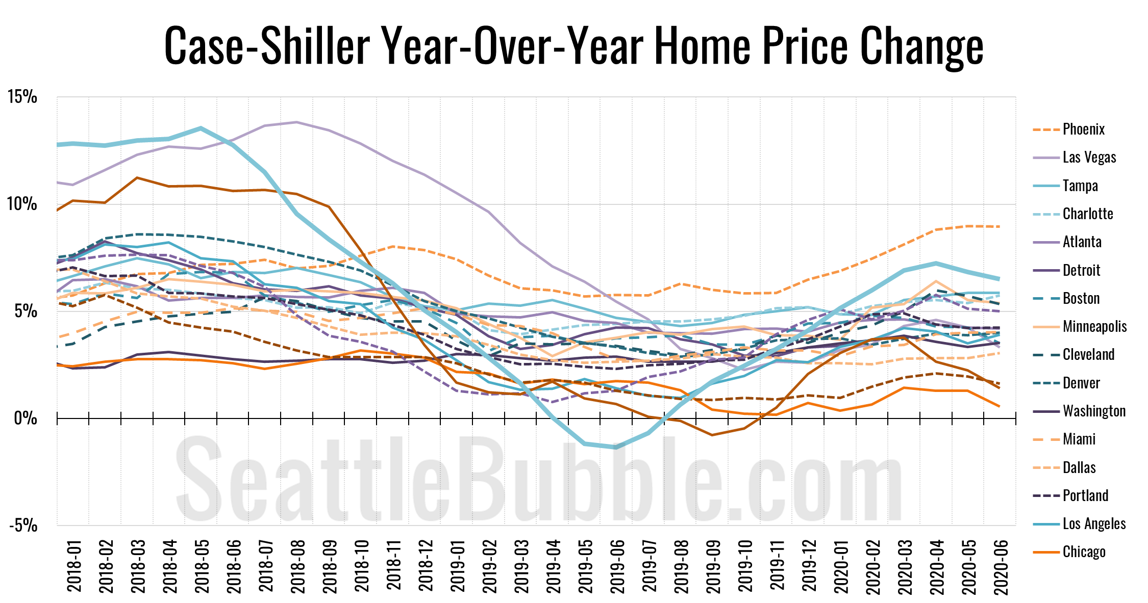
Let’s catch up a bit on our Case-Shiller data. According to June data that was released this week, Seattle-area home prices were up 0.2 percent May to June and up 6.5 percent YOY…
local real estate news, statistics, and commentary without the sales spin.
Let’s catch up a bit on our Case-Shiller data. According to June data that was released this week, Seattle-area home prices were up 0.2 percent May to June and up 6.5 percent YOY…
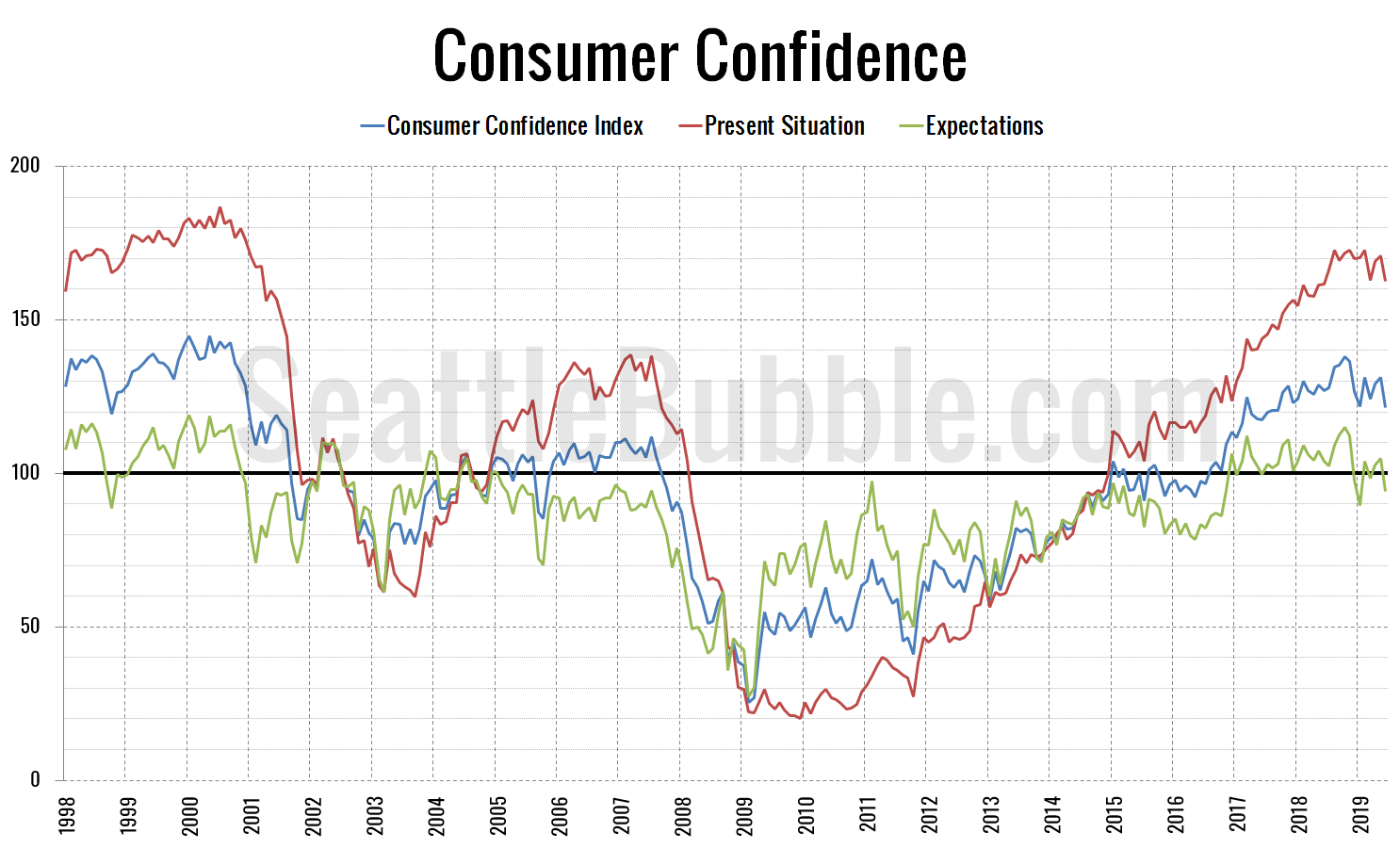
As part of our data catch-up extravaganza, let’s check in in on the latest data from the Consumer Confidence Index.
The overall Consumer Confidence Index currently sits at 121.5, down 7.5 percent in a month and down 4.4 percent from a year ago.
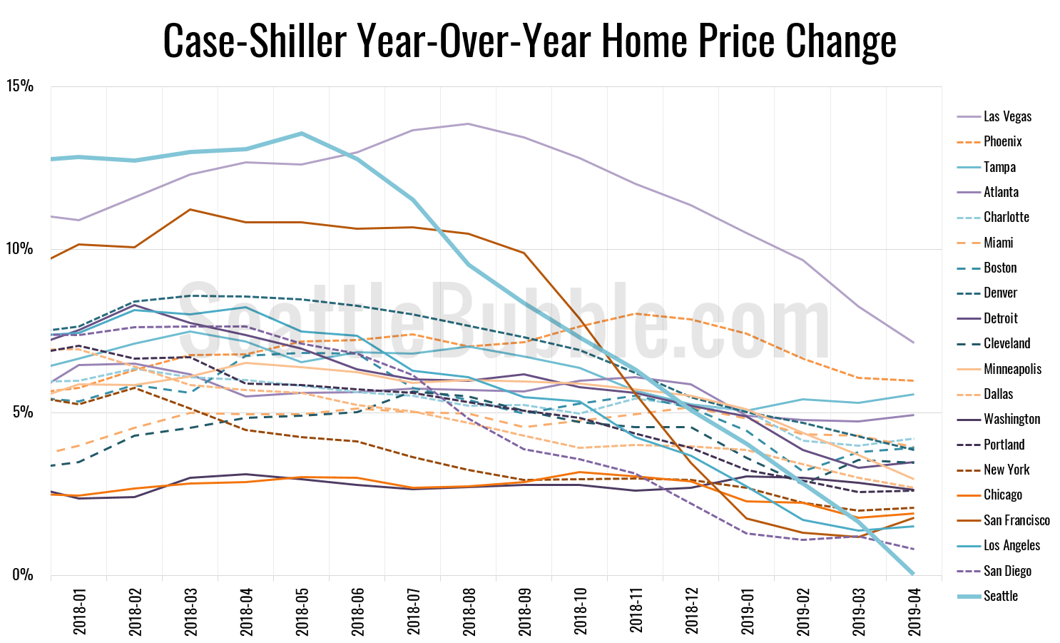
Let’s play a bit of catch-up today with some stats that I’ve allowed to fall behind. First up, the latest Case-Shiller data from a couple weeks ago. According to April data that was released late June, Seattle-area home prices were:
Up 1.1 percent March to April
Up less than 0.1 percent YOY.
Up 30.9 percent from the July 2007 peak
Last year at this time prices were up 2.7 percent month-over-month and year-over-year prices were up 13.1 percent.
It’s been a while since we posted our Case-Shiller charts and dashboards, so let’s have a look at the latest data from the Case-Shiller Home Price Index. According to January data that was released yesterday, Seattle-area home prices were: Down 0.3 percent December to January…
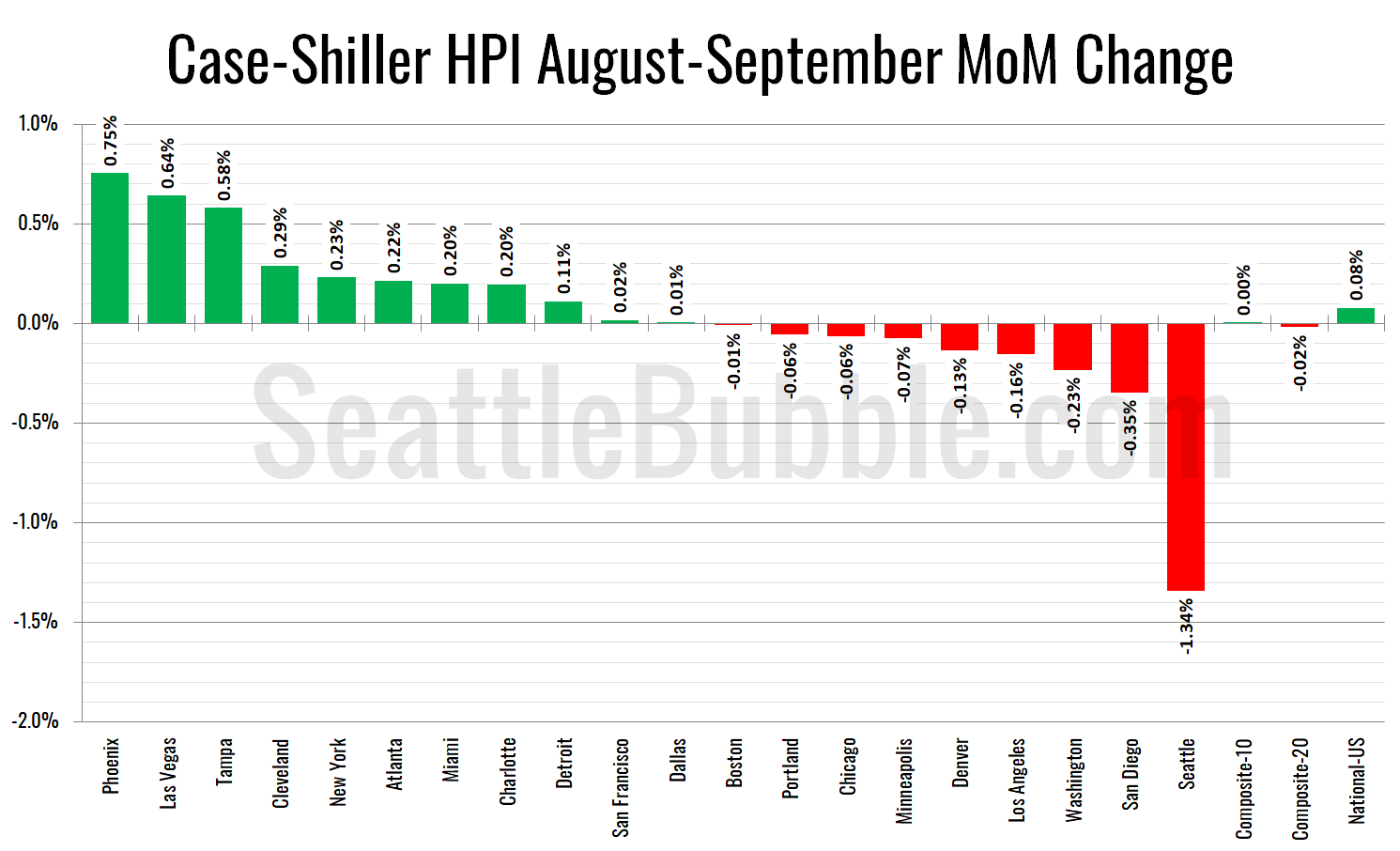
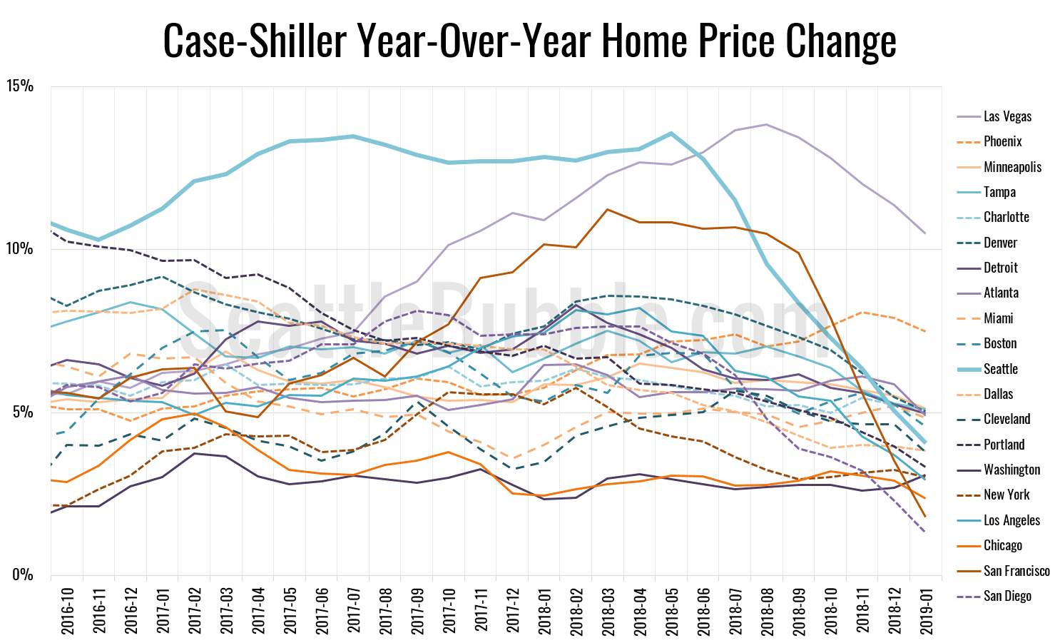
Let’s have a look at the latest data from the Case-Shiller Home Price Index. According to September data that was released today, Seattle-area home prices were:
Down 1.3 percent August to September
Up 8.4 percent YOY.
Up 30.2 percent from the July 2007 peak
Last year at this time prices were down 0.3 percent month-over-month and year-over-year prices were up 12.9 percent.